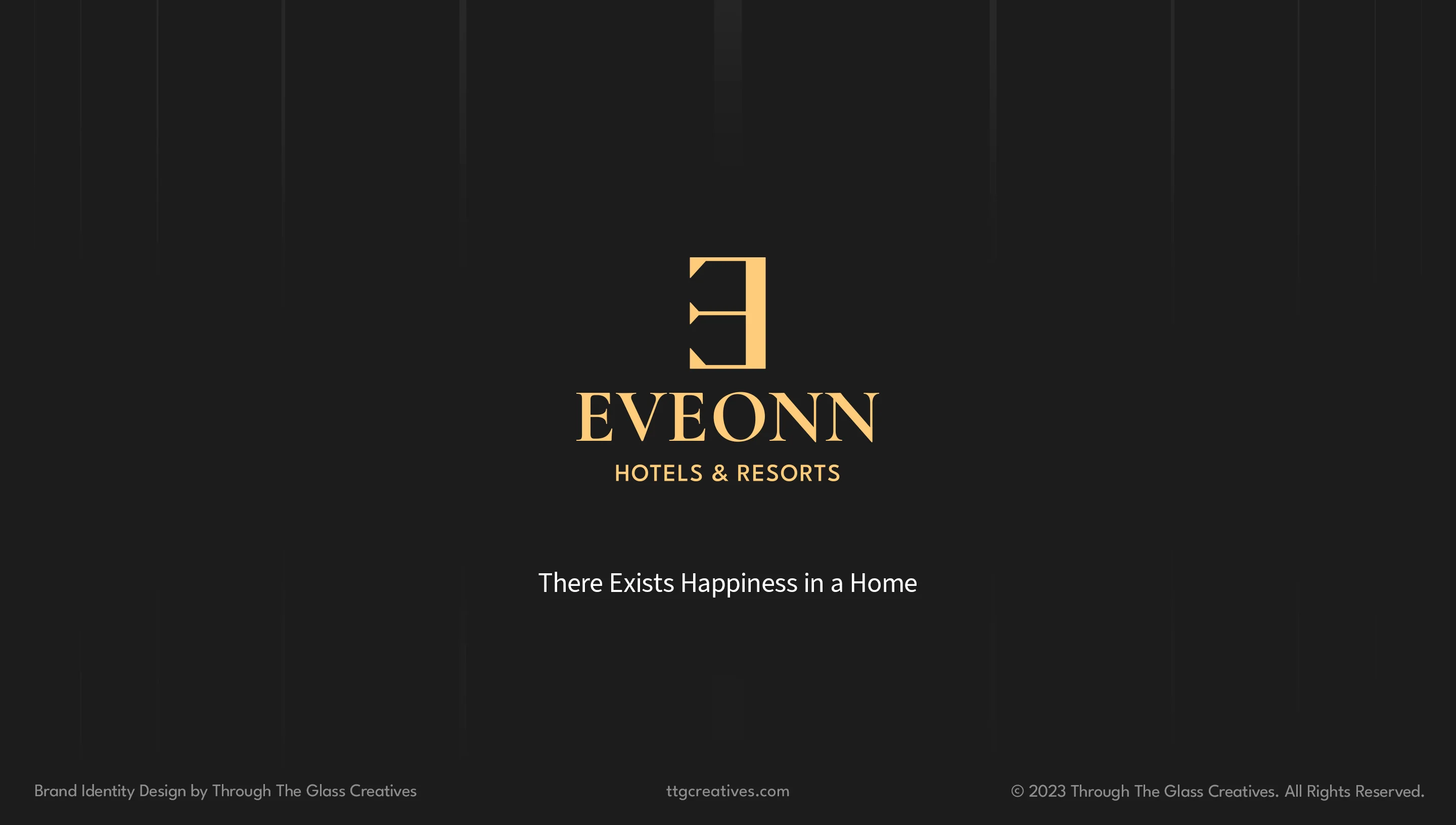
Eveonn Hotels & Resorts
Brand identity for a Philippine hotel chain where there exists happiness in a home.
Eveonn Hotels & Resorts logo animation.
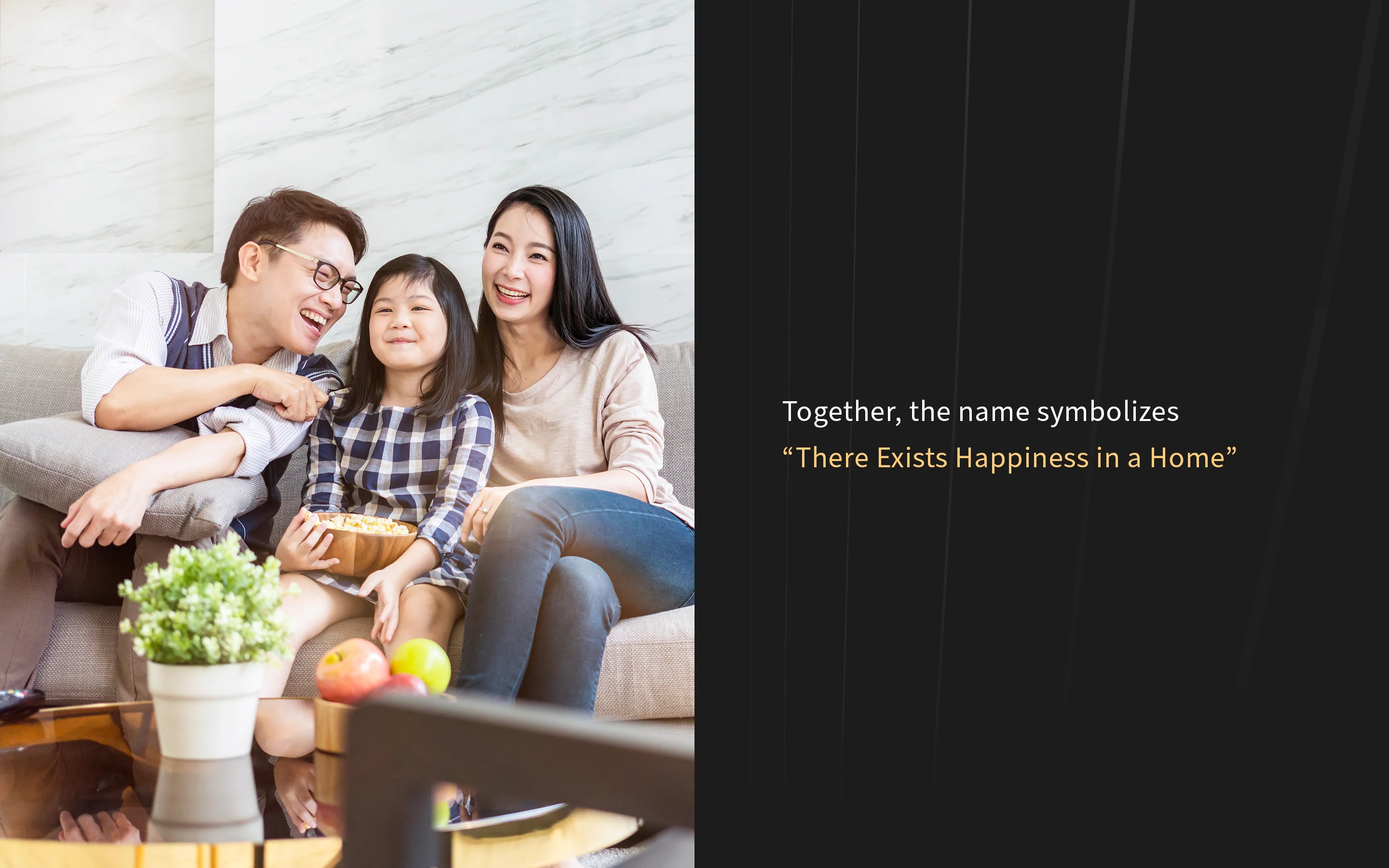
"Ev" means "Home" in Old Turkish. "Onn" means "Happiness" in Estonian. The reversed "E" denotes "There Exists." Together, the name symbolizes "There Exists Happiness in a Home." TTGC built the brand from the ground up for this growing Philippine hotel chain with 10–15 locations, ensuring consistency across every touchpoint — from lobby signage to room amenities.

Brand identity cover.
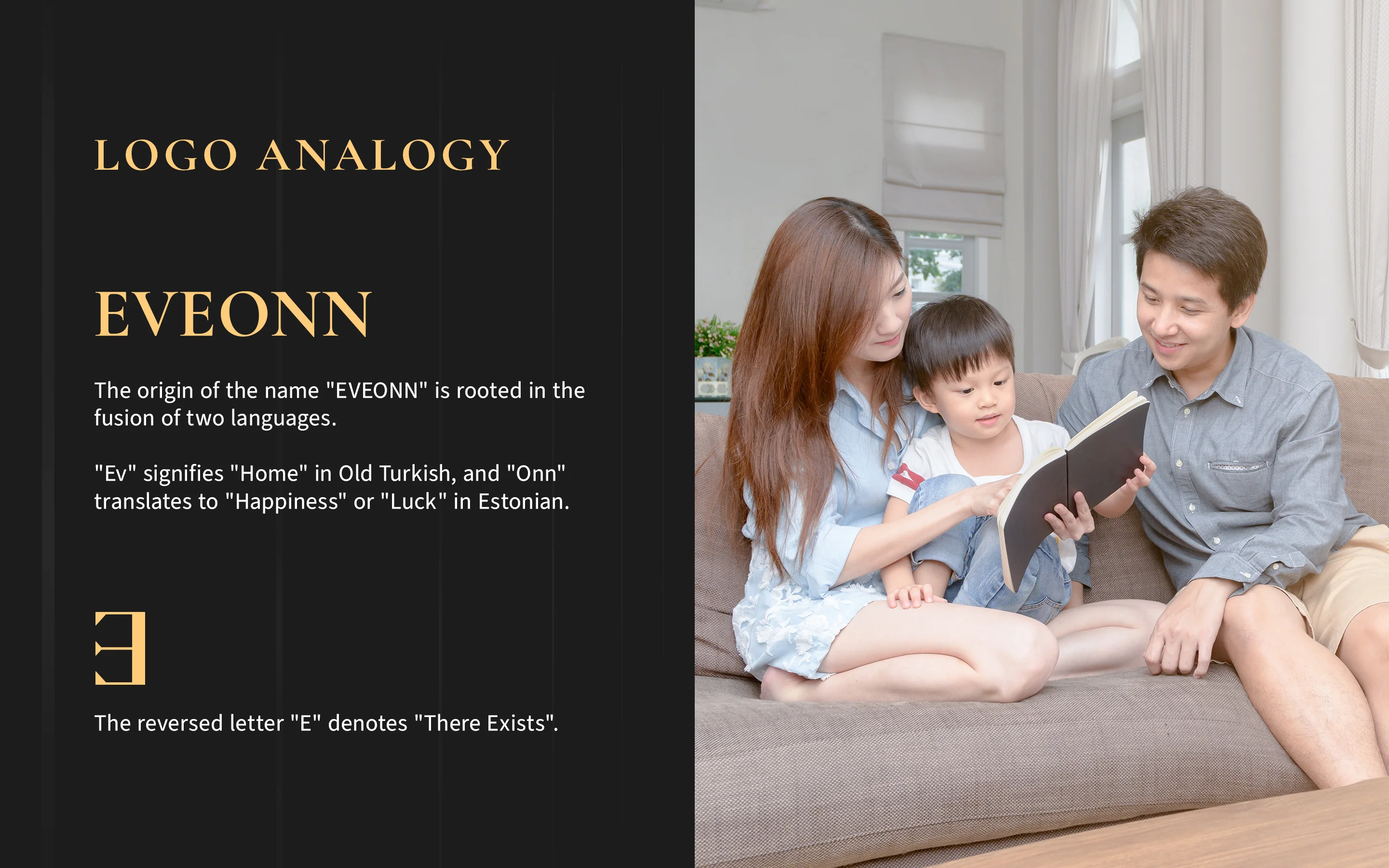
Logo analogy and name origin.
Name meaning breakdown.
Logo design process — from sketches to final mark.
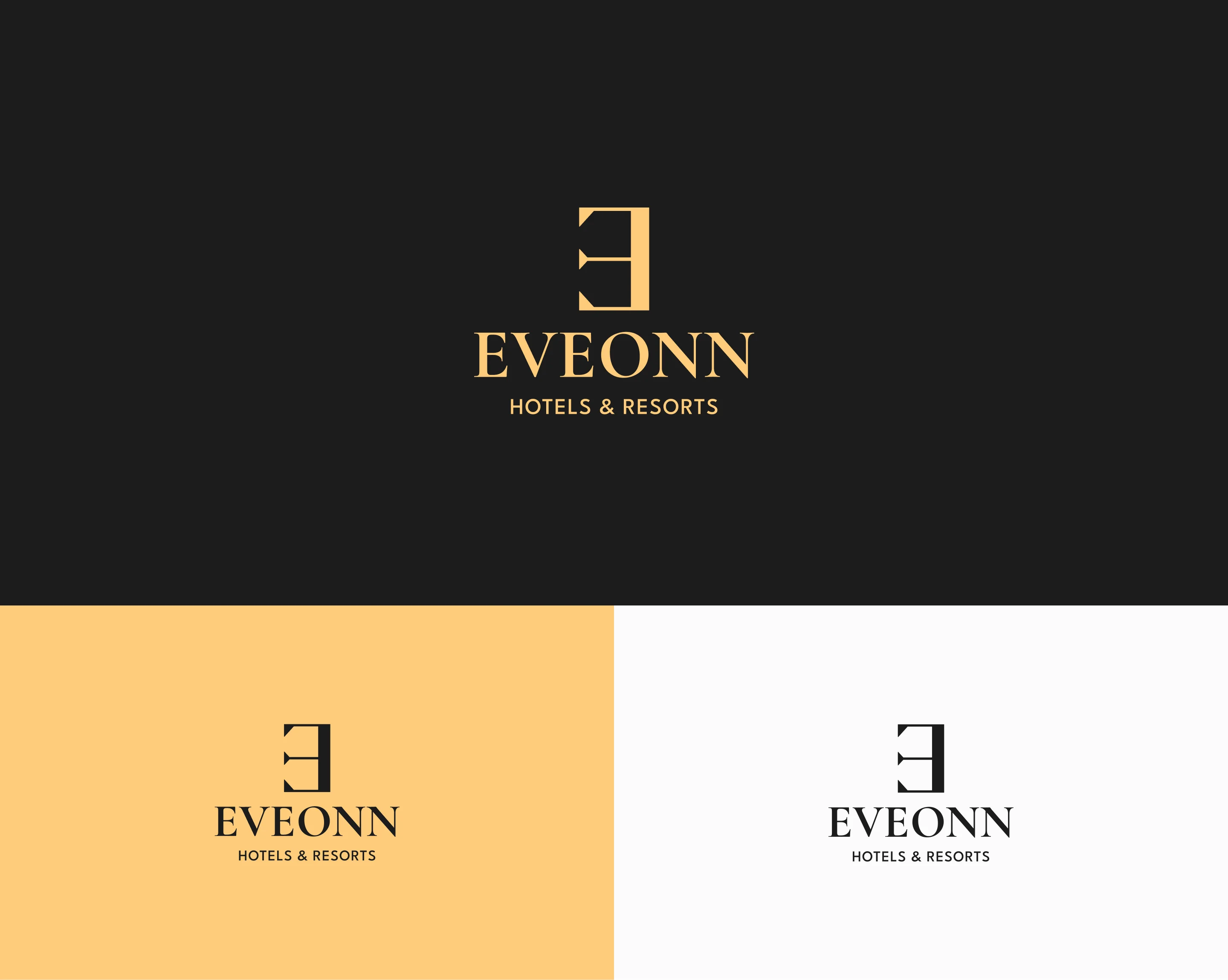
Logo color variations.
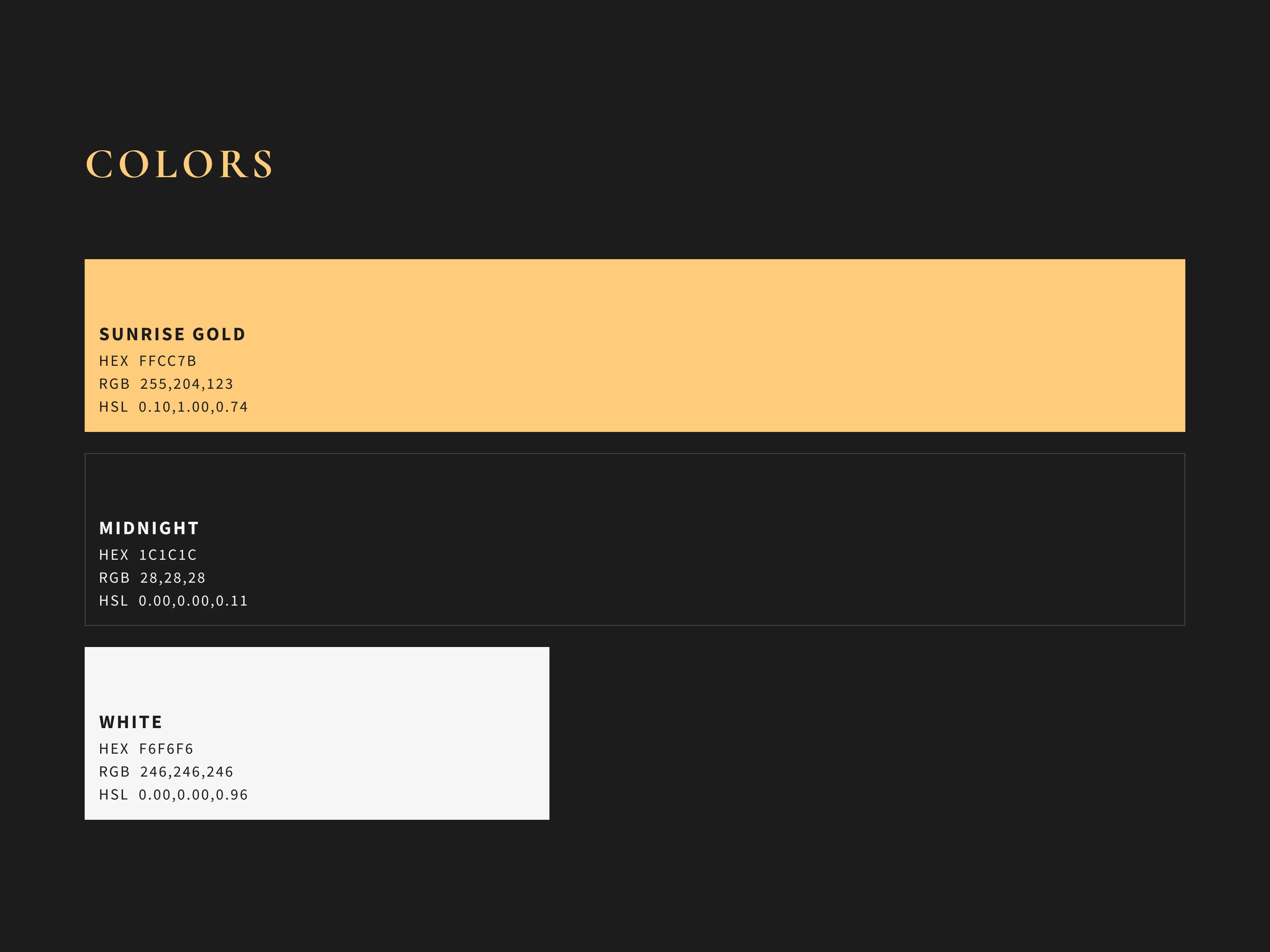
Color palette.

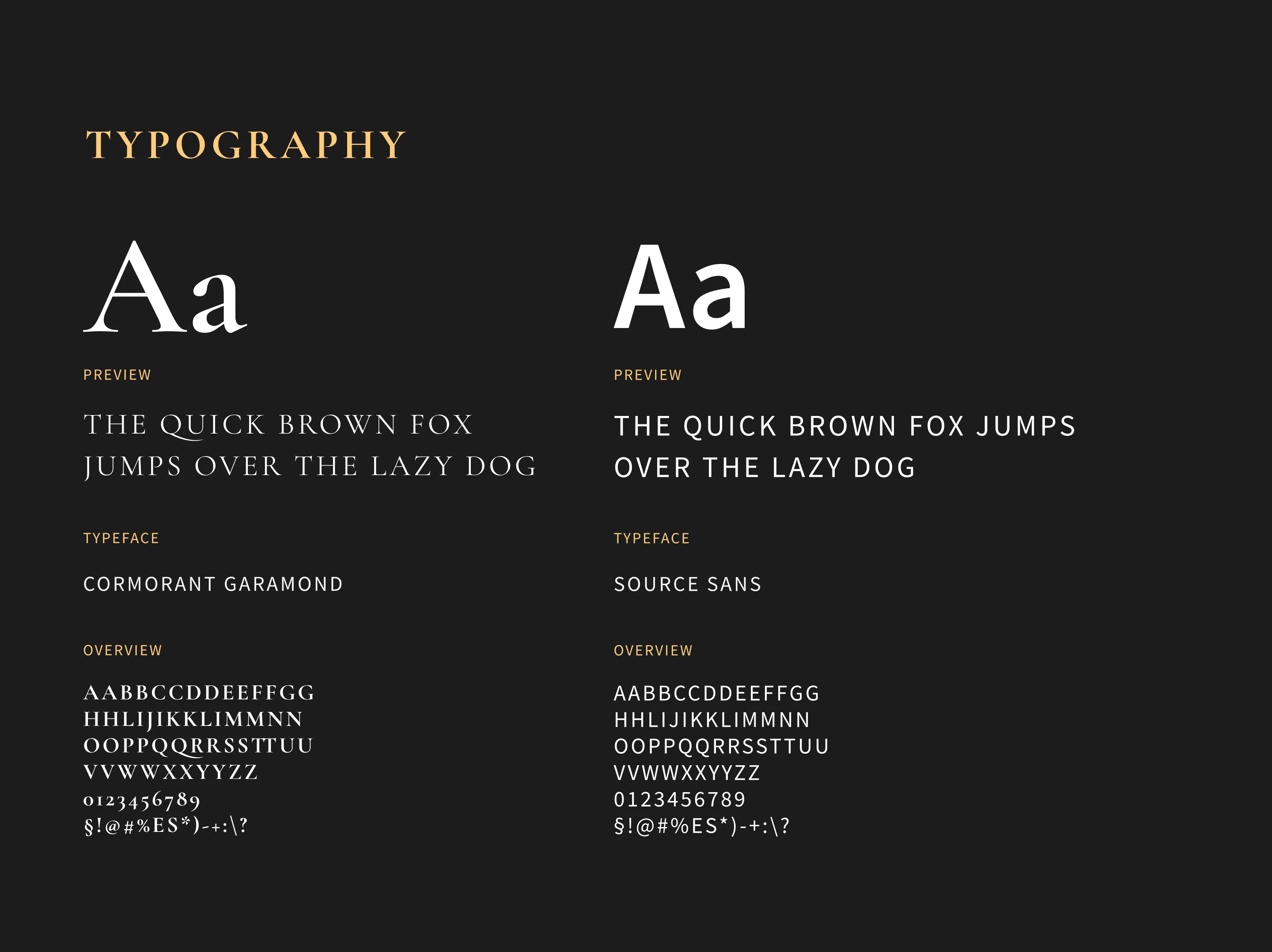
Typography — Cormorant Garamond and Source Sans.
Website desktop mockup.
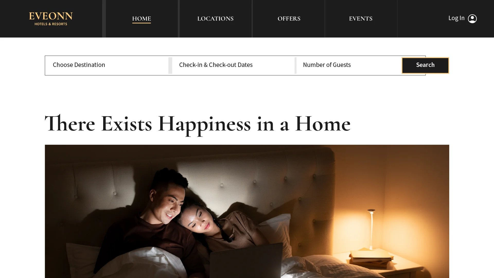
Full-screen website.

Website in context — "There Exists Happiness in a Home."

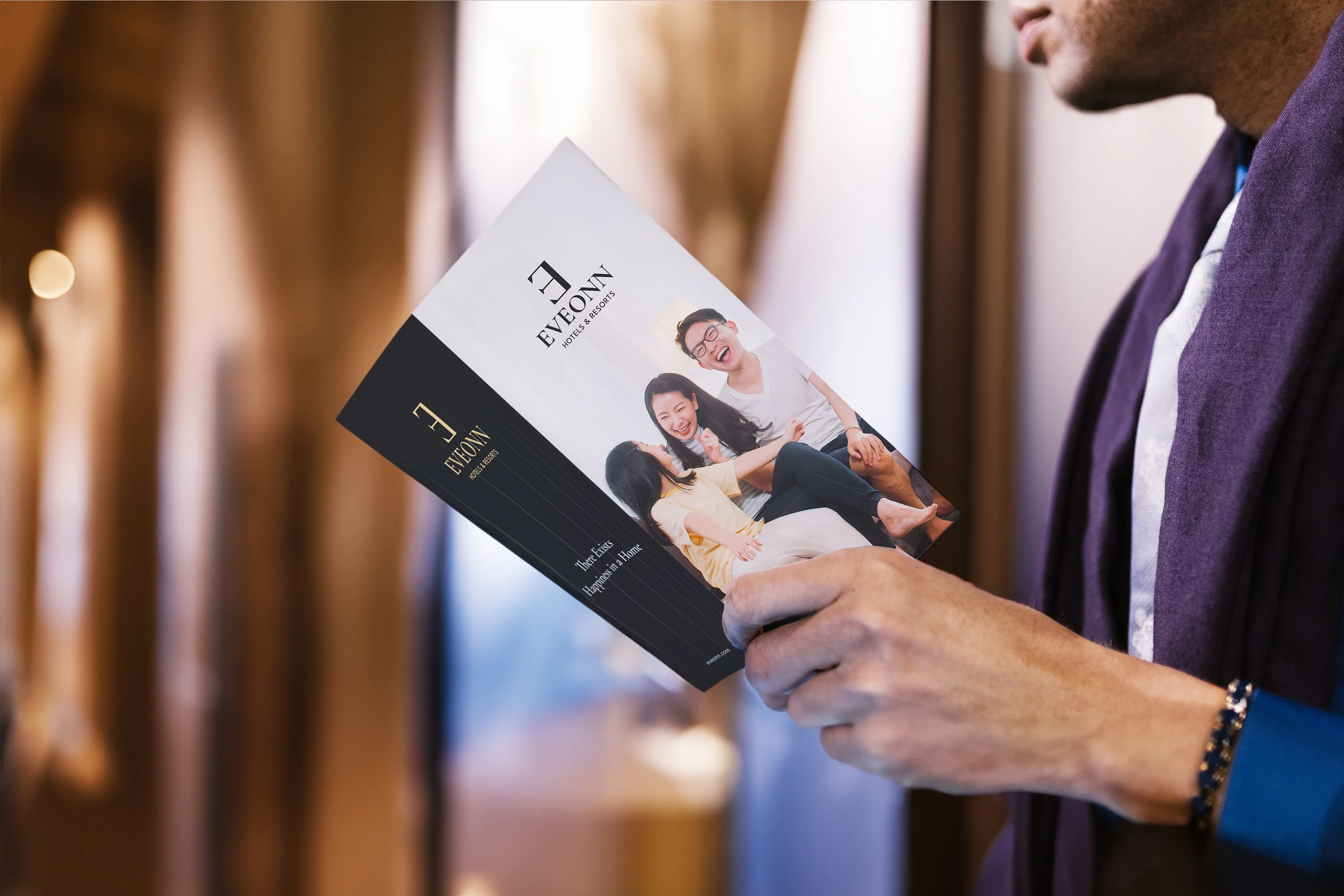
Brochure and print collateral.

Staff polo with embroidered mark.
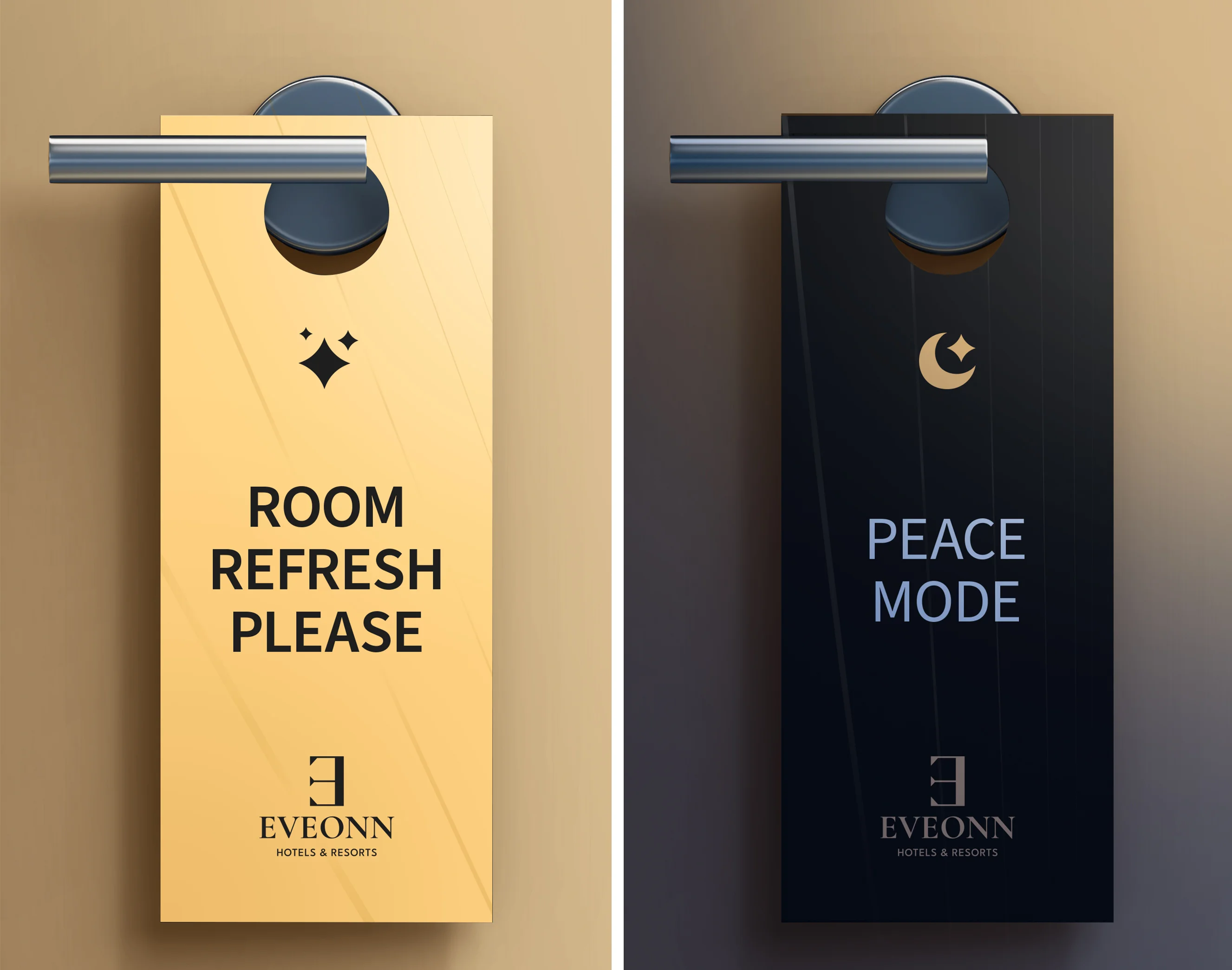
Door hanger designs.

Black business cards — Mherie Vic Palomo-Prevendido, Chairman.
Business card suite.

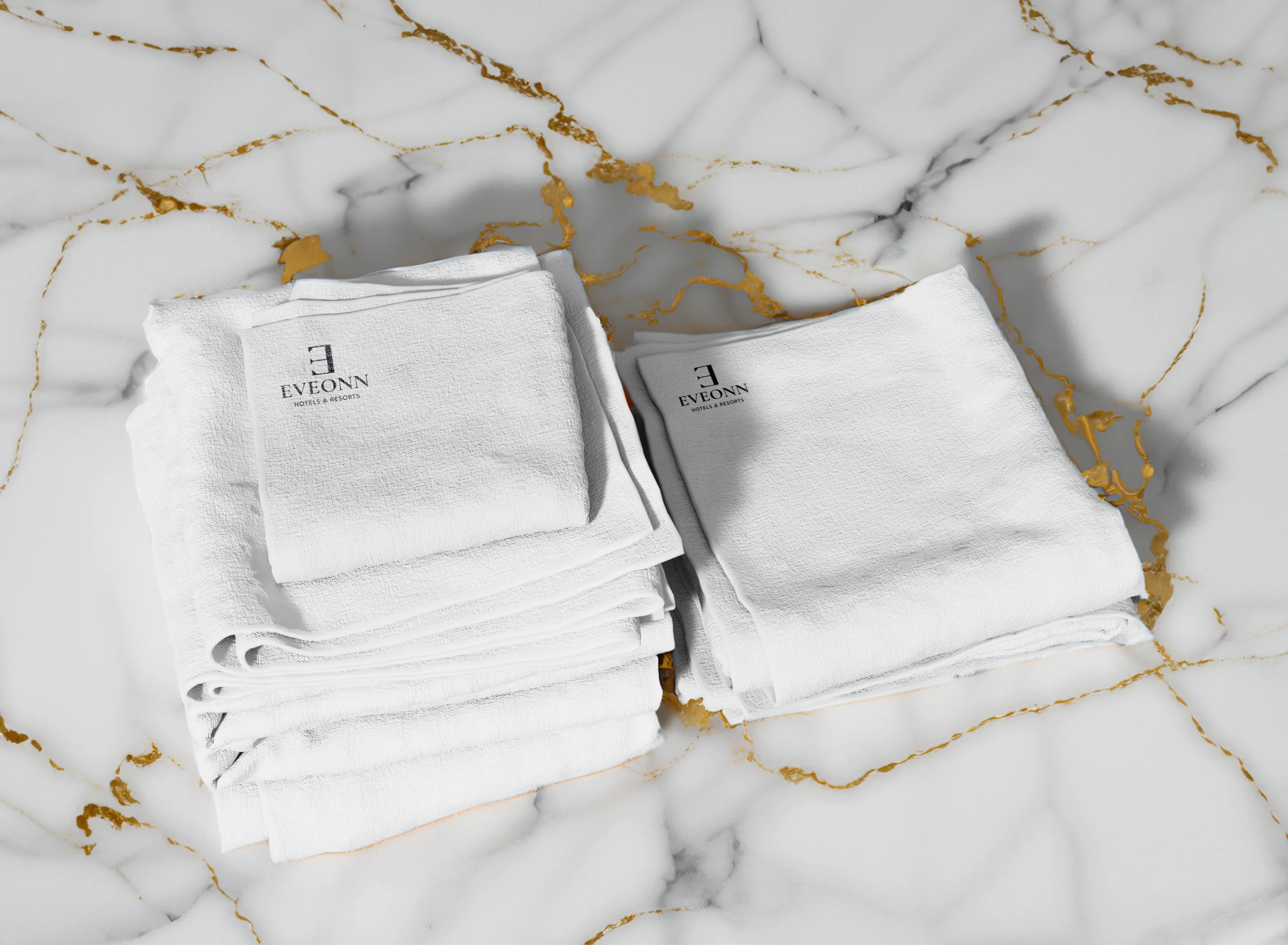
Stationery suite with welcome materials.

Hotel slippers with embossed mark.

Branded amenity tubes.

Reversed "E" door emblem — metal hardware on wood.
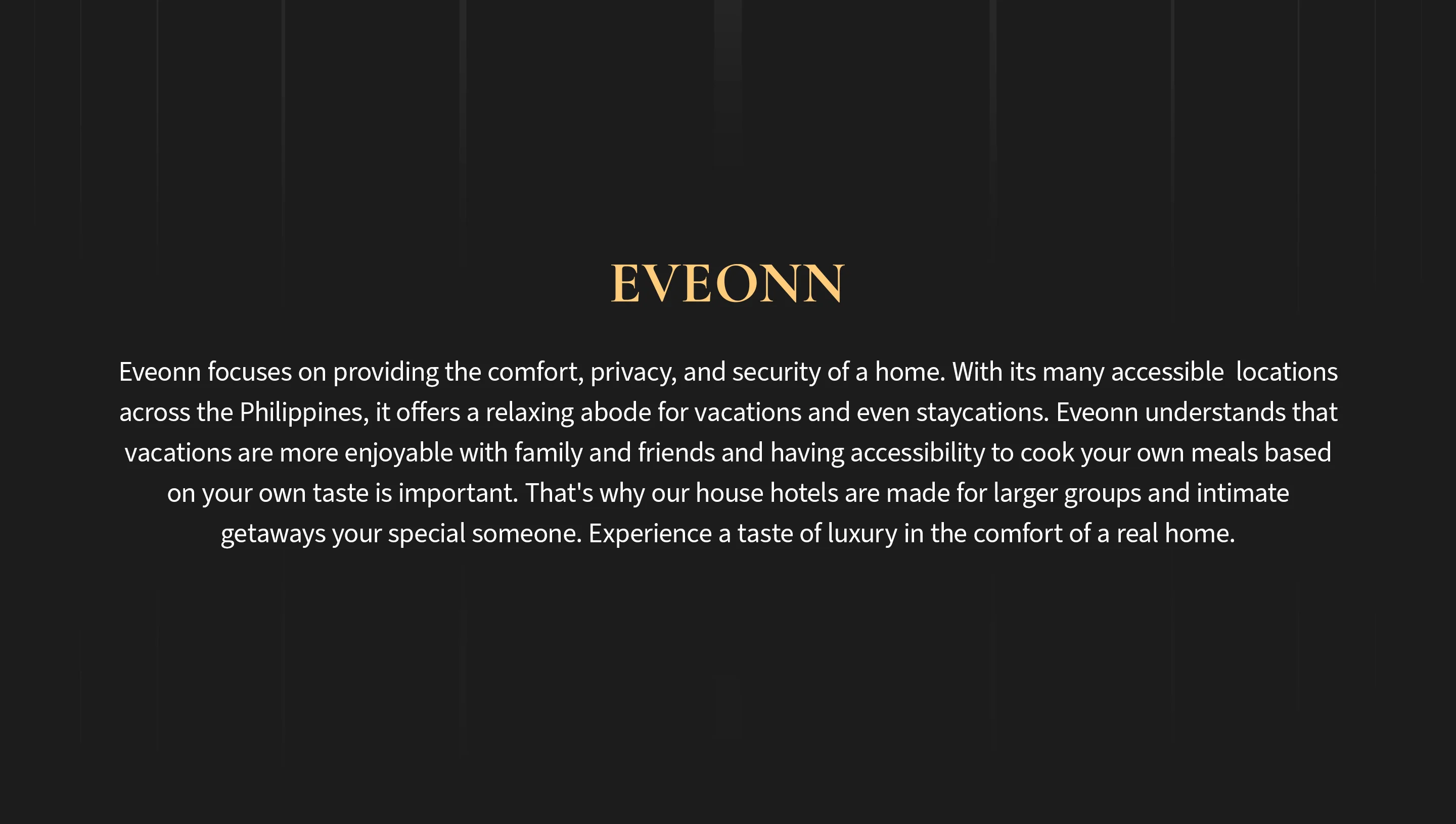
“Experience a taste of luxury in the comfort of a real home.”