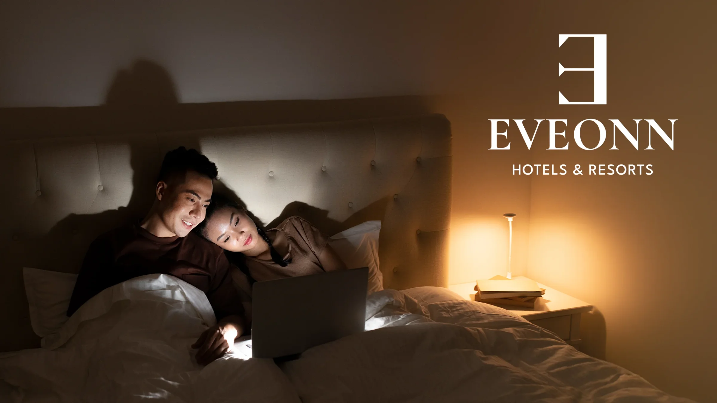
Eveonn Hotels & Resorts: There Exists Happiness in a Home
How TTGC built a hospitality brand from scratch for a growing Philippine hotel chain with 10–15 locations — from name etymology to hotel amenity branding.

The Challenge
EveonnHotels & Resorts is a Philippine hotel chain. It offers house-style rooms for families and couples. The locations are easy to reach. This was not a rebrand. It was a brand built from scratch. This kind of hospitality branding starts with a blank page. The chain needed one full brand. That brand had to grow across 10 to 15 locations. It also had to stay warm and feel like home. And it had to look the same everywhere.
The Name: A Linguistic Discovery
"Ev" means "Home" in Old Turkish. "Onn" means "Happiness" in Estonian. The reversed "E" mark means "There Exists." Put them together. You get "There Exists Happiness in a Home." This name comes from three languages. It became the base of the whole brand. Every design choice traced back to this idea.
The Design Process
Logo Design
The team tried many directions. Some were hand-drawn sketches. Others were digital drafts. The options fell into three groups. They were called "Strong Elegance," "Modern Elegance," and "Classic Elegance." Each group had a range of styles. The final mark is a reversed "E." It is elegant and simple. People notice it right away.
Visual System
The brand system includes:
Color Palette: Sunrise Gold (#FFCC7B), Midnight (#1C1C1C), and White (#F6F6F6). The colors feel warm, kind, and refined.
Typography: Cormorant Garamond for headings. This serif font gives an editorial voice. Source Sans handles the body text. It is clean and easy to read.
Photography Direction: Warm, soft light. Close family moments. The comfort of home.
Touchpoint Design
Every guest touchpoint was designed to support the brand promise:
Welcome materials: Greeting cards, anniversary cards, and a stationery set. All use warm gold tones.
Room amenities: Door hangers ("Room Refresh Please" / "Peace Mode"), branded slippers with an embossed "E" mark, toiletry tubes, and embroidered towels.
Staff apparel: Black polo shirts with an embroidered gold mark. Employee ID badges on branded lanyards.
Digital: A website with booking built in. It works well on every device.
Print collateral: Trifold brochures with lifestyle photos.
The Result
Eveonn launched with one clear brand. It looks the same at every location. A guest sees the reversed "E" on the building. Later they see the same mark on their slippers. Every detail sends the same message. There exists happiness in a home.
Experience a taste of luxury in the comfort of a real home.
Ready to work with Through The Glass Creatives?
Book a free Brand and Growth Assessment. See exactly how the TTGC team would approach it.
Related reading: Vibrantly Innovative: Branding the Full-Arch Closing Certification · Voidborn Legions: Forging an Esports Identity