My Heart Beats in Iloilo: Redesigning the Heart of a City
Invited into the Iloilo city branding project covered by the Philippine News Agency: a logo redesign that captures the spirit of festivals, tranquility, and the heartbeat of a hometown.

The Story
2023was a full year for TTGC. The studio was recognized in several international awards programs. Its founders flew out to accept the honors. Big projects were running back at home. Between those flights they kept missing Iloilo, the city they grew up in. Then a chance came to rethink the city's mark. The work turned personal fast. Iloilo City's rebrand was covered in a by Perla Lena. What follows is the concept TTGC drew, and the thinking behind each choice.
The TTGC founders were grateful to the Mayor for the chance to create something for their hometown.
The Design
Keeping the Heart
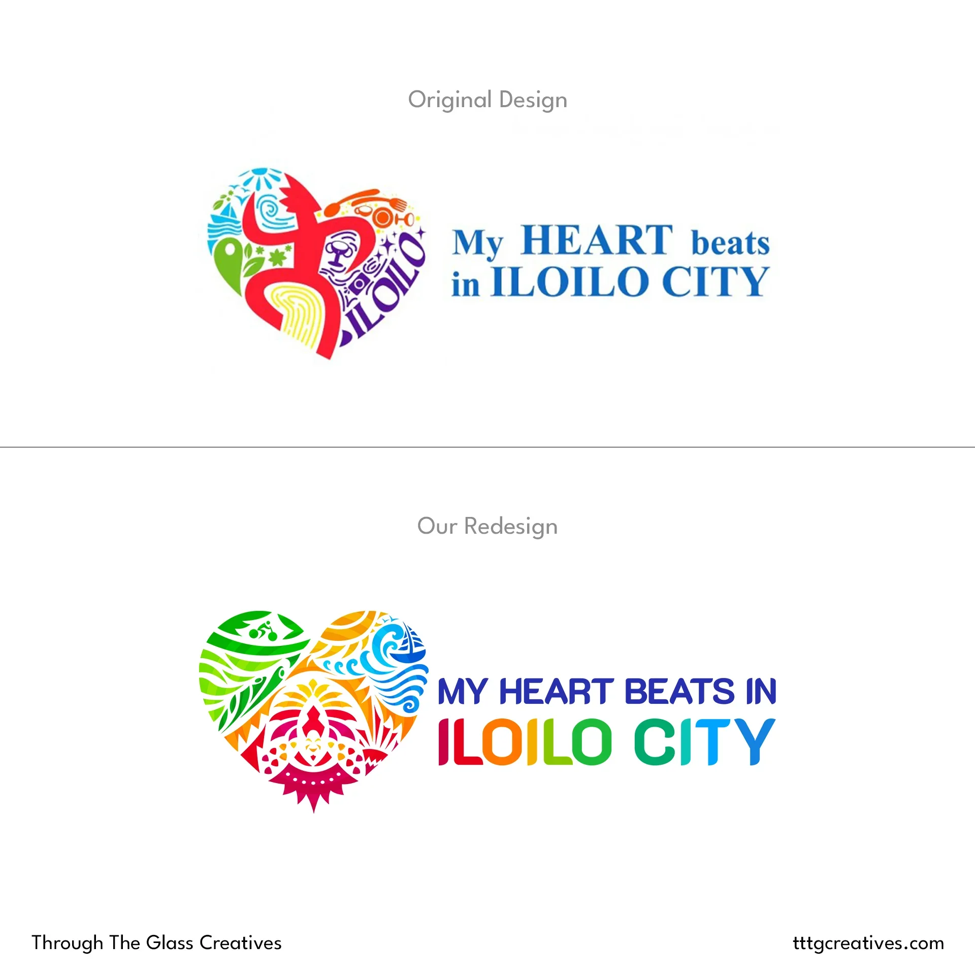
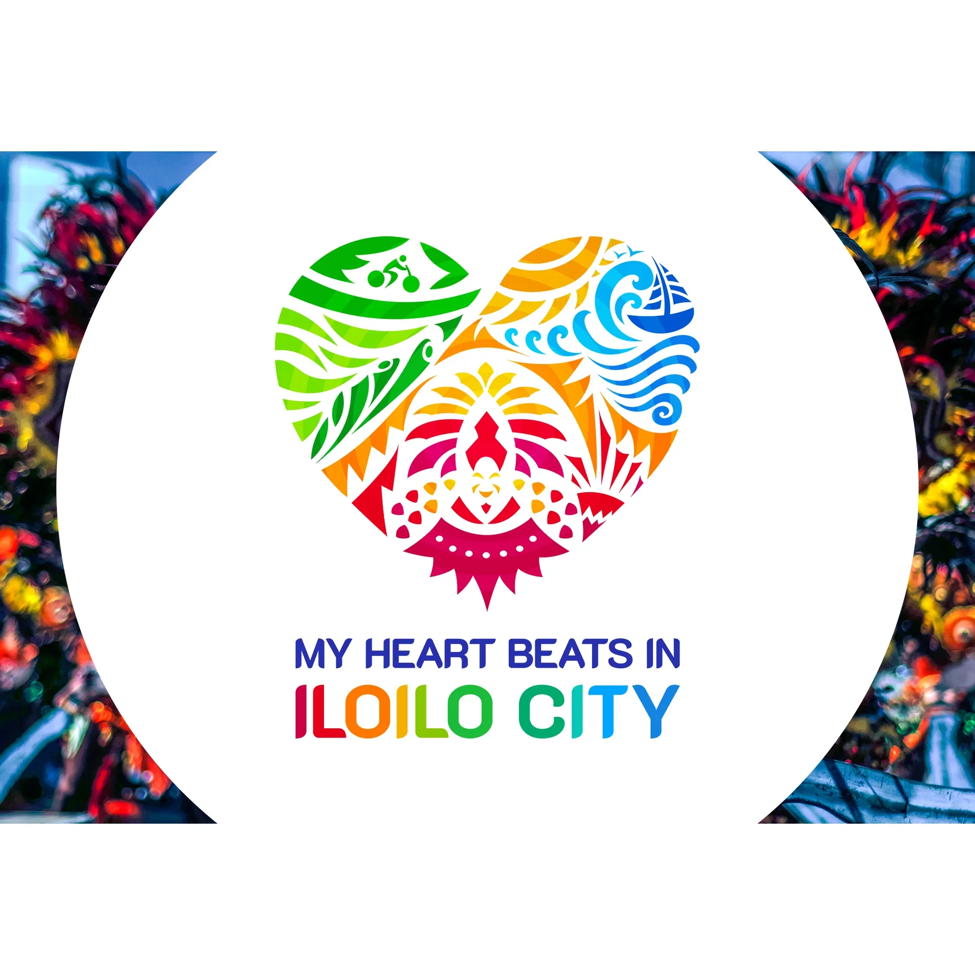
The first move was not drawing. It was studying the logo the city already had. The heart was the piece worth keeping, because a heart reads as unity before anyone explains it. Dropping it would have traded years of public memory for the thrill of something unfamiliar. So the heart stayed, and all of the work happened inside it. A heart can also hold many different parts and colors in one shape without a fight. That is the same balancing act the city itself performs. Iloilo runs loud at festival time and stays calm through the rest of the year.
The Elements
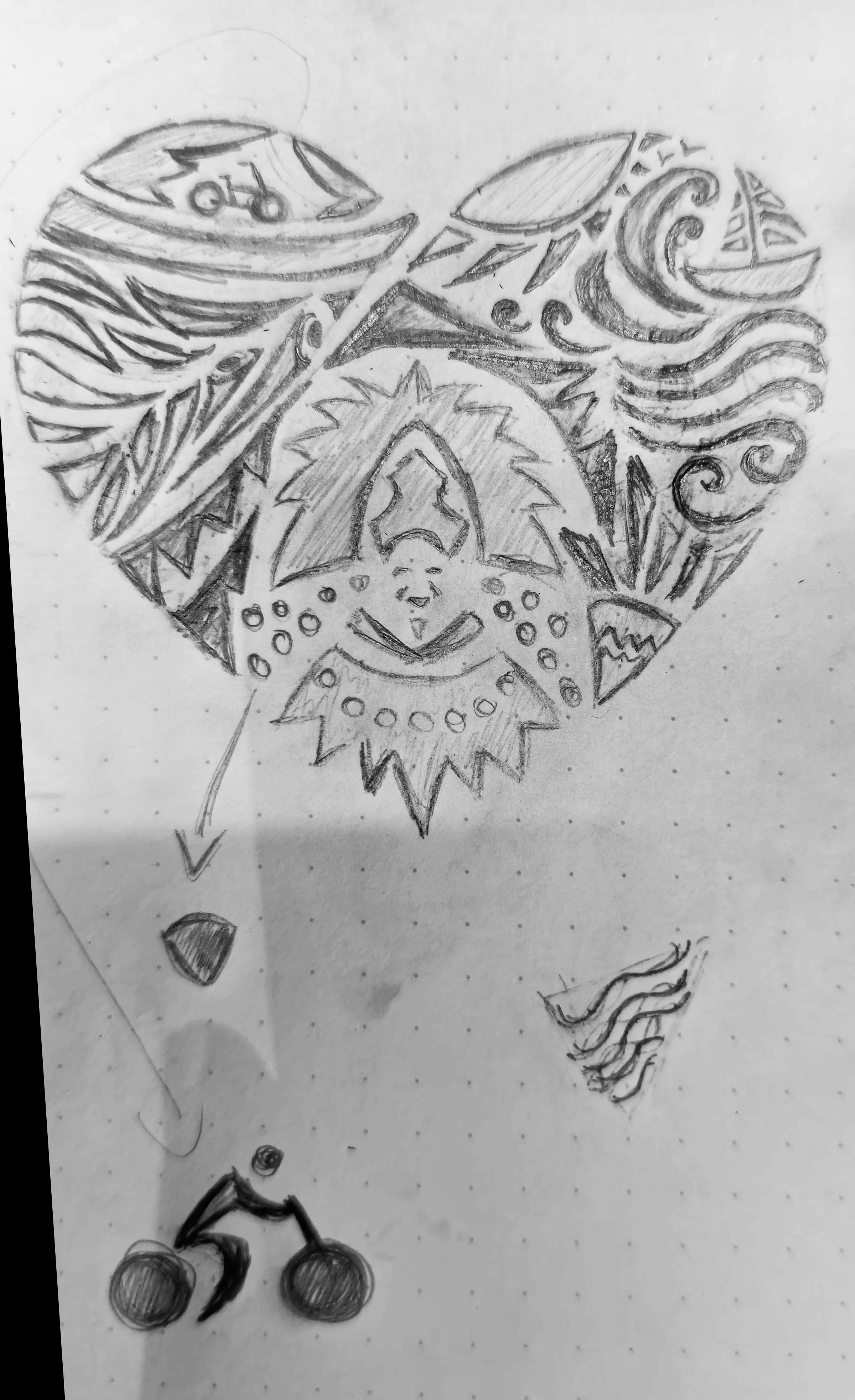
A bike sits in the greenery. It carries the calm half of the story, the half that is easiest to leave out of a city logo. Iloilo is known as the "Most Bike-Friendly City" in the Philippines. Its parks and its everyday cycling culture shape how the place actually feels to live in. A mark built on festivals alone would only flatter one loud week of the year. The bike keeps the ordinary weeks inside the frame.
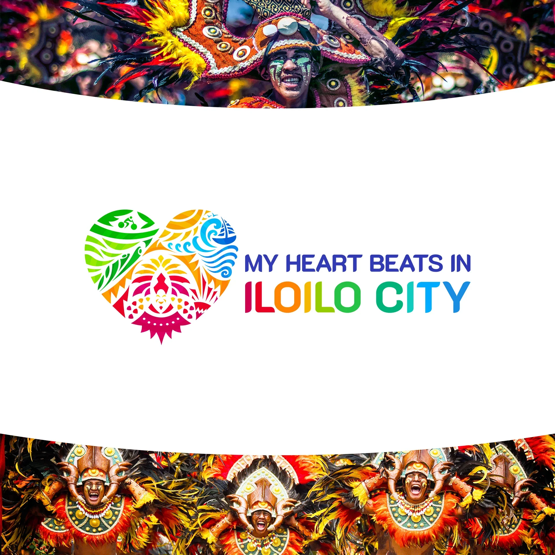
The Dinagyang Festival is one of the biggest festivals in Iloilo City. People travel from across the Philippines and from other countries to join it. Drums, paint, and crowds are hard to draw inside a small mark. So the festival appears as movement instead, carried in the flowing forms. The aim was the feeling of the street, not a portrait of a dancer.
The Iloilo Paraw Regatta Festival brings the sea into the mark. The yearly sailboat race has a smooth, tilting motion that a single curve can hold. Those lines do the work that a literal sailboat could never manage at a small size. They carry the feel of an ocean breeze without spelling the idea out.
The City
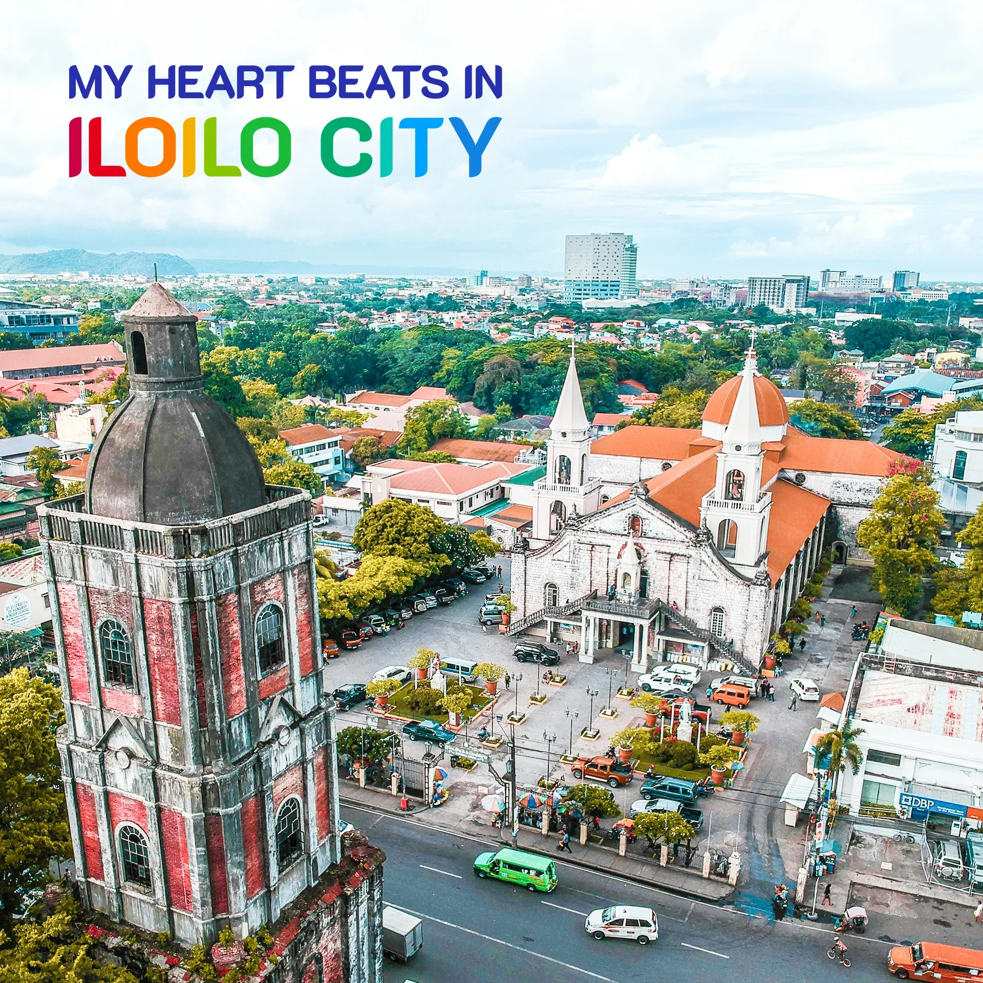
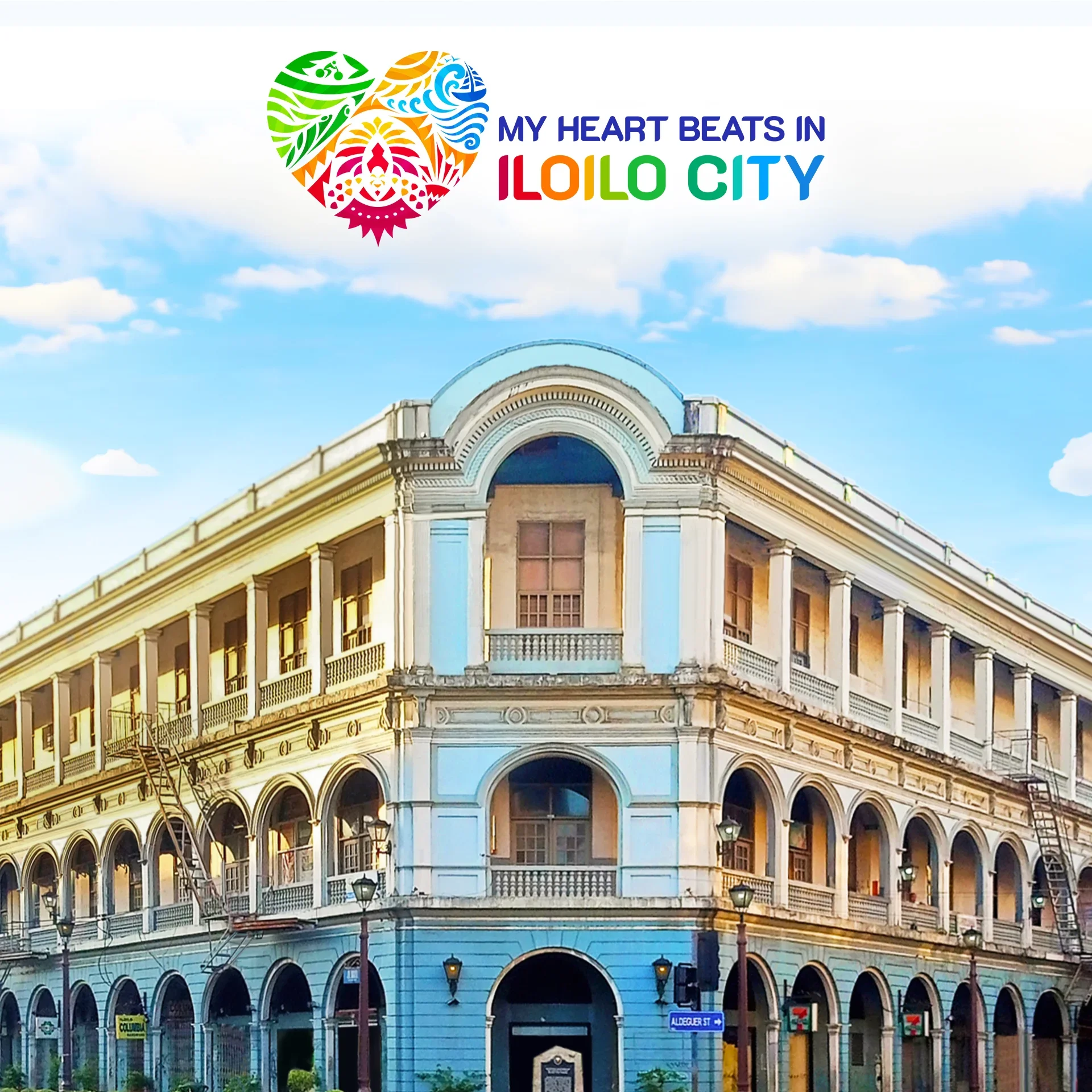
Iloilo is a city of contrasts. That is the design problem. Old heritage buildings stand beside new towers. A bowl of La Paz Batchoy warms the soul on an ordinary afternoon. Then every January the Dinagyang Festival floods the streets with color. A mark that picks one mood would be lying about the place. The concept tries to hold the contrast instead.
Logo Applications
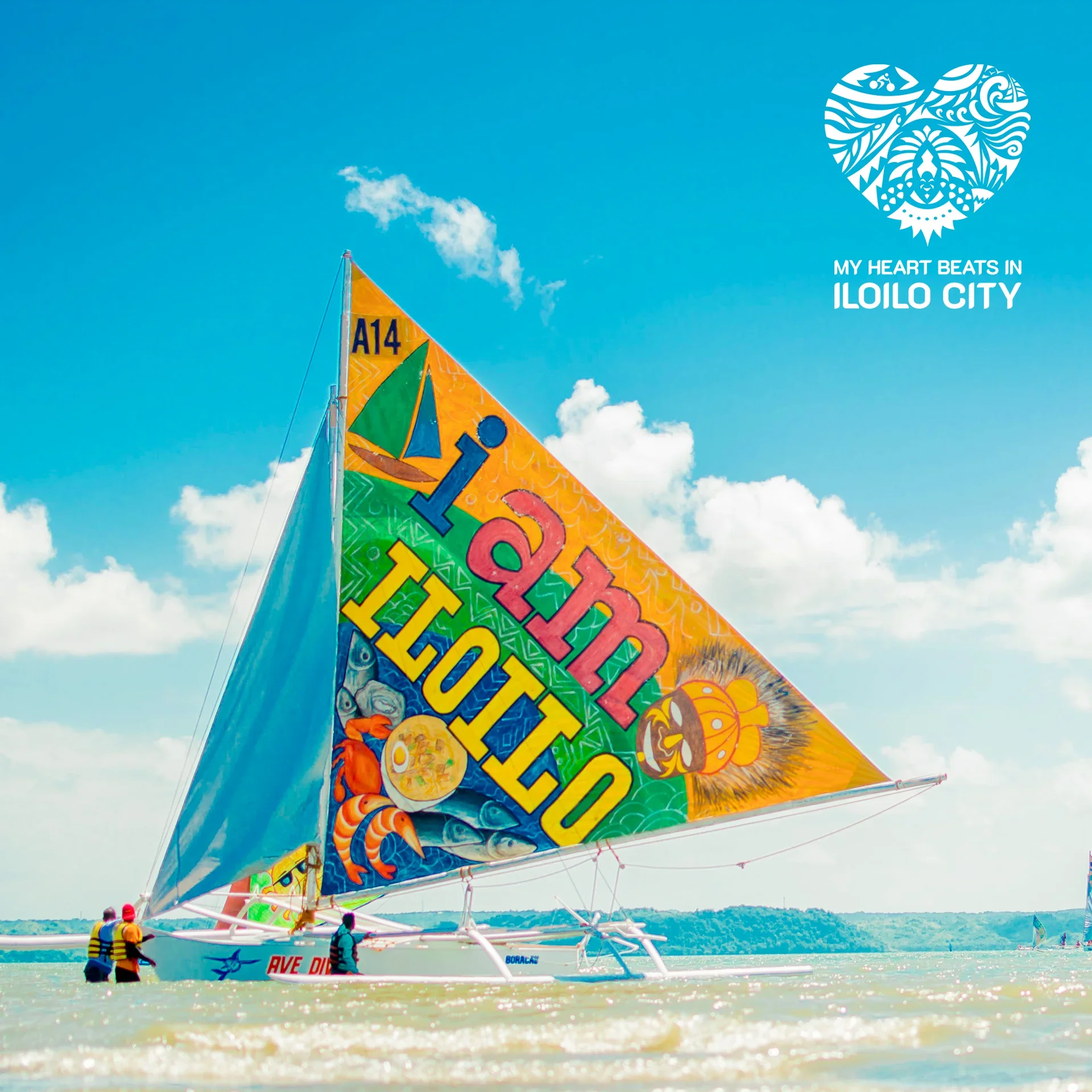
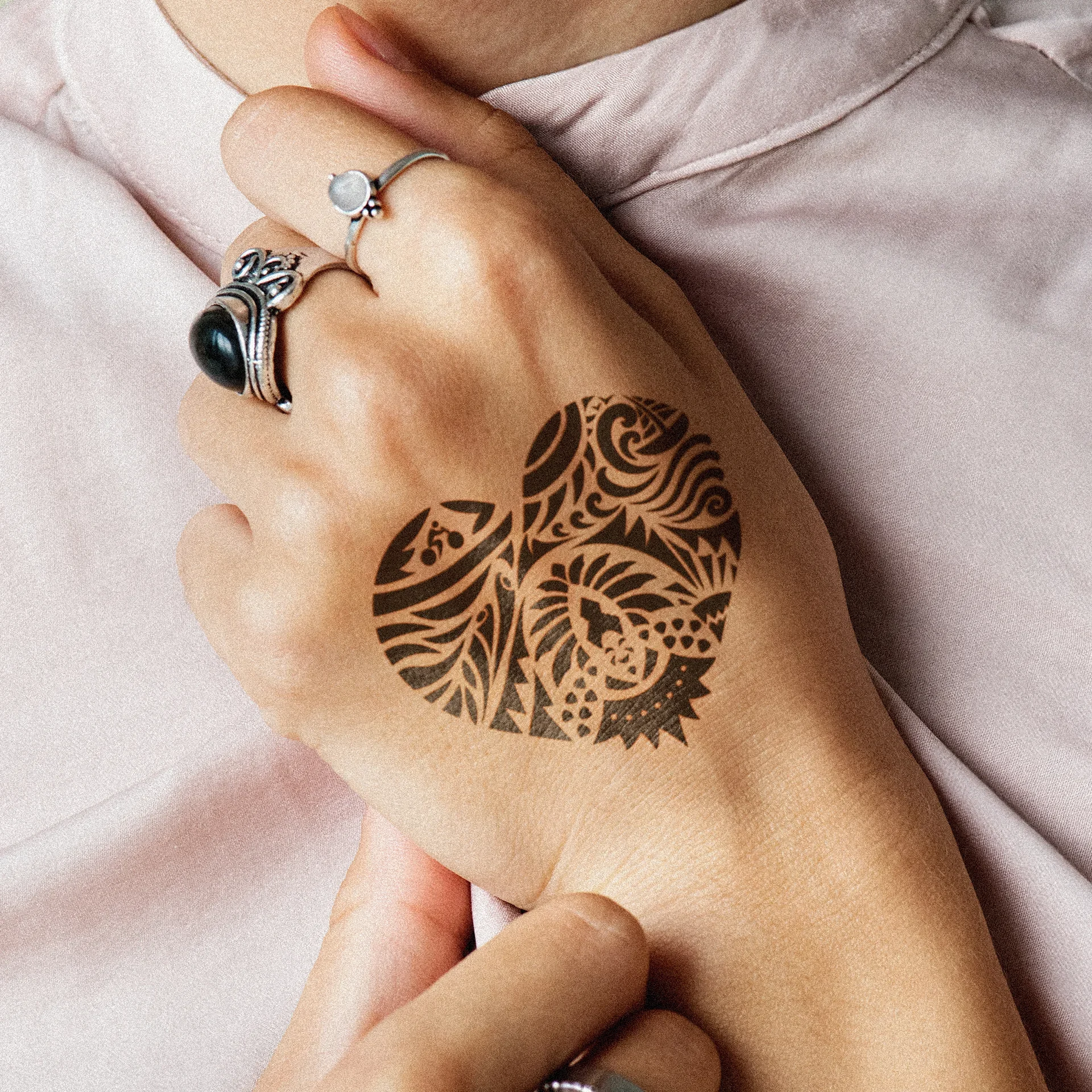
A city mark does not live on a screen. It gets printed huge behind a festival stage, and it gets bolted onto signage across town. Those two jobs pull in opposite directions, so the shape has to stay readable from far away and up close. The hardest test, though, was the smallest one. Some people put the mark of their hometown on their own skin. A tattoo strips away gradients and fine detail entirely. A form that survives ink will survive almost anything else, and in every one of these applications the mark stands for hometown pride.
The Reception
One honest note about status. What you see here is TTGC's concept work, and the studio does not claim the city's final mark as its own. The concept was well received by the people who saw it, and that is the extent of what we can report. The goal was never to win an argument about symbols. It was to make something Ilonggos and visitors would recognize immediately as theirs, in a city whose heartbeat is lively and calm at the same time.
It was an honor for the team to help shape how the beloved city looks to the world. As the logo finds its place, may it mirror the heartbeat of Iloilo. The city is both lively and calm. It captures the hearts of Ilonggos and the people who witness its beauty.
Ready to work with Through The Glass Creatives?
Book a free Brand and Growth Assessment. See exactly how Mherie, Ravve, and the TTGC team would approach it.
Related reading: The Power of Identity: How OWWA's New Logo Repositioned Government Branding · View the OWWA portfolio