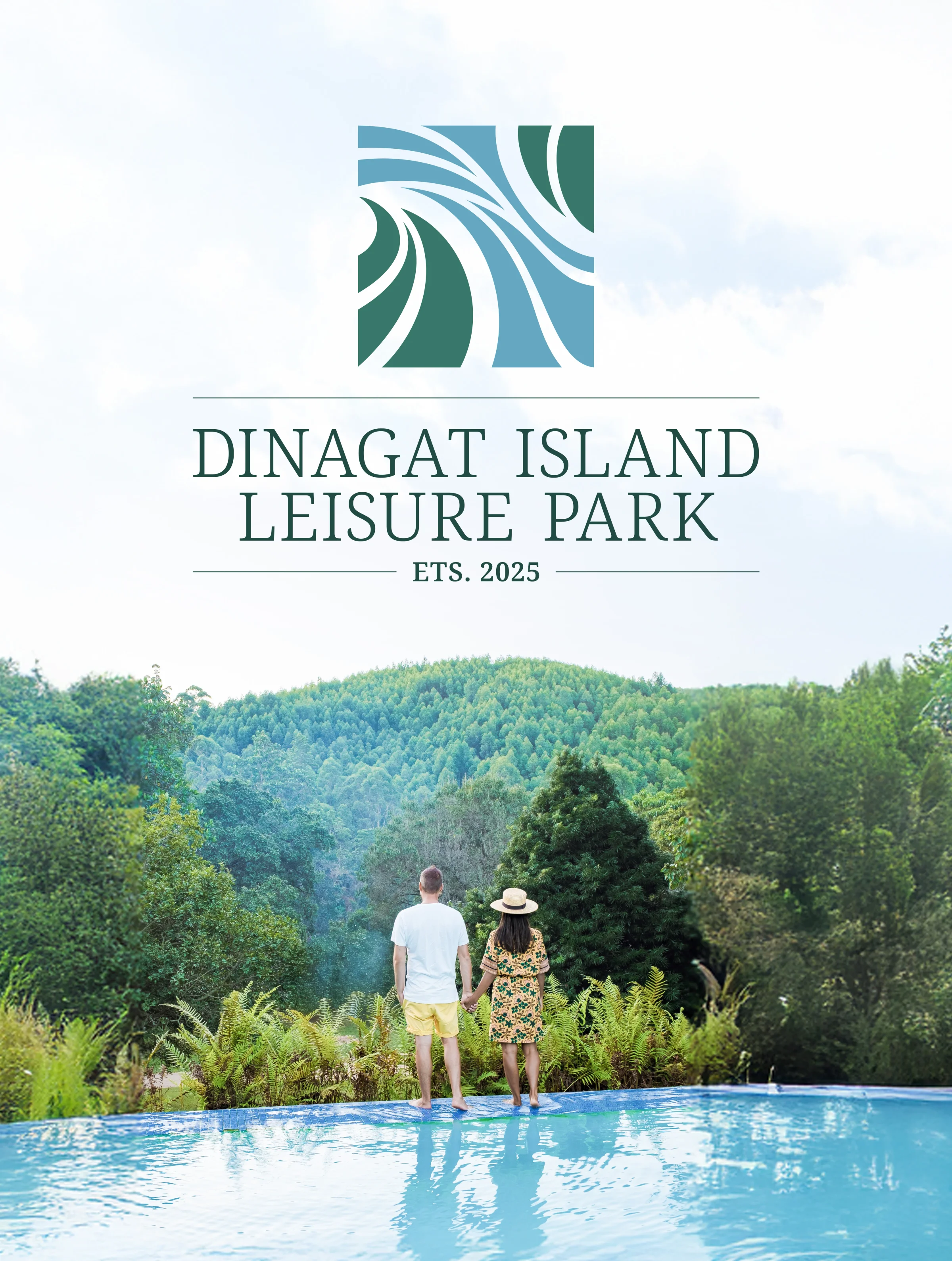
Dinagat Island Leisure Park: Capturing the Feeling of an Island
An abstract identity born from the breezes, pathways, and ocean flow of one of the Philippines’ most beautiful islands.

The Brief
DinagatIslands is a place of rare natural beauty in the Philippines. Tourism there was already growing. This island branding project began with the leisure park owner. He has a deep personal tie to the island. He grew up there. His family home stands there. His most treasured memories live there. He wanted a brand that captured the spirit of the place. The name alone was not enough.
The Design Philosophy
Feeling Over Literal
TTGC avoided a literal picture of an island or a park. Instead the team took an abstract path. The goal was to capture how it feels to be in the Dinagat Islands:
Looking out a window at the beautiful landscape
Walking along winding park pathways
Feeling the island breeze, breezy and relaxing
The flowing shapes call to mind islands in the ocean
The "pathway" can also read as the flow of the ocean
The logo system comes in several setups. There is a primary mark, an emblem style, a vertical layout, and a document version. Each one keeps the same flowing, organic character.
The Result
The Dinagat Island Leisure Park identity works for a simple reason. It does not try to explain the island. It lets you feel it. The abstract mark carries a relaxing, breezy mood. That mood defines the Dinagat experience. So the mark fits everything from entrance signage to promotional materials.
The logo is more about a feeling. It is the feeling you get when you visit Dinagat Island.
Ready to work with Through The Glass Creatives?
Book a free Brand and Growth Assessment. See exactly how Mherie, Ravve, and the TTGC team would approach it.
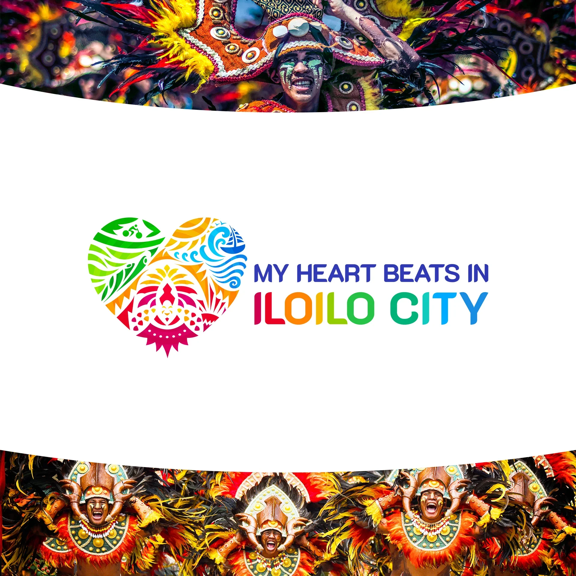
Related reading: Building Dreams One Storey at a Time: Victor Palomo Construction · My Heart Beats in Iloilo: Redesigning the Heart of a City