Building Dreams One Storey at a Time: Victor Palomo Construction
How a family-owned construction company in the Philippines became recognizable from afar, and, the family reports, won its largest project to date after the rebrand.

The Challenge
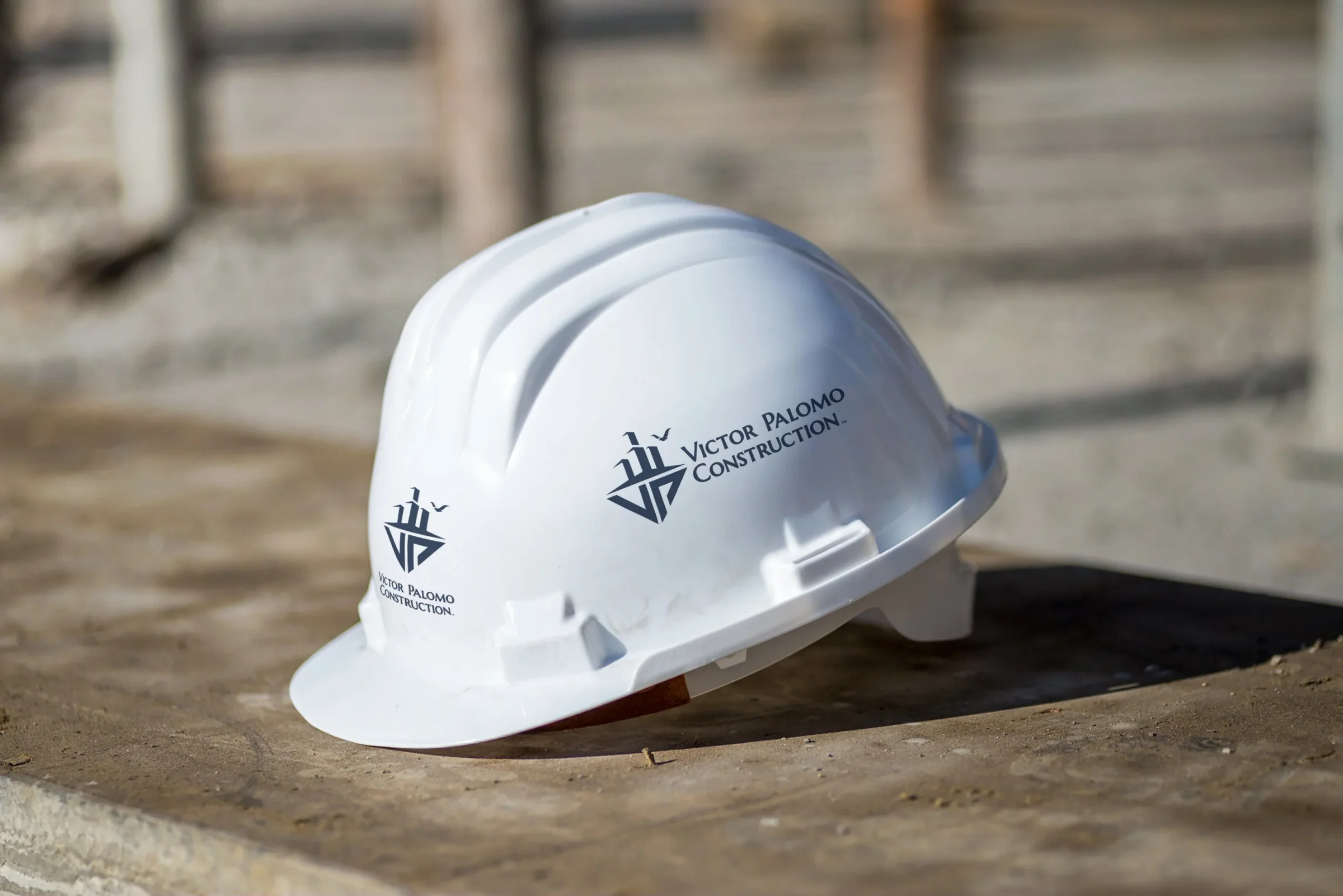
Thisconstruction branding case study follows Victor Palomo Construction. It is a family firm in the Philippines, built on pride and humility, and Victor Palomo started it himself. For years the company worked under an older logo. It was hard to see and hard to recall. On a job site, that costs you. A hard hat, a banner, and a sign get read from across a road, often by someone driving past. If the mark blurs at that range, a good firm looks smaller than it is. Visibility on site is what builds credibility and trust.
The family wanted two things at once. The brand had to honor what they stand for. It also had to look ready for bigger contracts. The old logo made both hard. It was difficult to reproduce across mediums, so every new surface became a fresh problem to solve. And it said nothing about the family behind the name.
The Approach
A Mark That Tells a Family Story
So the design started with the family rather than the industry. TTGC got to know the Palomos, and three symbols came out of those conversations. Each symbol had to do two different jobs. It had to mean something to the family at the kitchen table, and it had to hold its shape on a banner seen from the far side of a construction site. Together they carry the household, the memory it keeps, and the name above the door.
The Four Buildings: one for each member of the Palomo family. Dad, Mom, Big Sister, and Little Brother. It is a family portrait drawn in the firm's own material. Simple forms were the point, because a shape that has to live through dust, distance, and the curve of a hard hat cannot carry fine detail.
The Dove: it honors the founder's daughter, who passed away young, and keeps her memory present in everything the company builds. This is the quiet layer of the mark. Plenty of people will see it on a banner and never learn the story behind it. It does not need explaining to do its work.
The VP Initials: they ground the mark in the company name and the founder's identity. The symbols carry the meaning, and the letters carry the name. On a business card, a folder, or an ID badge, VP is the part a client repeats back.
The tagline "Building Dreams One Storey at a Time" captures two ideas at once. It describes the literal work, floor by floor, and it states the philosophy behind the company: thoughtful and steady, one project at a time. A storey is a level of a building, and it happens to sound like story. That is the whole brand in a single sentence. The family builds floors, and each floor belongs to somebody.
Complete Brand System
The logo was only the start. TTGC built the full identity system around it. The palette is navy and white, a blue the brand calls "Debonair", set in Montserrat type. Navy on white is a high-contrast pair. Contrast is what a banner needs when the light is harsh and the viewer is far away. Montserrat is a geometric sans with even, open letters. The name holds up small on a badge and large on a panel. The system then covers the paperwork. That means letterhead, envelopes, business cards, a compliments slip, and a folder. It covers the site with signage and employee ID badges. It scales up with the work, onto scaffolding banners and shipping containers. Each surface was treated as a real place where the brand has to work. You can see the finished pieces on the Victor Palomo Construction portfolio page.
The Result
After the rebrand, the family reported several changes. The list below is what they told us. We did not measure it.
According to the family, they went on to win their largest contract to date following the rebrand. We will not claim the branding won it, because a brand does not price a bid or pour concrete. What a good identity can do is help a smaller firm look ready for a project of that size.
Recognizable from afar: the new logo on hard hats, banners, and signage is easy to see across sites, a sharp gain over the old identity. This was the brief stated in plain terms. It is also the one result you can judge with your own eyes.
More inquiries and contacts: the family reported stronger Facebook engagement. They also saw more direct messages from potential clients. That fits the rest of the picture. A profile photo is a tiny square. A mark built to read across a site tends to hold up at that size too. Small is just another kind of far away, and the same shape does both jobs.
The new branding made Victor Palomo Construction easy to spot from a distance. That is a key edge in construction, where site visibility matters so much.
The brand now tells the Palomo family's story in every interaction. It shows up on the hard hat at the job site. It shows up on the business card at a client meeting. If you run a construction firm, that is the part worth copying. Start with the hardest surface you own. It is usually the one people read from farthest away. Design for that first, and the smaller pieces tend to fall into line. Our guide to branding for construction companies covers the rest of the system. The Anatomy of a Brand Identity System shows where a logo stops and the system begins.
Ready to work with Through The Glass Creatives?
Book a free Brand and Growth Assessment. See exactly how the Through The Glass Creatives team would approach it.
Related reading: Dinagat Island Leisure Park: Capturing the Feeling of an Island · Voidborn Legions: Forging an Esports Identity · Branding for Construction Companies: From Logo to Trucks · A Logo vs. a Brand Identity: Why the Difference Costs You · How a Rebrand Timeline Actually Works