Voidborn Legions: Forging an Esports Identity
Logo design and tournament jersey for a competitive Mobile Legends: Bang Bang team.

The Brief
VoidbornLegions is a competitive Mobile Legends: Bang Bang esports team. Strong esports branding was the goal. They needed a full visual identity. This meant a logo and tournament jerseys. The look had to command respect in competition. It also had to stay clean enough for merchandise and digital display. The identity had to work in three places. It needed to fit social media team cards. It needed to fit tournament overlays. It also needed to fit printed jerseys worn under stage lighting.
The Design
From Sketch to Mark
The work started with hand-drawn sketches. These sketches explored aggressive, angular forms. The forms aimed to show competitive intensity. The final mark uses sharp, interlocking geometric shapes. These shapes call to mind both a shield and a blade. The shield stands for defense. The blade stands for attack. Both fit a MOBA team well. The purple and navy palette runs from the logo through the full jersey design.
Jersey Design
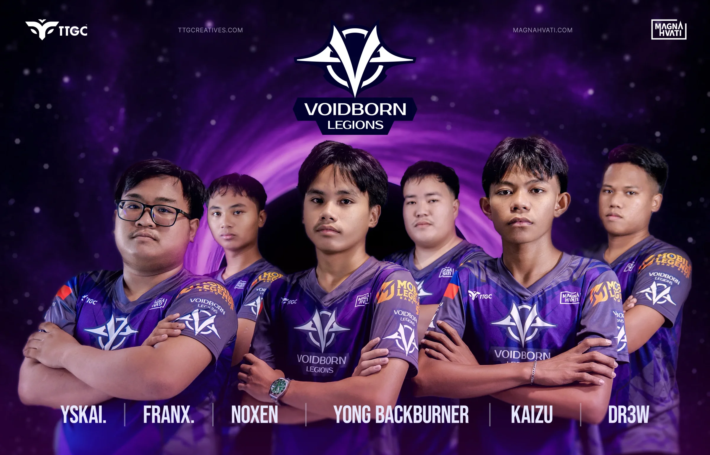
The tournament jersey puts the Voidborn Legions mark front and center on the chest. The full logo sits on the back. The background uses a cosmic purple gradient with geometric patterns. This adds visual depth. It does not overwhelm the team branding. Sponsor placements include TTGC, Magna Hvati, and Mobile Legends. Each one sits cleanly in the shoulder and collar areas.
The Result
The roster has six players. They are Yskai, Franx, Noxen, Yong Backburner, Kaizu, and Dr3w. They now compete in tournaments wearing an identity that matches their intensity. One team card shows all six players in their jerseys. It has become their main social media asset. The logo also scales cleanly. It works as a 16px favicon. It works just as well as a tournament broadcast overlay.
Ready to work with Through The Glass Creatives?
Book a free Brand and Growth Assessment. See exactly how the TTGC team would approach it.
Related reading: Vibrantly Innovative: Branding the Full-Arch Closing Certification · Building Dreams One Storey at a Time: Victor Palomo Construction