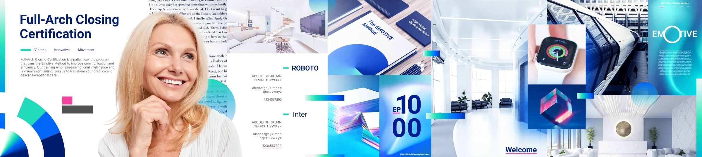
Vibrantly Innovative: Branding the Full-Arch Closing Certification
How TTGC built the brand identity for a high-ticket dental certification program from brand attributes to stylescapes to a complete visual system.

The Challenge
RobinDackman runs Dental Implant Machine. Robin wanted a premium certification program. This certification branding needed its own identity. The program would teach dental pros one skill. They would learn to present implant solutions. It used the EMOTIVE Method. The look had to stand apart from DIM. Yet it had to stay close in spirit. It had to feel like authority. It had to feel like innovation. It had to feel like skill. It also had to suit middle-aged dentists. These dentists do not like loud visuals. They do not like aggressive ones either.
The Brand Discovery
Brand Attributes
TTGC ran a deep brand discovery process. The work found 21 core attributes. They were: Empathy, Triumphant, Artistic, Innovative, Neat, Dynamic, Modern, Refined, Advancement, Breakthrough, Movement, Pioneering, Streamlined, Sleek, Organized, Clean, Vibrant, Technology, Cutting Edge, Connect, and Resonate.
These ideas came down to two words. They became the brand's north star: "Vibrantly Innovative." Most medical branding is cold and clinical. It uses plain black and white. This brand would not be that. It would not be too much either. It would mix vibrant innovation with restraint. The look would inspire. Yet it would still earn trust.
Stylescapes
The team showed three clear visual directions:
The Master's Guild - Premium, bold, and actionable. Jost and Alex Brush typography. Dark backgrounds with confident gold and navy accents. This was the chosen direction.
The Expert Hub - Clean, modern, and professional.
Contemporary Diversity - Colorful, inclusive, and energetic.
The Solution
Logo Design
The Closing Master's Academy logo took many rounds. TTGC tried several mark concepts. The team refined the type by steps. It refined the icon too. The final mark feels distinct. It carries the authority of a certification. It also holds the warmth of the EMOTIVE method. The logo works in digital and print. It works in physical spaces too.
Complete Deliverables
TTGC built the full brand ecosystem:
Logo design and animation (intro sequence for course videos)
Color palette based on the "vibrantly innovative" direction - blues, teals, and accent colors calibrated for the target audience
Typography system: Roboto and Inter for digital clarity
Course materials: Worksheets, scripts, patient discovery forms, funding plan templates
Presentation slides for the certification program
Environmental mockups: Subway billboard, office signage
The brand had to feel vibrant. It had to feel innovative. It could not look cold and clinical. That is how most medical branding looks. Instead, it had to match dental pros' energy. These people want to grow their practices.
The Result
FACC launched as its own premium brand. It sits inside the DIM ecosystem. The program now has visual authority. That look fits its high-ticket price. Dentists finish the course. They earn a certificate. The certificate carries real perceived value. A strong brand identity backs it. The whole thing feels like an institution. It does not feel like a side project.
Ready to work with Through The Glass Creatives?
Book a free Brand and Growth Assessment. See exactly how Mherie, Ravve, and the TTGC team would approach it.
Related reading: From 2 Clinics to a Billion-Dollar Empire: The Rise of Nuvia · Eveonn Hotels & Resorts: There Exists Happiness in a Home