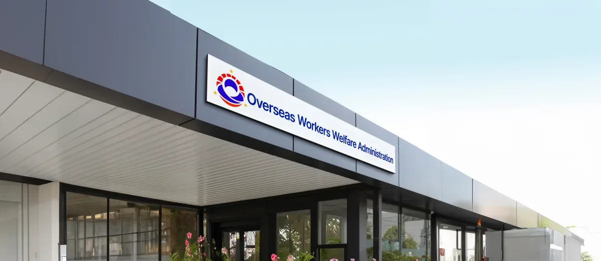
The Power of Identity: How OWWA's New Logo Repositioned Government Branding
The Overseas Workers Welfare Administration (OWWA) is the lifeline of millions of Overseas Filipino Workers (OFWs), providing unwavering care and support wherever they are in the world. Guided by the motto "Umulan ma't Umaraw ang OWWA ay maaasahan" (Rain or shine, OWWA is dependable), the organization sought a modern identity that would honor its cultural roots while reflecting its global mission.

The Challenge
Honoring Legacy, Embracing Modernity
Thisgovernment branding project started with respect. Ravve Jay Prevendido is the CEO and Co-Founder of Through The Glass Creatives. He admired the original OWWA logo. He also admired the person who made it. For years, that logo stood for OFWs. It meant protection and service. But the world had changed. A new wave of modern-day heroes had risen. These OFWs now work in a global, digital world. It is a competitive one too. The brand needed to grow with them.
Mherie Vic Palomo Prevendido is the Chairwoman and Founder of Through The Glass Creatives. She worked on the project with her husband. The work went beyond a fresh look. It also tackled an old problem. Many government logos lean hard on symbols of authority. That worked well in the past. But it can also feel cold and distant. The world keeps changing. OWWA needed a warmer, kinder brand. That brand had to feel human. It had to show the agency's true role. OWWA is a trusted partner for OFWs. It guards their welfare and safety. Smart design told a story rooted in service. With it, the team built a logo that invites trust. It invites empathy and national pride too.
The goal was not to erase the past. It was to build on it. The team kept the heart of OWWA's legacy. Then it added a fresh design for today's OFWs. The new look had to honor tradition. It had to honor cultural pride too. It also had to feel global. It needed to scale. And it needed to stir emotion.
“This logo softened the image of the government agency, making OWWA appear more caring, more human. It reshaped the rapport between OFWs, their families, and the institution itself.” - Mherie Vic Palomo Prevendido, TTGC Chairwoman
The Solution
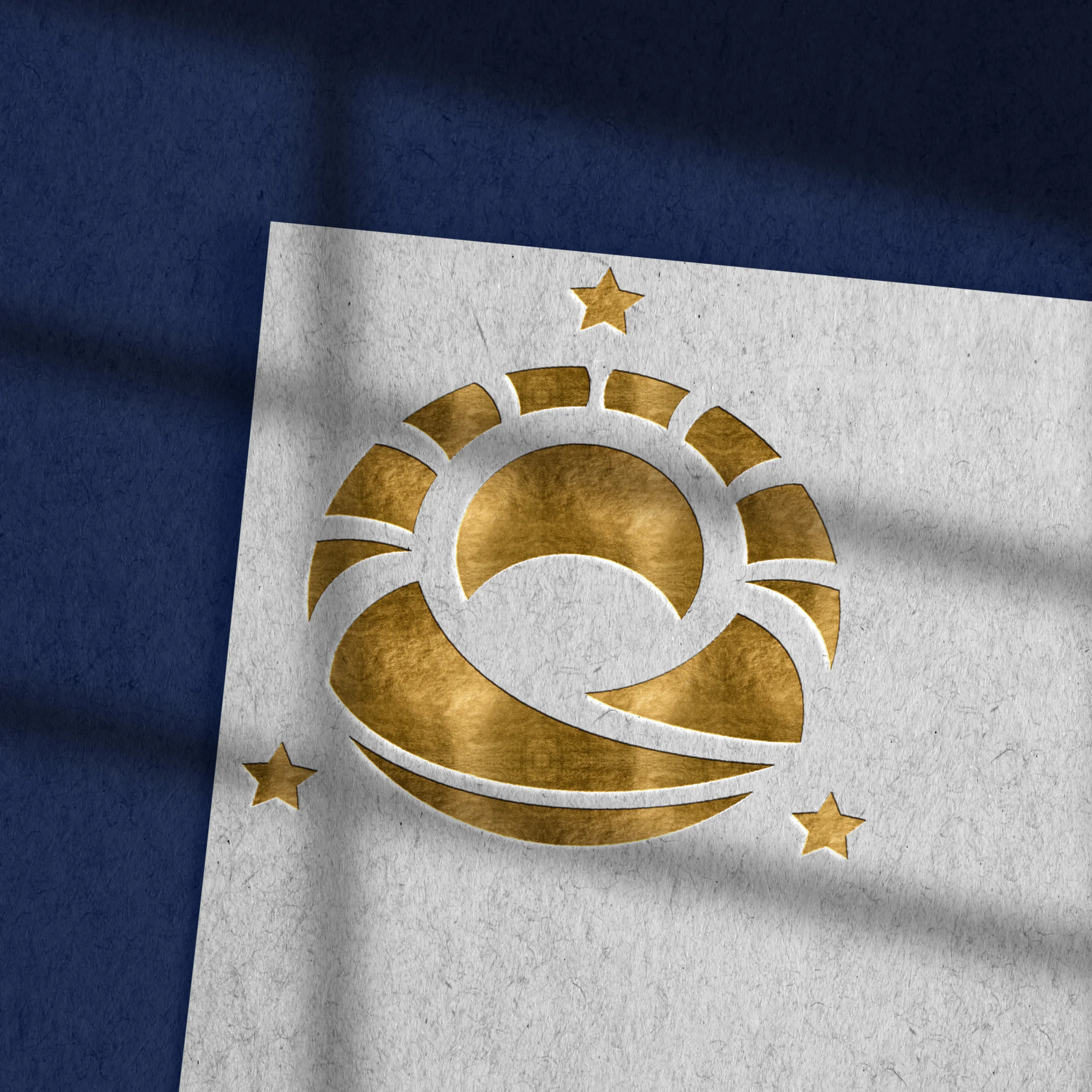
Logo Meaning & Symbolism
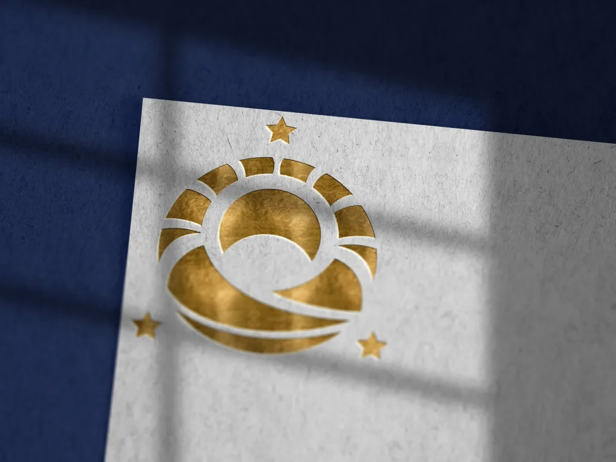
The new emblem is called "Pagyakap sa Inang Bayan." It means Embrace of the Motherland. It captures the love and grit of overseas Filipino workers. It honors their sacrifice too. Every part of it carries deep meaning.
Color System
Blue stands for trust. Red stands for sacrifice, passion, and courage. Gold stands for wisdom and knowledge.
Why Branding Matters for Government Agencies
More than Inspiration; It’s Representation. The rebrand did more than lift up OFWs. It shaped how the Philippine government shows up on the world stage.
Perception = Power. Image matters in diplomacy and talks. It matters in joint work too. How you look and sound shapes how others judge you.
Branding Builds Credibility. A strong brand signals skill. It signals readiness and trust. Global partners look for these traits. Foreign governments look for them too.
Reputation Impacts Leverage. A weak image is a real risk. Agencies can get ignored in big talks. In those talks, power and funding are at stake.
Modernization Reflects Capability. A fresh brand shows growth and skill. It proves the agency can meet global standards. That matters when you work with world bodies.
Visual Identity is Strategic Identity. For OWWA, the rebrand is a tool. It helps the agency lead in global labor and welfare work. This is not just a new look. It is a real investment in standing.
Branding Shapes Partnerships. How an agency looks, speaks, and acts sets the tone. It shapes the partners it draws. Weak branding limits chances. Strong branding opens them.
First Impressions Last; Especially Across Borders. Today, meetings happen on Zoom. Choices get made in seconds. How an agency looks matters. On screen or in print, it can shape the next big chance.
“Your brand is the single most important investment you can make in your business.” - Steve Forbes, editor-in-chief of Forbes
The Result
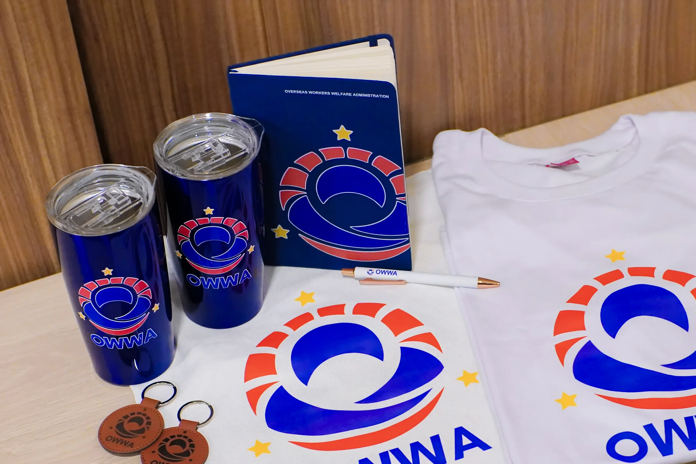
Environmental & Collateral Applications
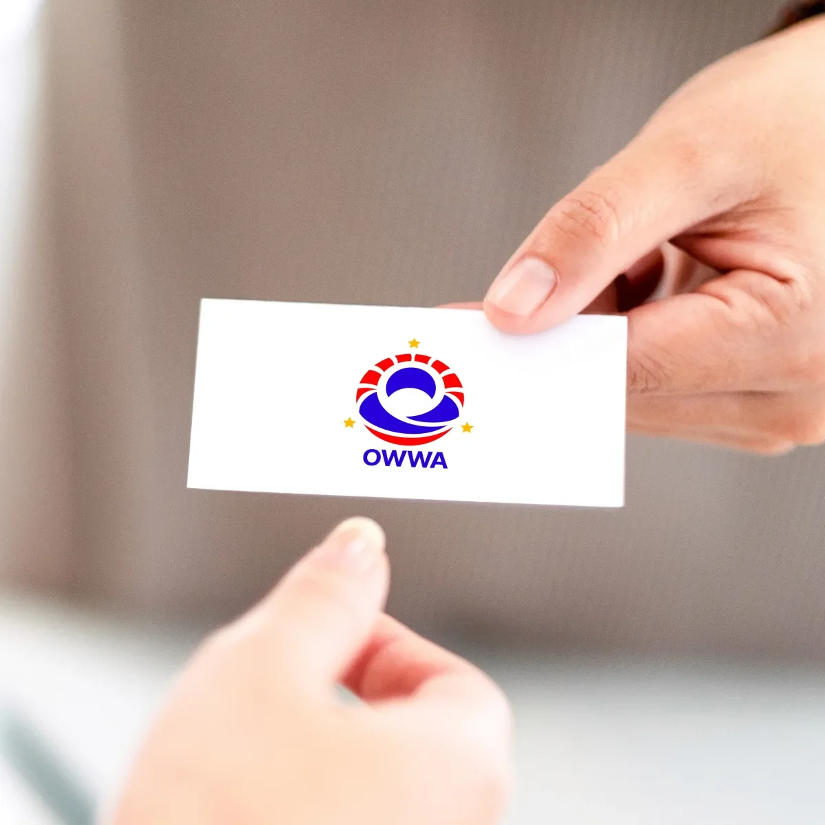
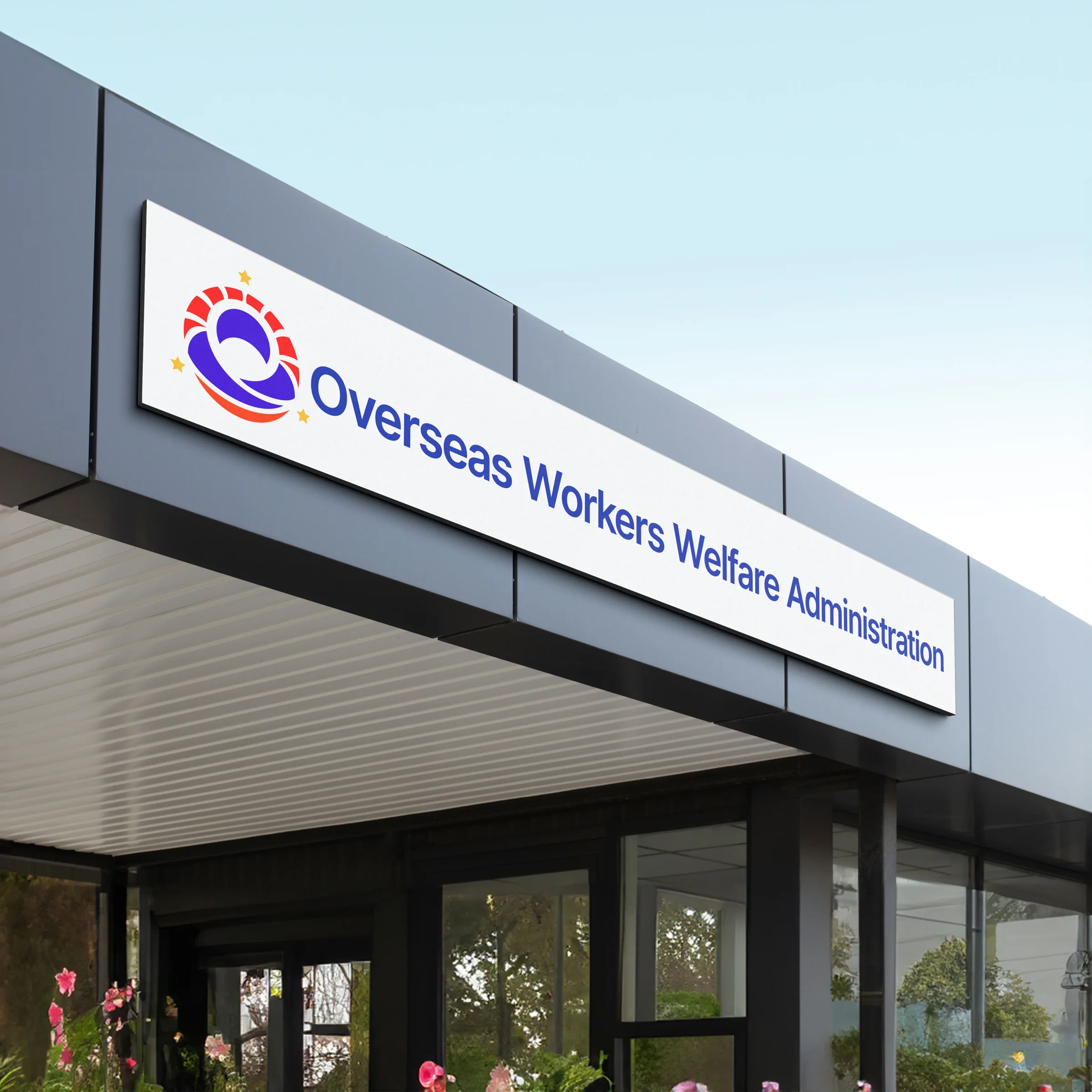
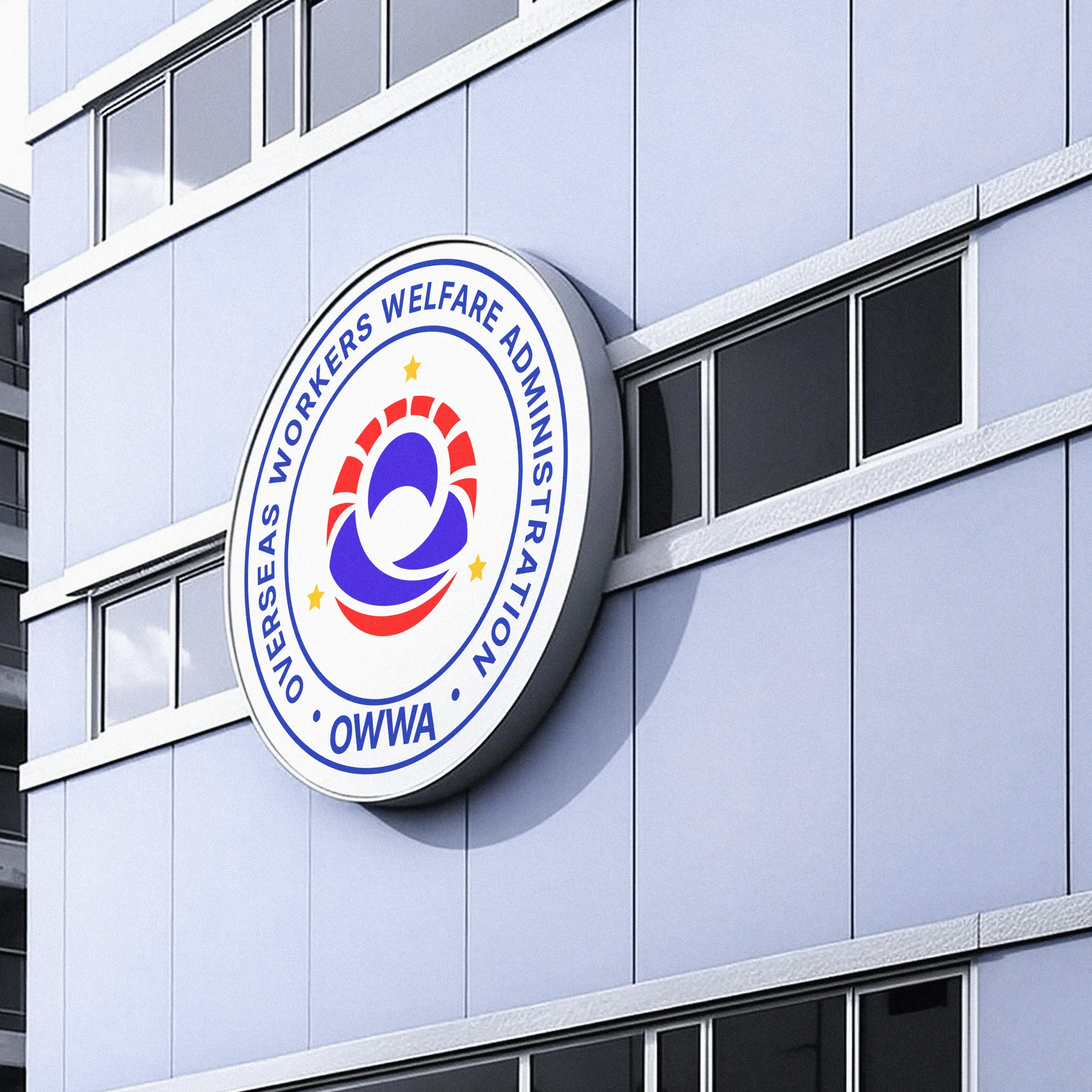
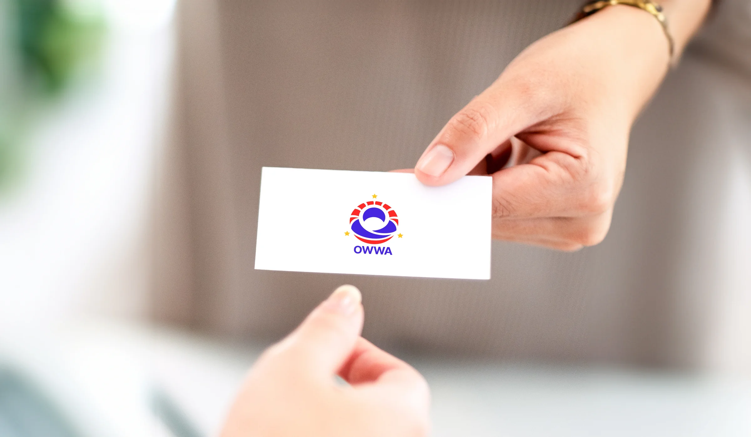
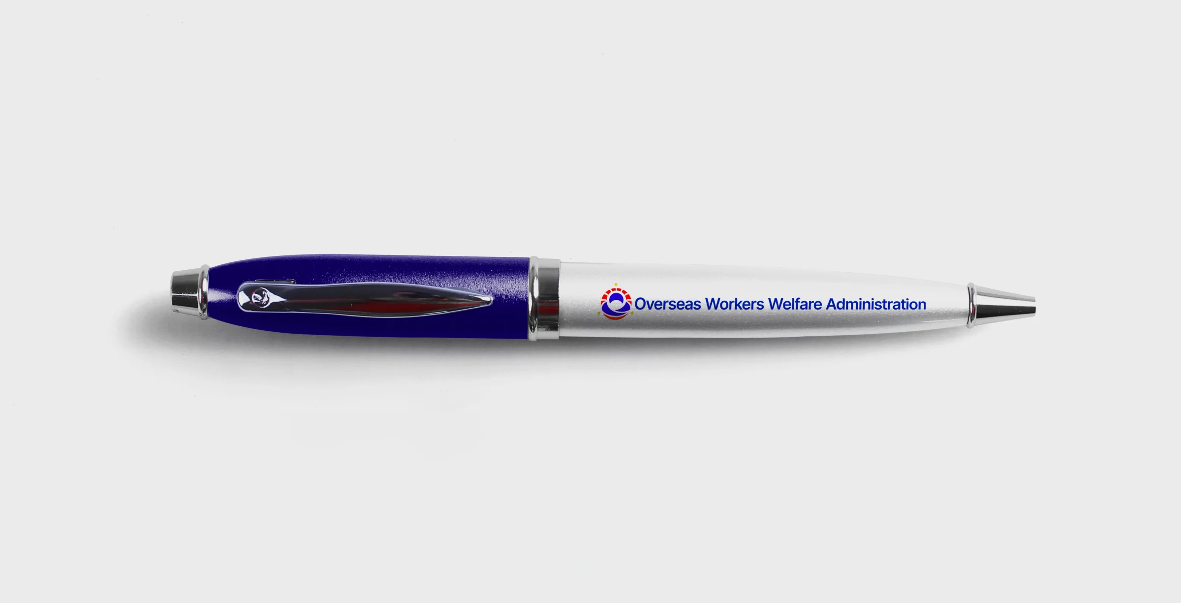
The new system works on every surface. It scales from building fronts and signs to business cards. It also covers branded goods and staff materials.
A Global Identity That Resonates
The rebrand gave OWWA a new identity. It matches the spirit of today's OFWs. They are strong and modern. They are known around the world.
Elevated Perception: A fresh yet timeless look that links heritage with today.
Emotional Connection: Stronger trust and belonging through symbolic storytelling.
Scalable System: One clear brand across platforms, from digital to print.
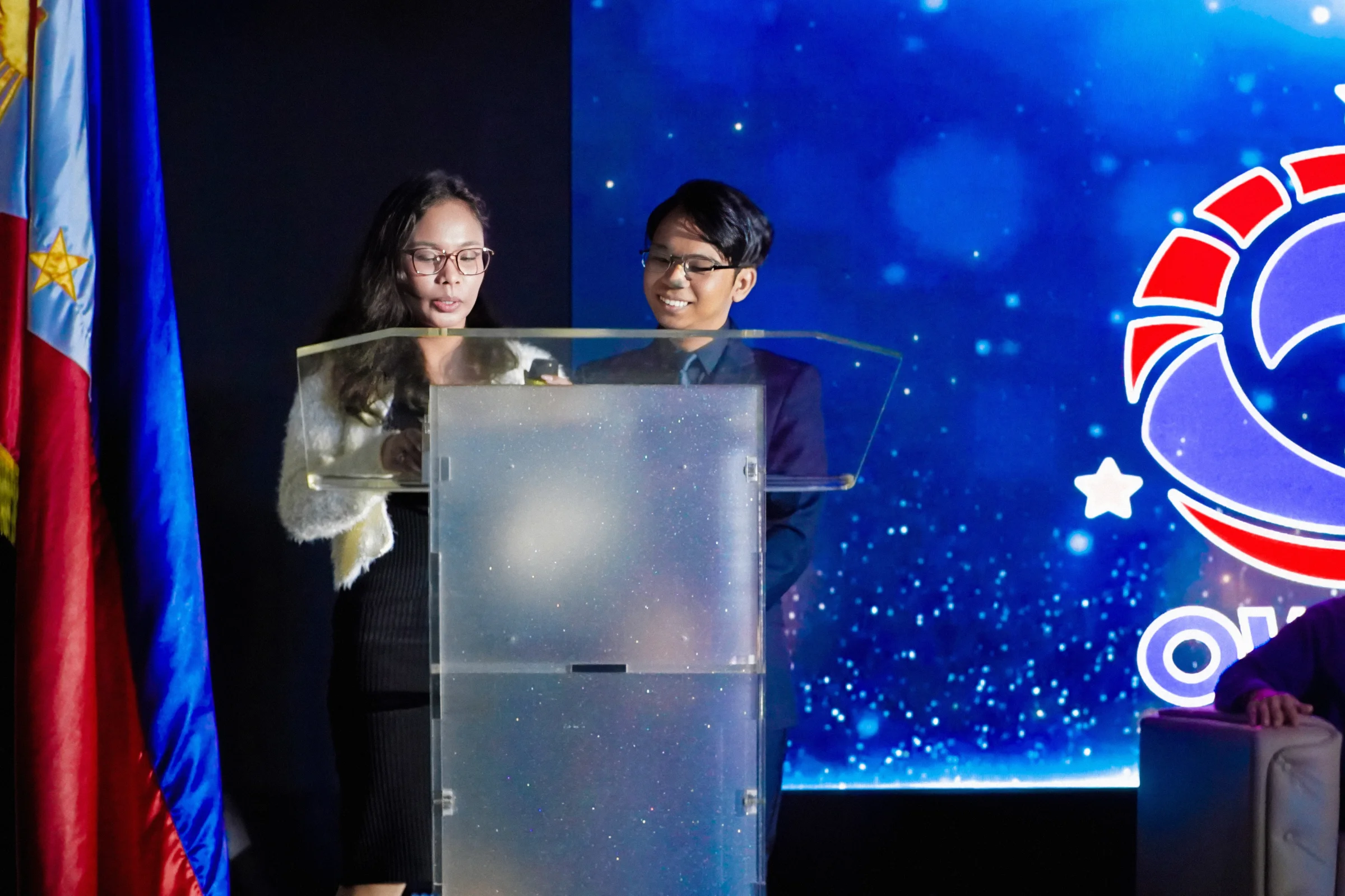
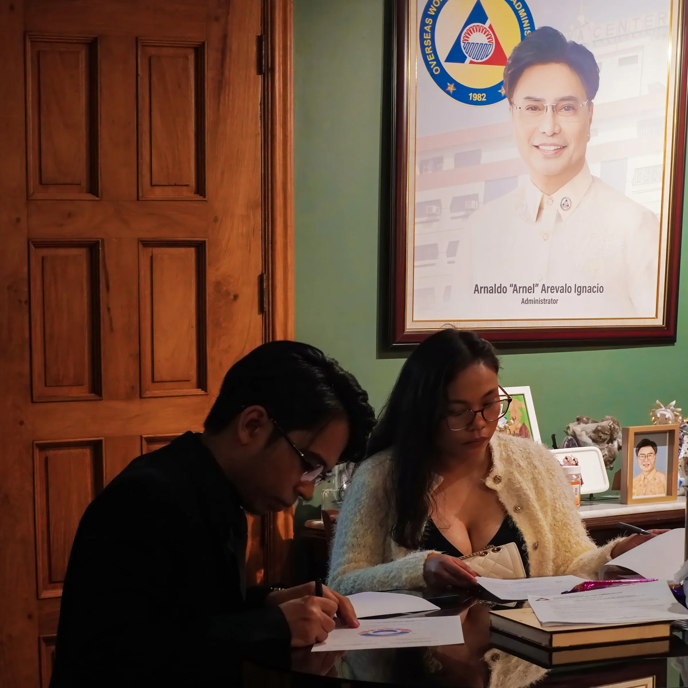
The Unveiling Ceremony
The new logo was revealed on February 5, 2025. The ceremony took place in Metro Manila. OWWA Administrator Arnell Ignacio led it. DMW Secretary Hans Leo Cacdac led it too. The room responded with warm applause and praise. That moment proved the design had met its goal.
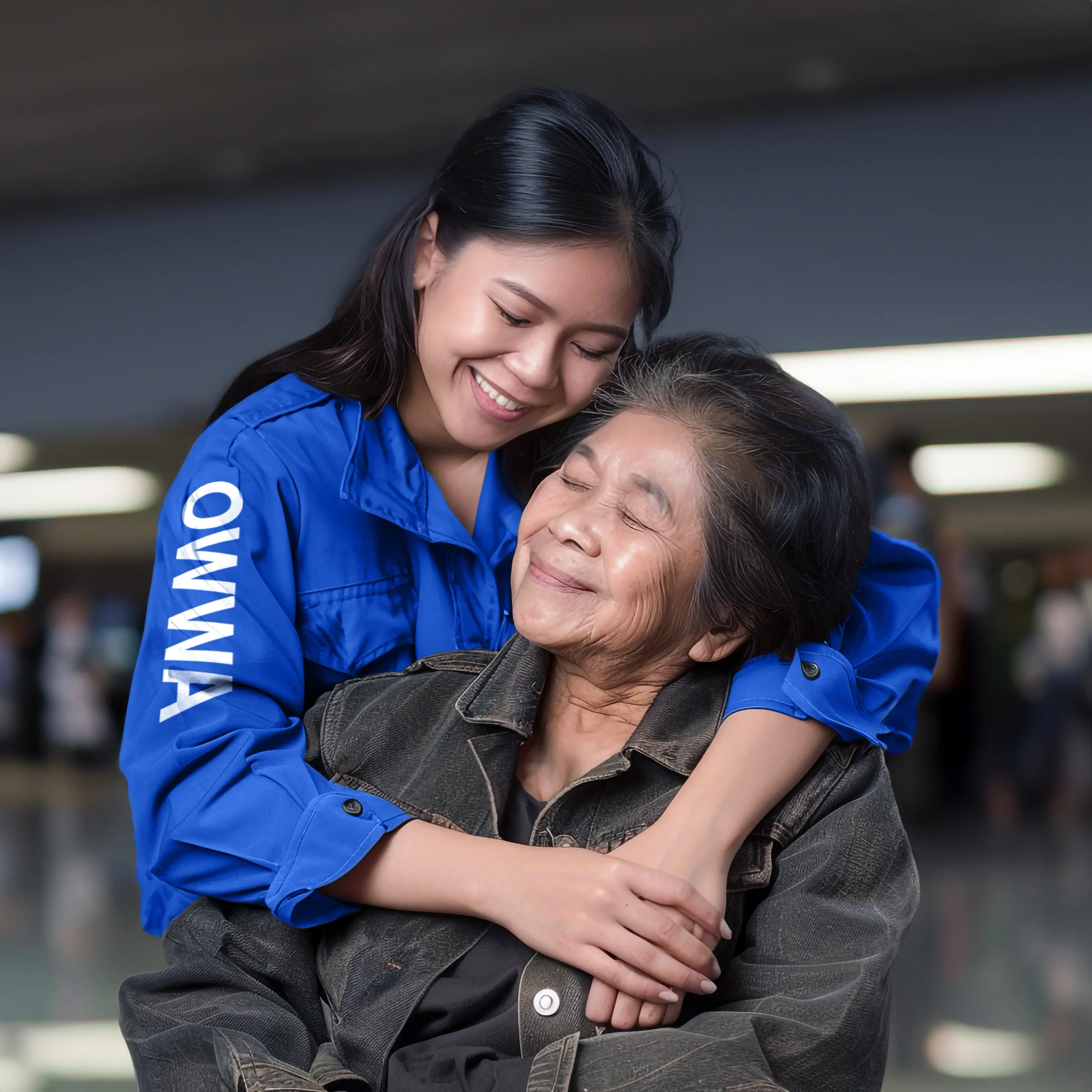
“It’s not just about how the logo looks but the reassurance it brings. For OFWs, spotting this logo even at an airport means safety, relief, and a reminder that they’re cared for.” - Ravve Jay Prevendido, TTGC CEO
OWWA Cares Sub-Brand
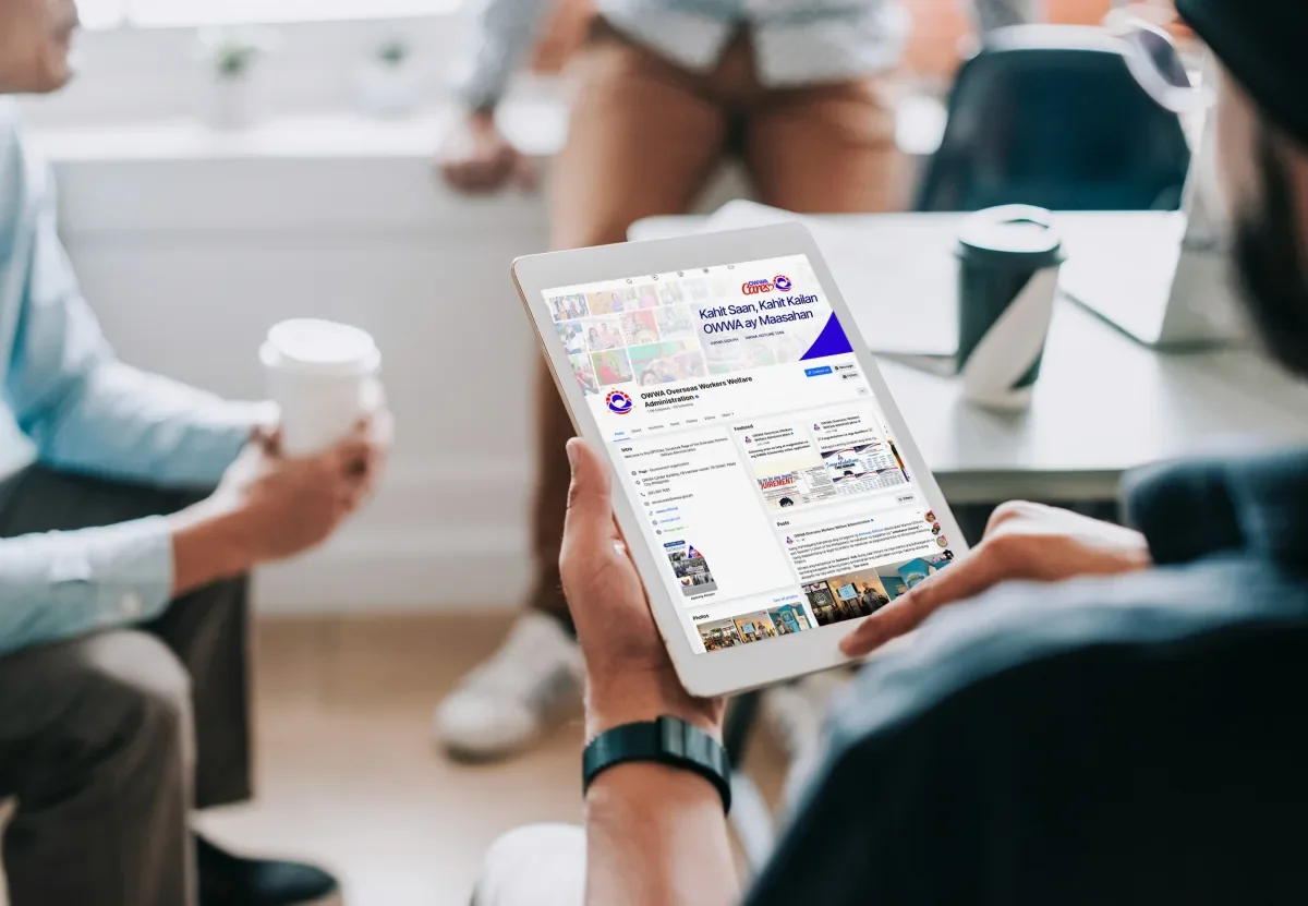
OWWA Cares is the community outreach arm of OWWA. The sub-brand builds on the main look. It uses softer tones. It uses a care-focused style. You see it on relief materials and volunteer uniforms. You also see it on event signs.
From Homeland to the World
The OWWA rebrand now stands for care, warmth, and unity. It is a modern emblem of support. It reaches Filipinos wherever they are.
Ready to work with Through The Glass Creatives?
Book a free Brand and Growth Assessment. See exactly how Mherie, Ravve, and the TTGC team would approach it.
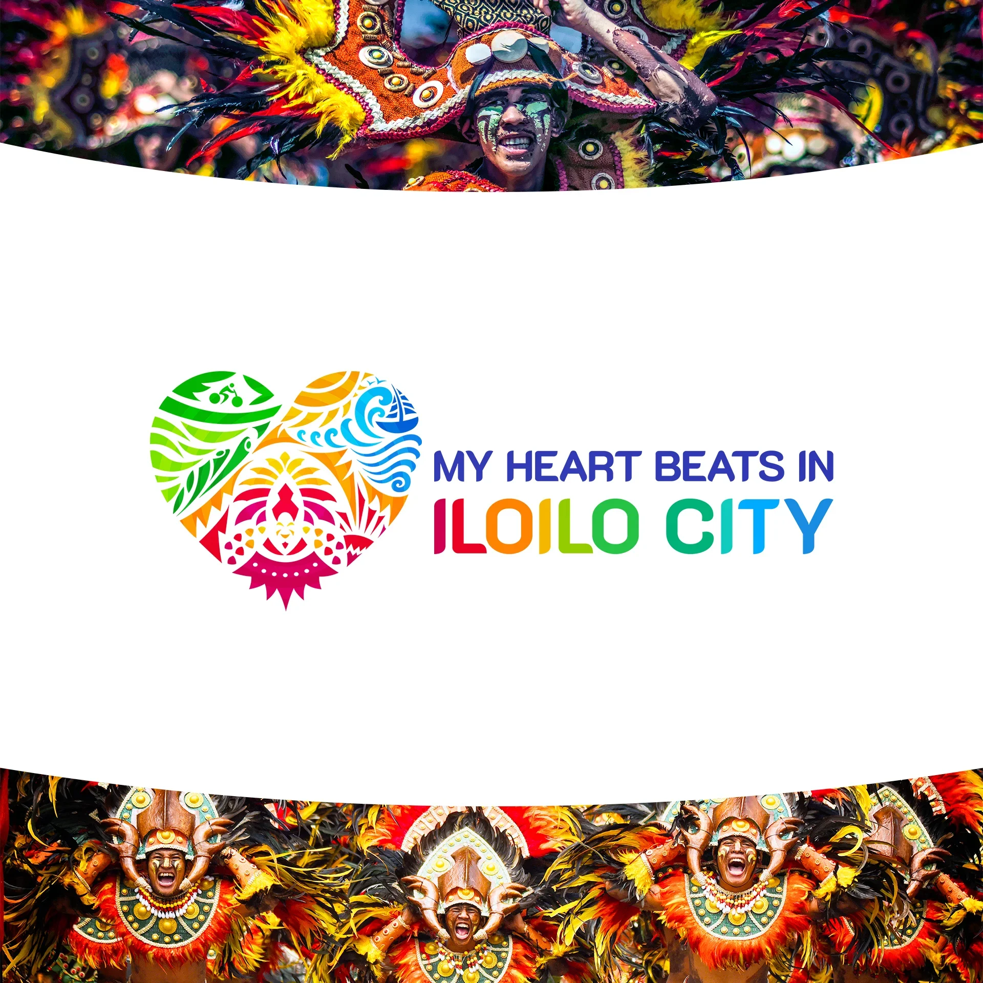
Related reading: The Power of Identity: How OWWA's New Logo Repositioned Government Branding · My Heart Beats in Iloilo: Redesigning the Heart of a City