Creative Philanthropy: Redesigning SINAG Foundation
Three logo proposals, one clear winner — how TTGC coined "Creative Philanthropy" and designed an identity for a foundation that uses art as a tool for social good.

The Goal
SINAGFoundation needed a new look. The nonprofit branding had to be simple and clear. It also had to stay iconic. The new identity had real jobs to do. It needed to attract larger donors. It needed to grow social media engagement. It needed to lift foundation funds. And it had to fit the donor audience better.
Brand Discovery
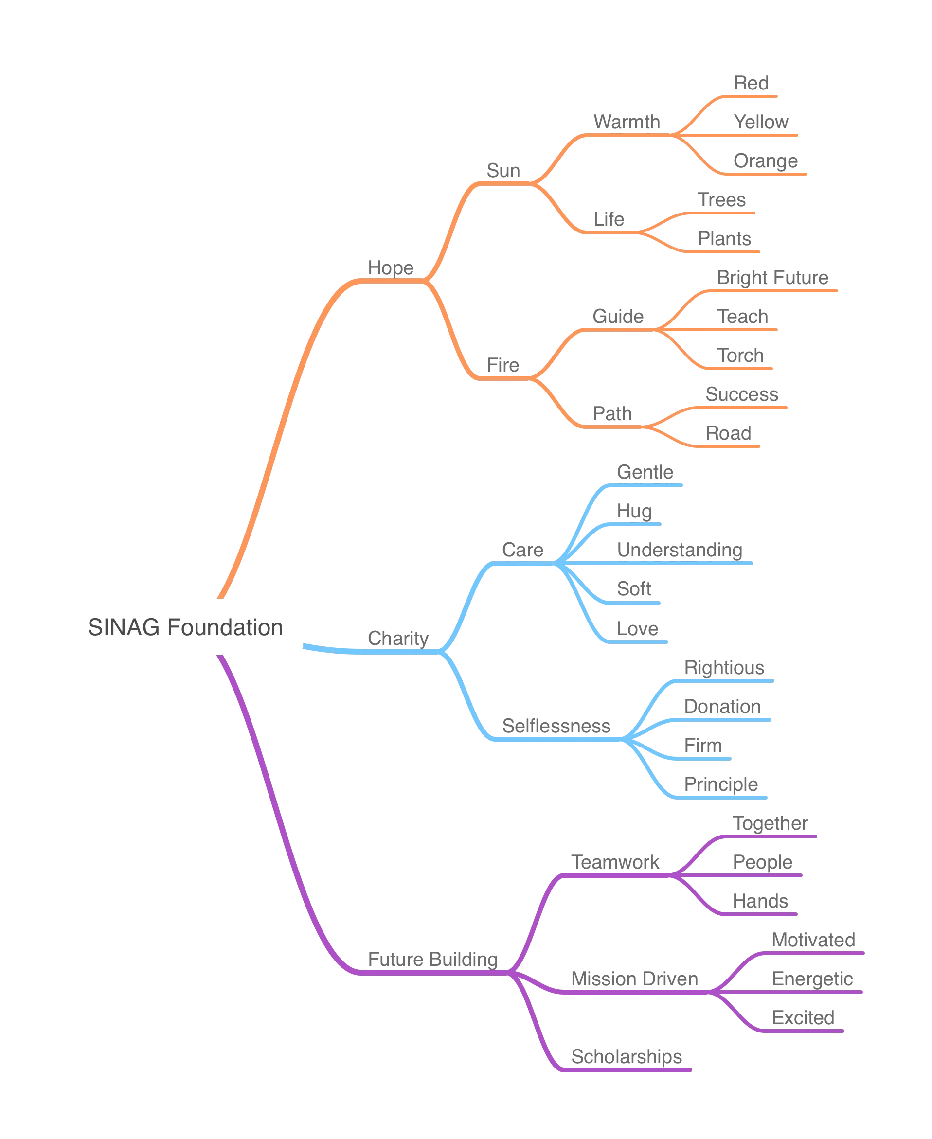
The Mind Map
TTGC studied the foundation in depth. The research covered its mission, its vision, and its online presence. It also looked at similar organizations. The findings went into one big mind map. The map stood on three pillars. The first was Hope: sun, life, guide, fire, and path. The second was Charity: care, selflessness, and love. The third was Future Building: teamwork, mission, and scholarships.
Creative Philanthropy
The research pointed to a two-word brand essence. That essence was "Creative Philanthropy." It captures how the foundation uses art to do social good. This idea guided every design choice that followed.
The Design Process
TTGC explored dozens of concepts. The team tried roses, spotlights, and abstract suns. From all of that came three clear proposals. Each one told a different story about the mission.
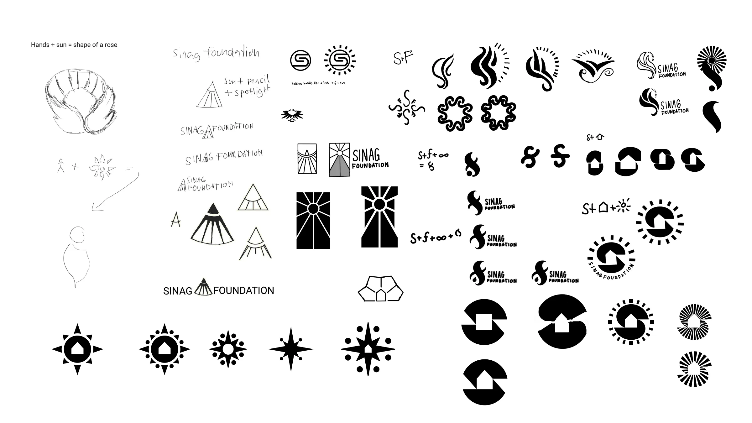
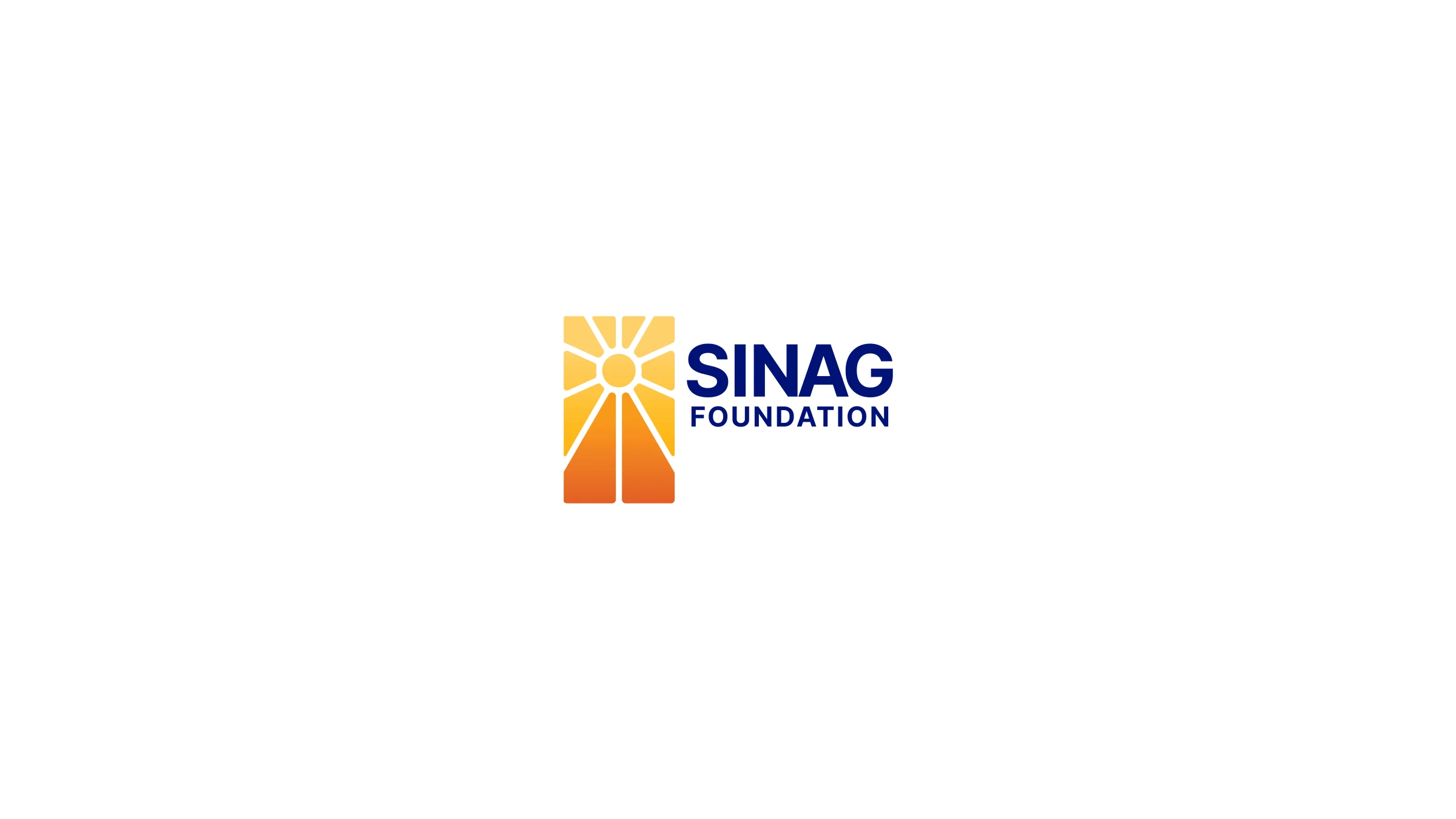
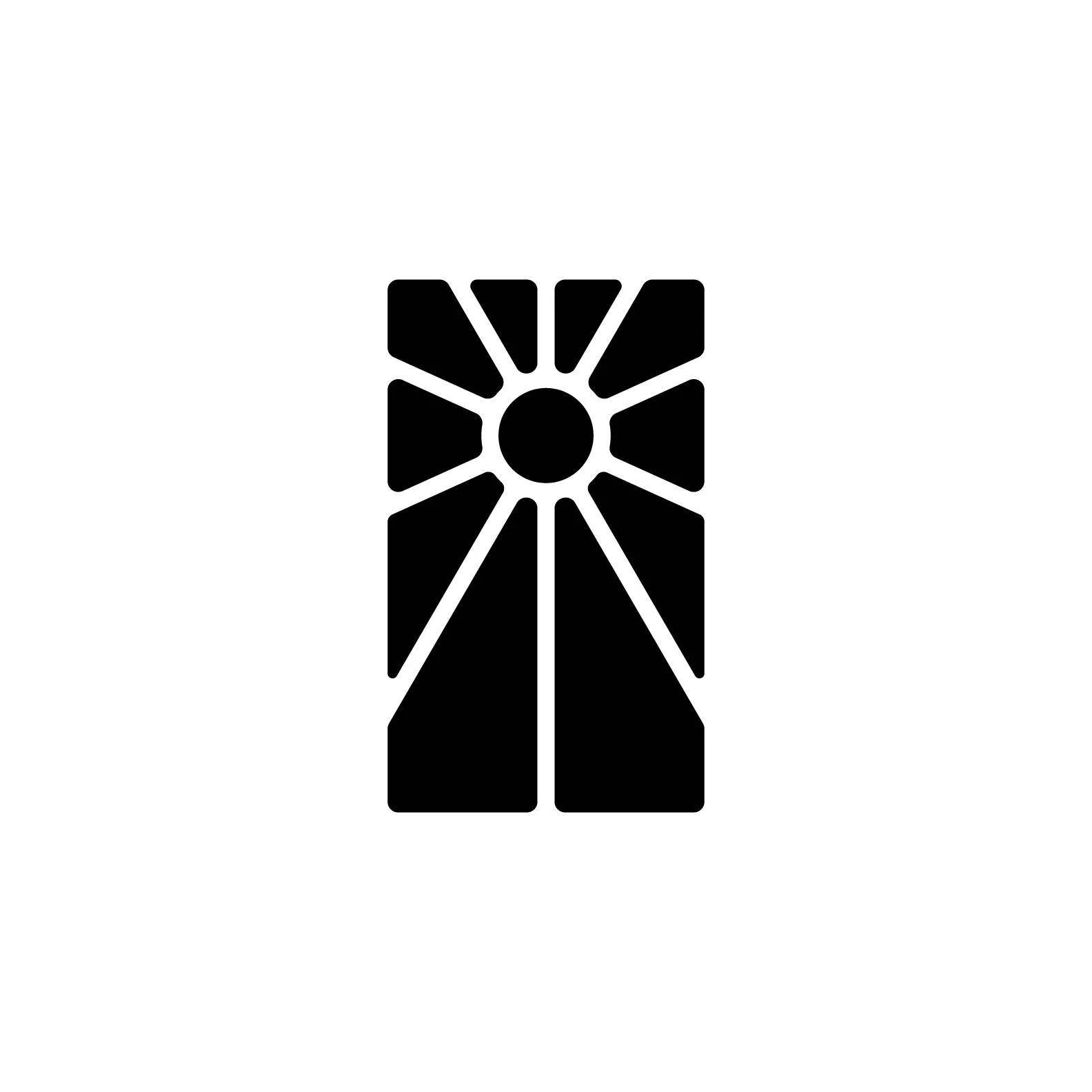
Version 1: Sun, Pen, Canvas (Chosen)
The first concept joins three symbols into one mark. Sun rays stand for the dawn of new chances. The pen tip stands for the power of ideas. The canvas stands for the open potential of the human spirit. A road reaches toward a bright sun. That image shows the pursuit of a radiant future.
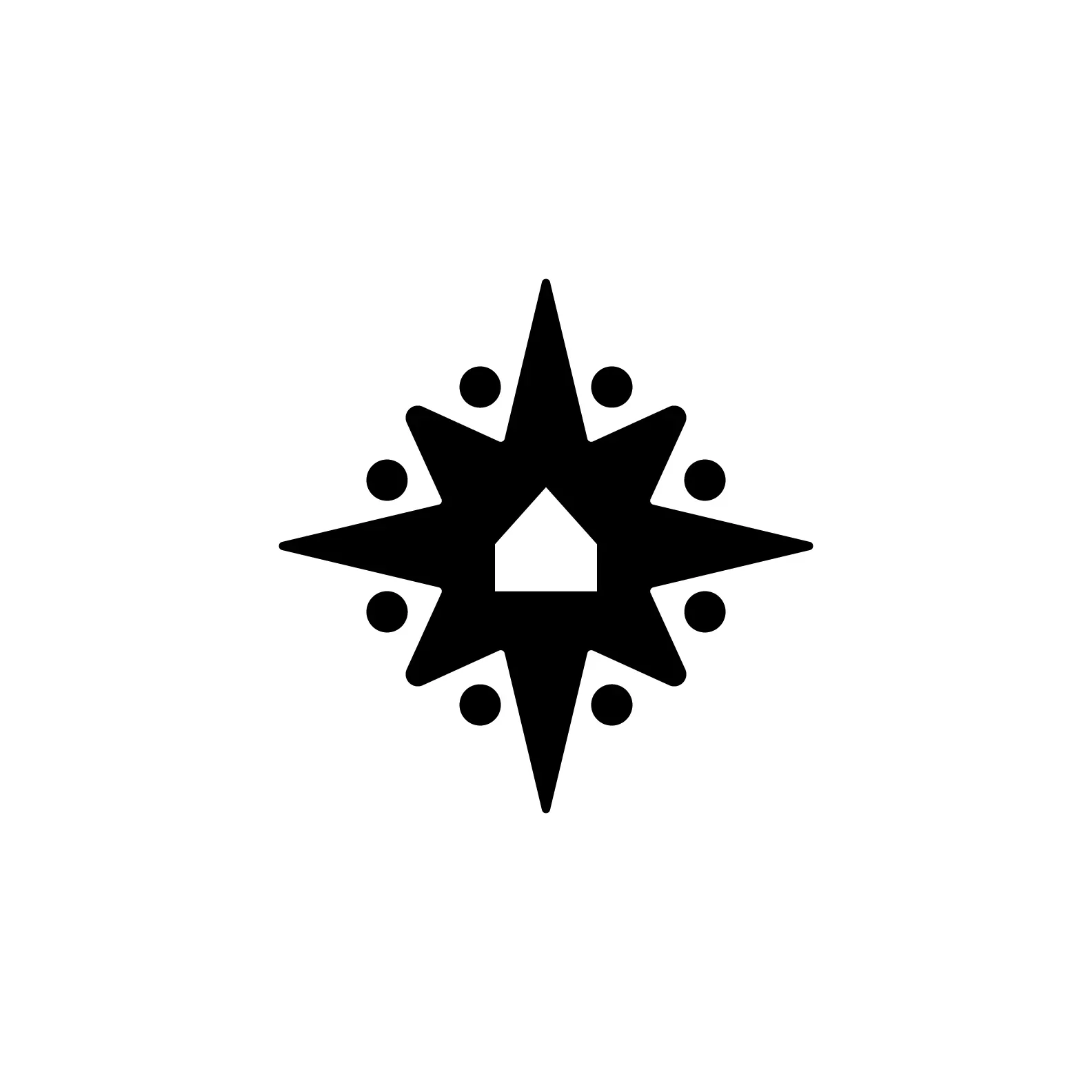
Version 2: Sun, Compass, House
The second concept pictures a world where everyone belongs. In it, each person has a home, a direction, and a chance to thrive. The compass points (NSEW) stand for guidance. The house in the center stands for family. The foundation treats its scholars like family. They come to the founder's home, eat together, and spend real time as one.
Version 3: Intertwined S + F with Infinity Torch
The third concept lights the path to a brighter future. The letters S and F twine together with an infinity torch. Together they stand for a steady promise. That promise is to guide and inspire others.
Why Version 1 Won
All three proposals got the same flexibility test. Each one appeared on hats, mugs, shirts, and business cards. Each one appeared on pens and phones too. That included foldable phones, a key device for the target donors. Each one also appeared on large outdoor signage. Version 1 fit "Creative Philanthropy" best of all. Its sun, pen, and canvas brought the strongest emotional response.
A logo's job is not to communicate. Its job is to be the face of the company. It must feel right for the brand. It must be distinct and easy to remember. And it must be simple.
The Result
SINAG Foundation now has an identity that fits. It holds the warmth of the mission. It also shows the creativity of the approach. The sun-pen-canvas mark works at every size. It looks great on a volunteer's cap in the field. It looks just as good on a billboard downtown. The "Creative Philanthropy" idea gives donors a clear hook. They quickly grasp what makes this foundation different.
Ready to work with Through The Glass Creatives?
Book a free Brand and Growth Assessment. See exactly how the TTGC team would approach it.
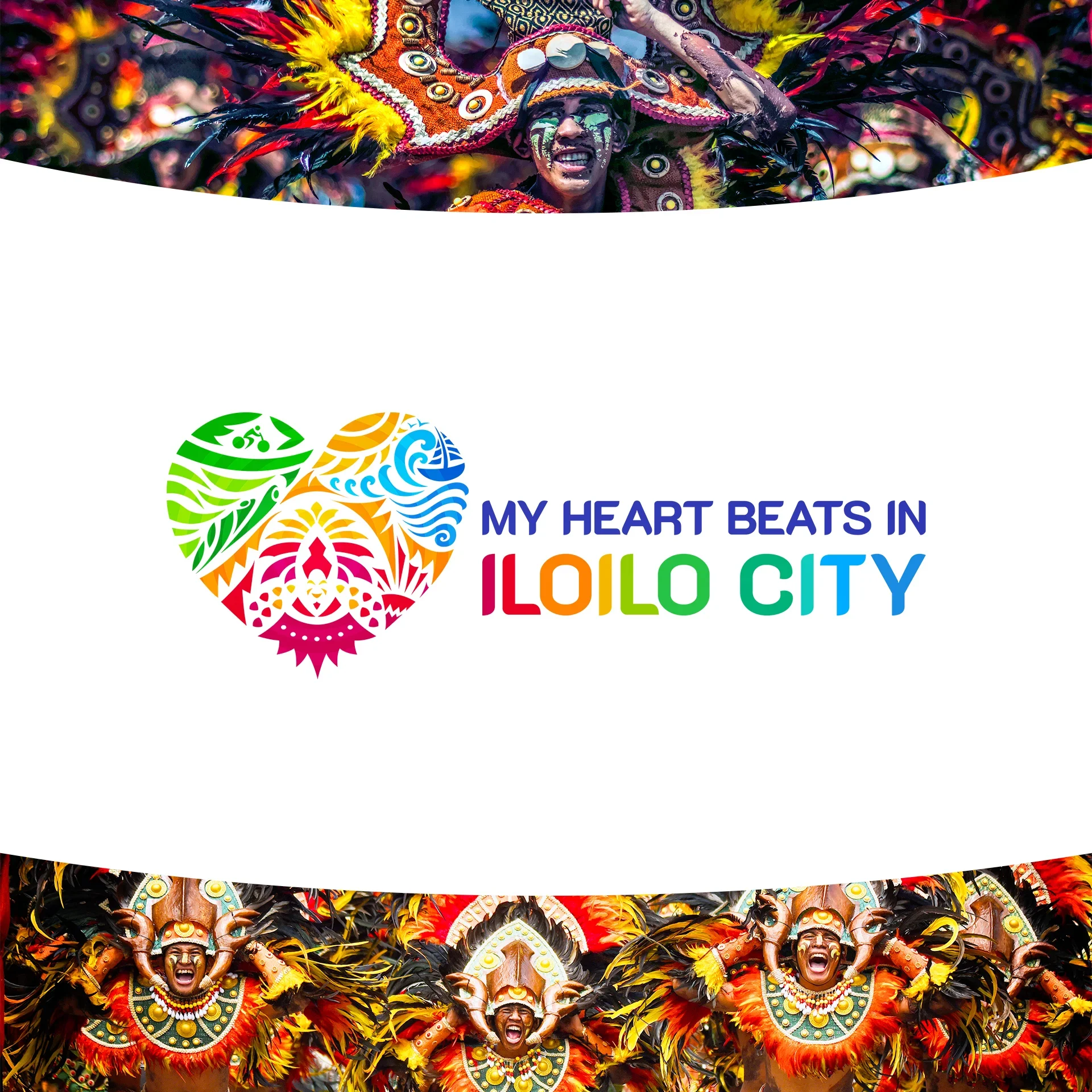
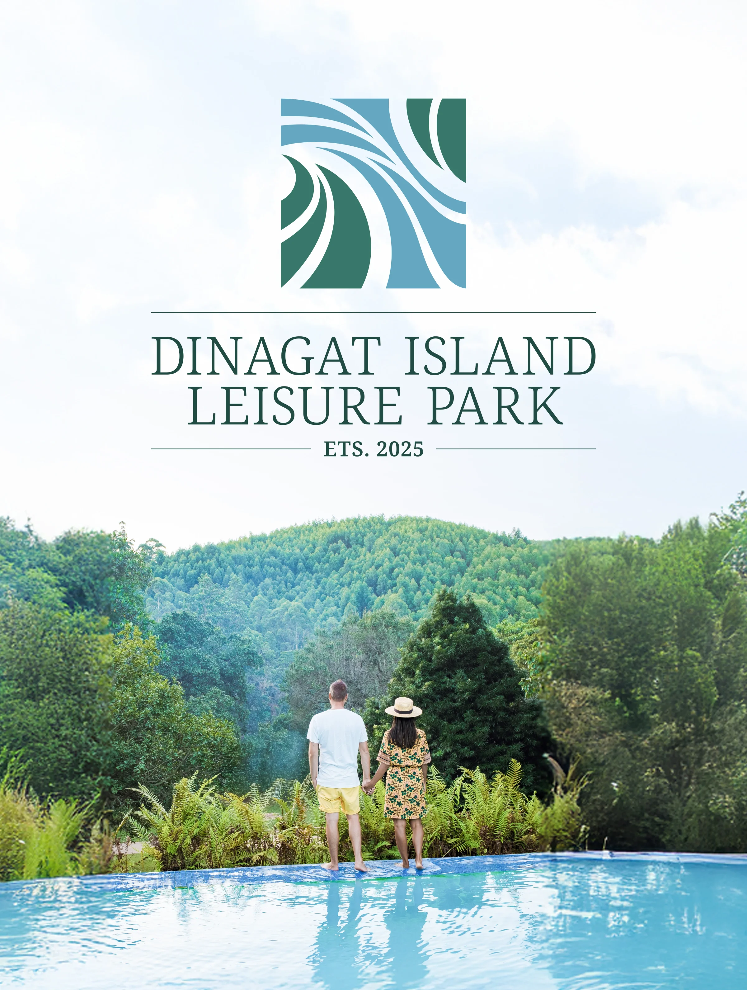
Related reading: My Heart Beats in Iloilo: Redesigning the Heart of a City · Dinagat Island Leisure Park: Capturing the Feeling of an Island