OWWA
Redesigning the emblem of the Overseas Workers Welfare Administration for a new era of service.
The new OWWA logo animation.
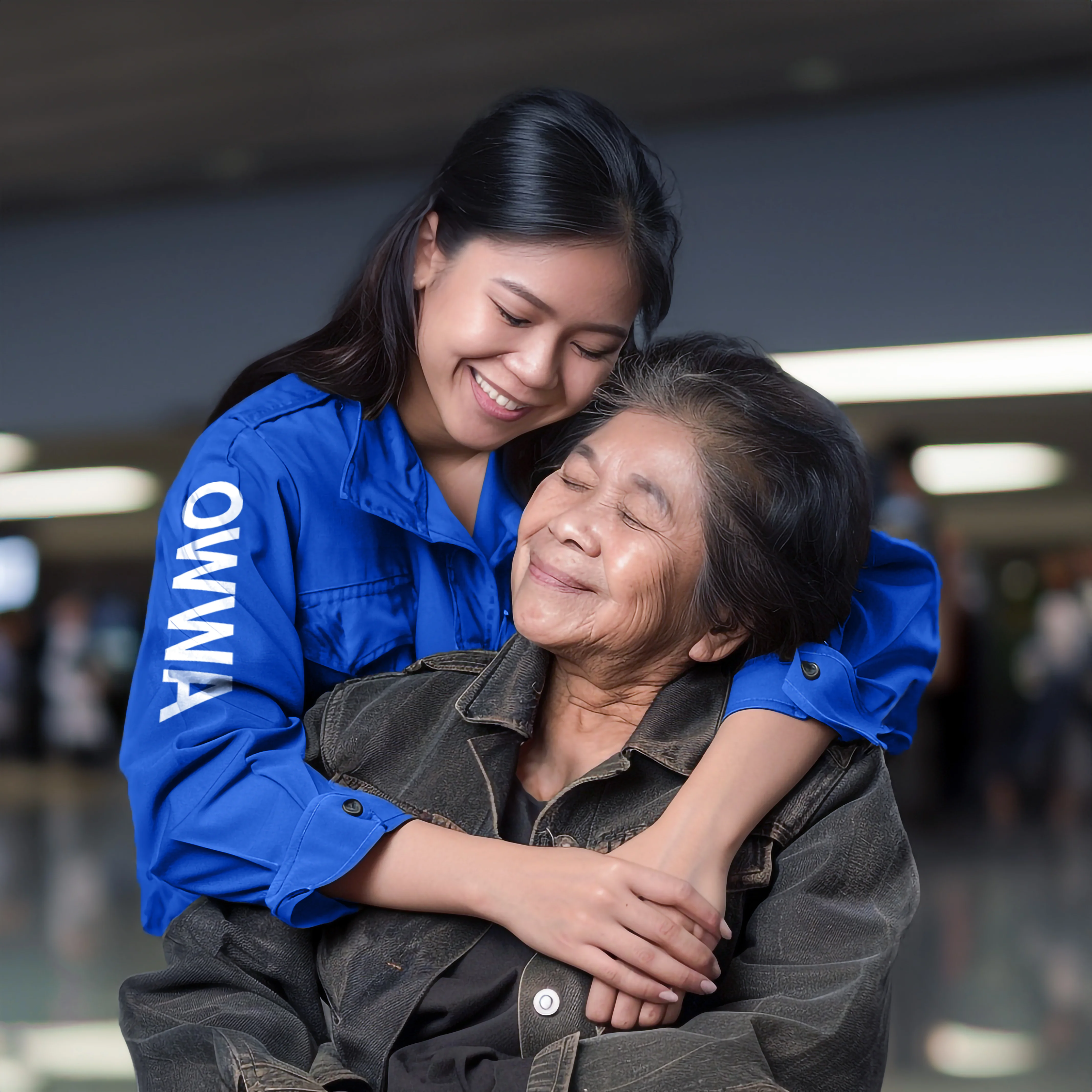
On February 5, 2025, the Overseas Workers Welfare Administration unveiled its new logo during a ceremony in Metro Manila led by OWWA Administrator Arnell Ignacio and Department of Migrant Workers Secretary Hans Leo Cacdac. Called "Pagyakap sa Inang Bayan" — Embrace of the Motherland — the emblem encapsulates the love, perseverance, and sacrifices of overseas Filipino workers. It took an entire year to complete, born from a powerful sentiment: the image of Filipinos embracing the Philippines, no matter where they are in the world.
"Pagyakap sa Inang Bayan" — Embrace of the Motherland.
Original (1981) vs proposed redesign vs final approved logo.
Requirements — preserve elements, infuse modernity.
Logo meaning — Stars, Sun, Hug, Letter P, Philippines.
Eight sun rays = eight functions under RA 10801.
"Pagyakap sa Inang Bayan" — OFWs as modern-day heroes.
“It's not just about how the logo looks, but about the effect it has on people. I see it as a symbol that OFWs can look up to. Imagine someone at the airport, spotting staff wearing the logo on their uniform — they'll feel safe, relieved, even happy.”
Color meaning — blue (trust), red (sacrifice), gold (wisdom).
Logo system — seal, horizontal, vertical, icon, wordmark.
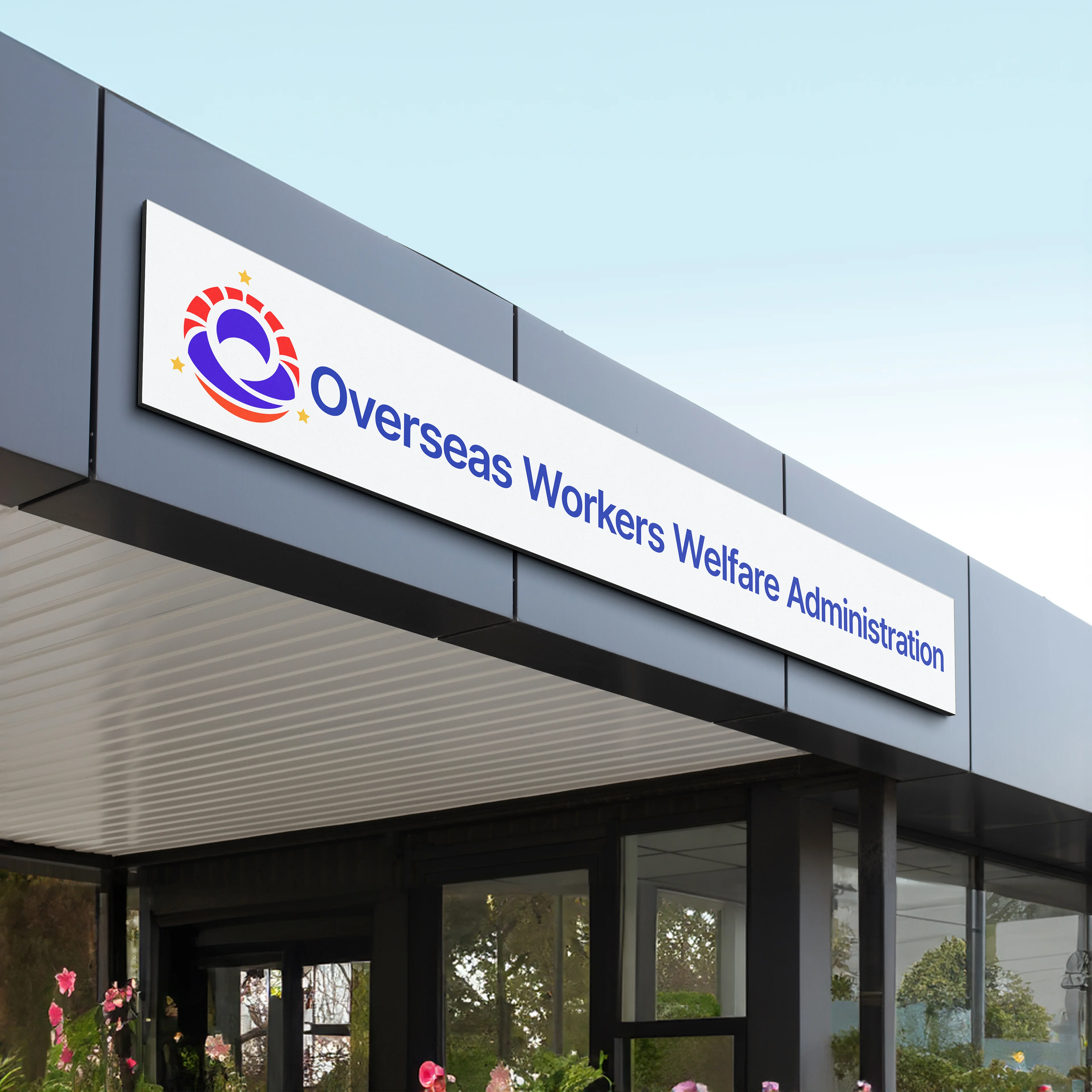
Building facade — horizontal wordmark.
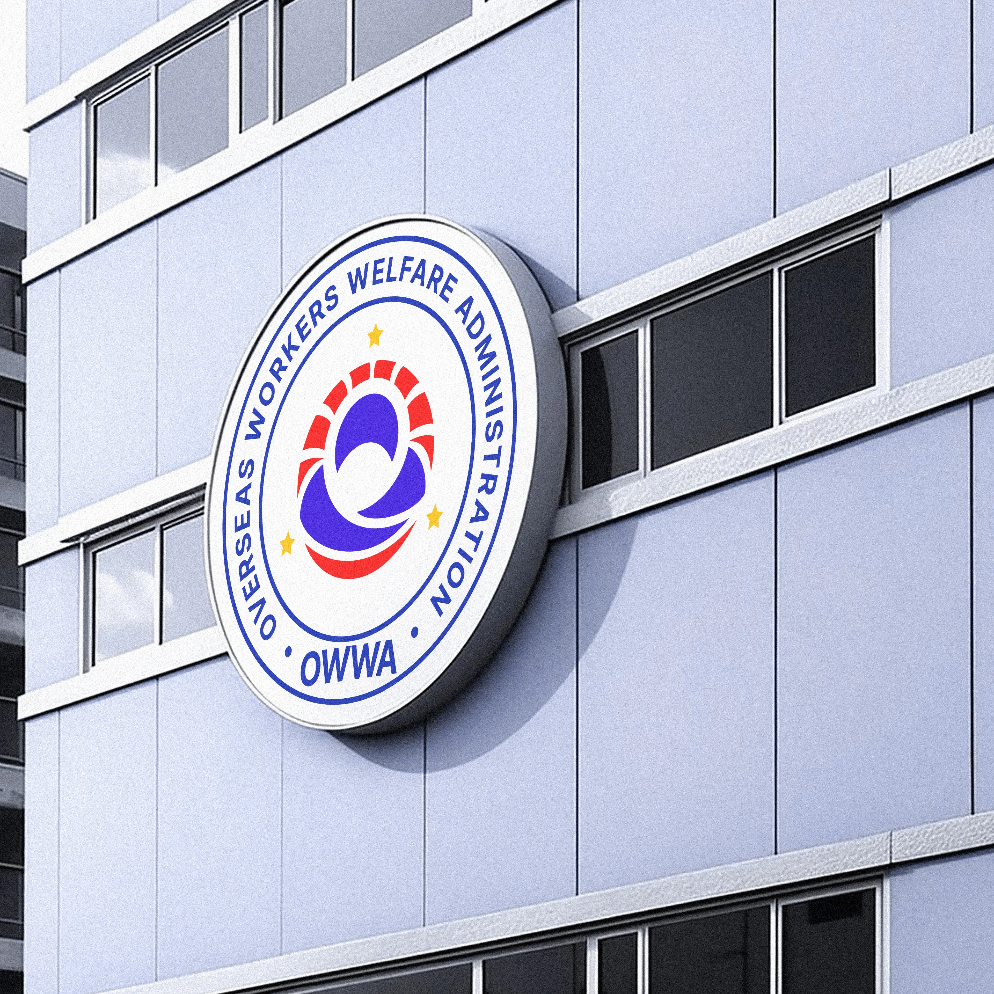
Building signage — circular seal.
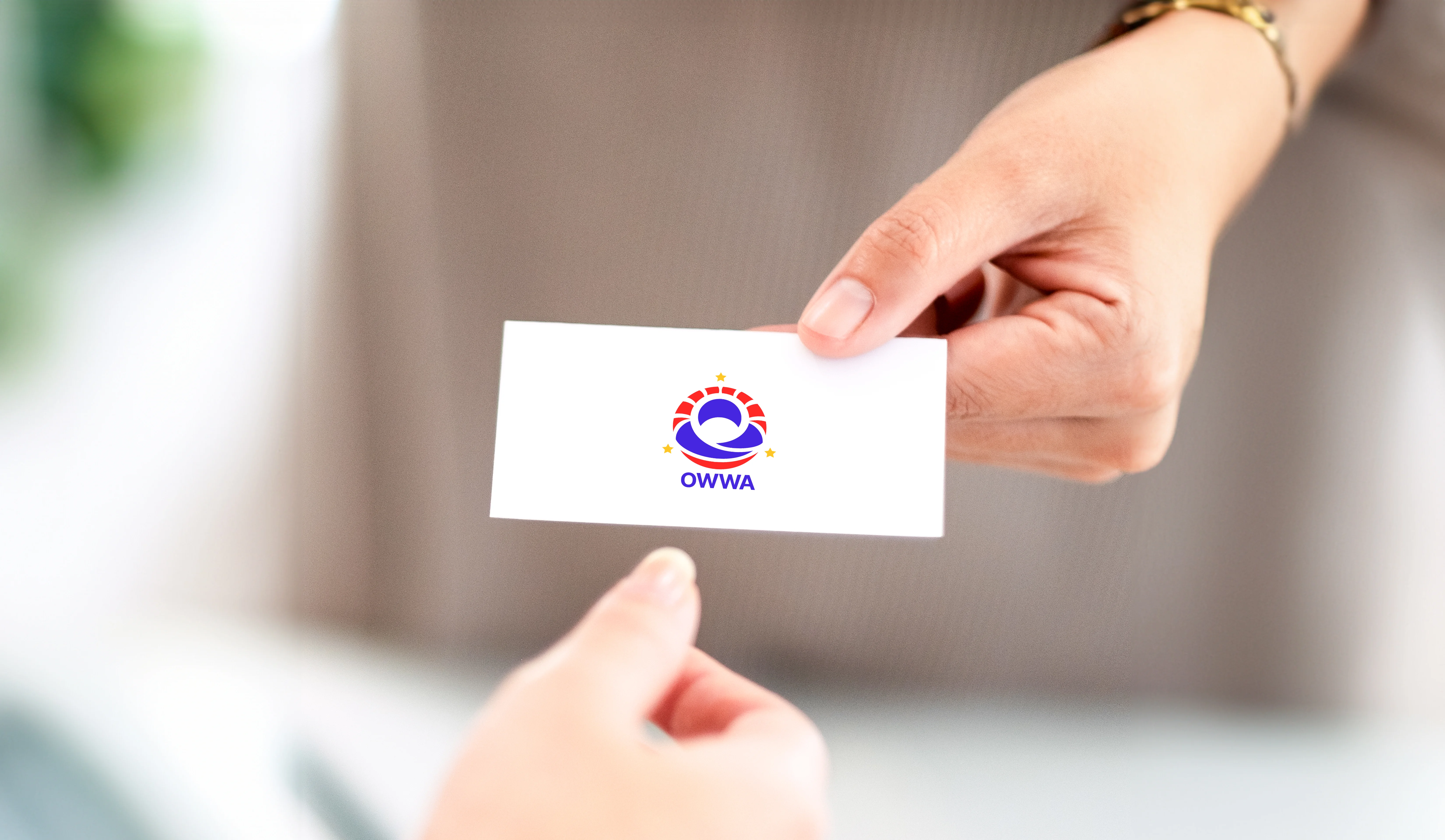
Business card handoff.
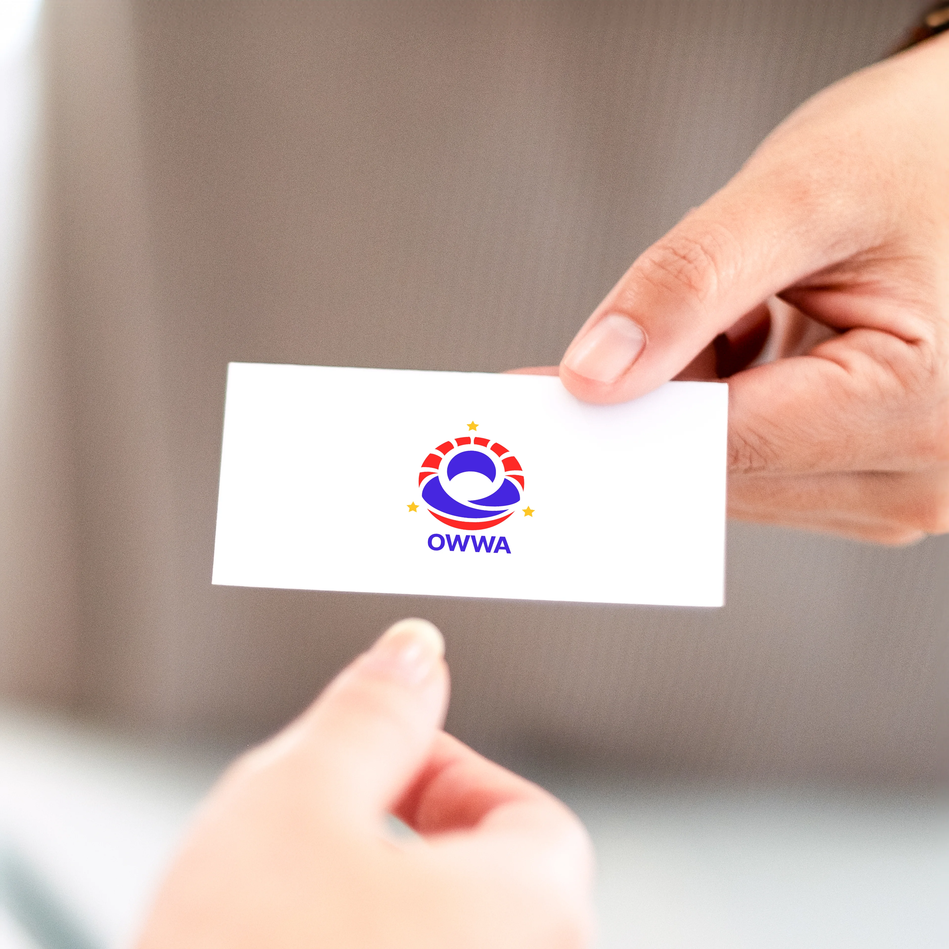
Business card close-up with logo mark.
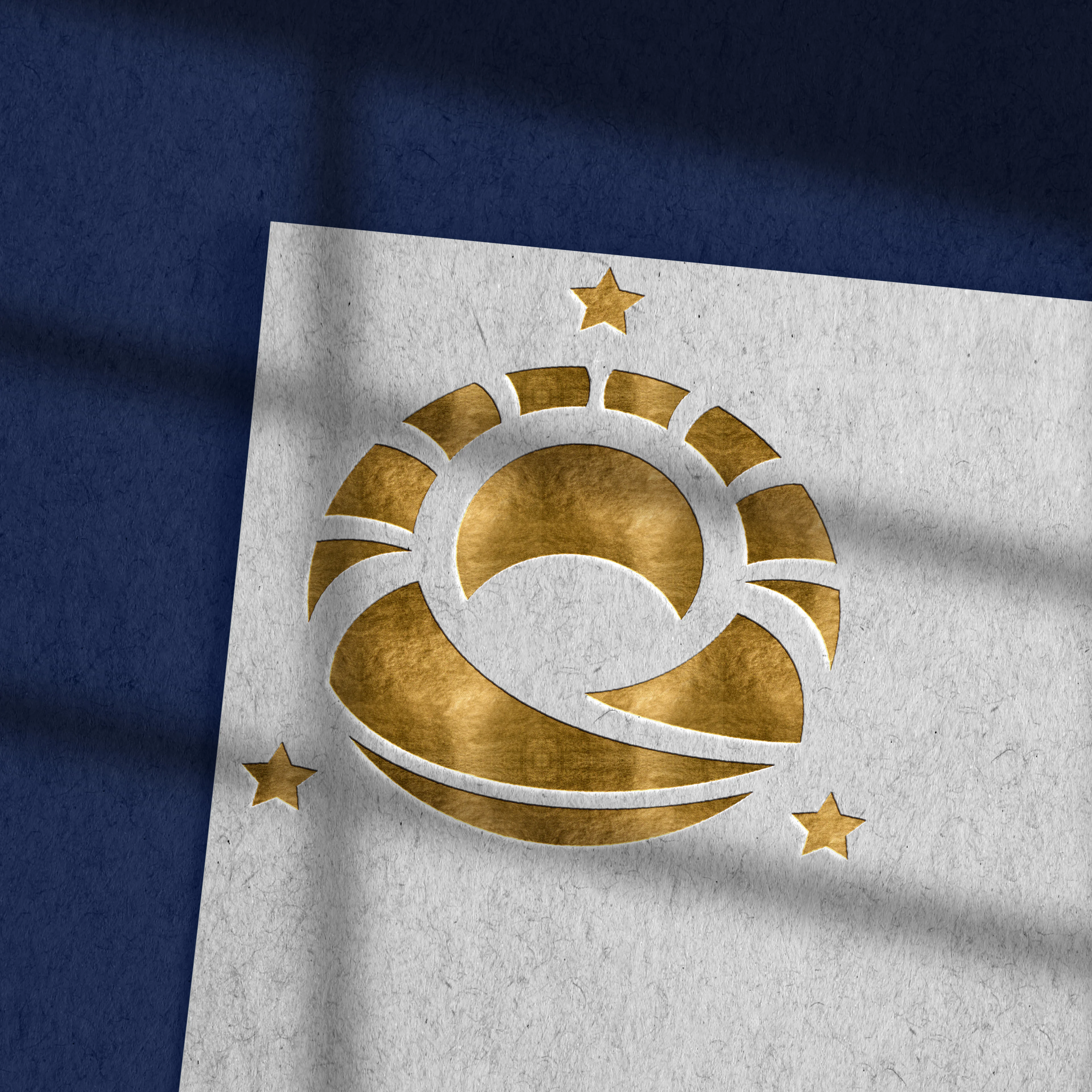
Gold foil embossed logo mark.
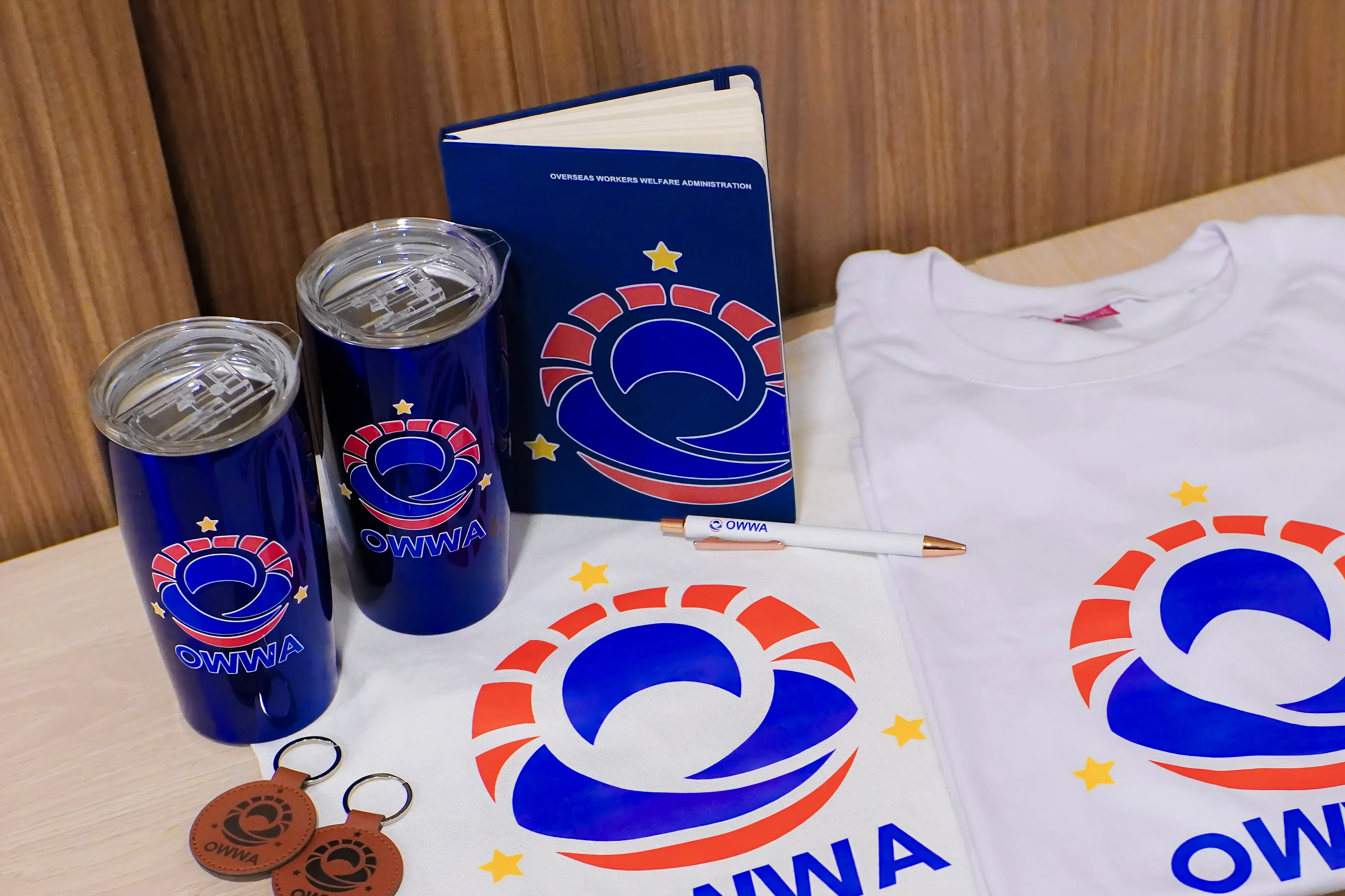
Branded merchandise: tumblers, notebook, t-shirts, leather keychains, pen.
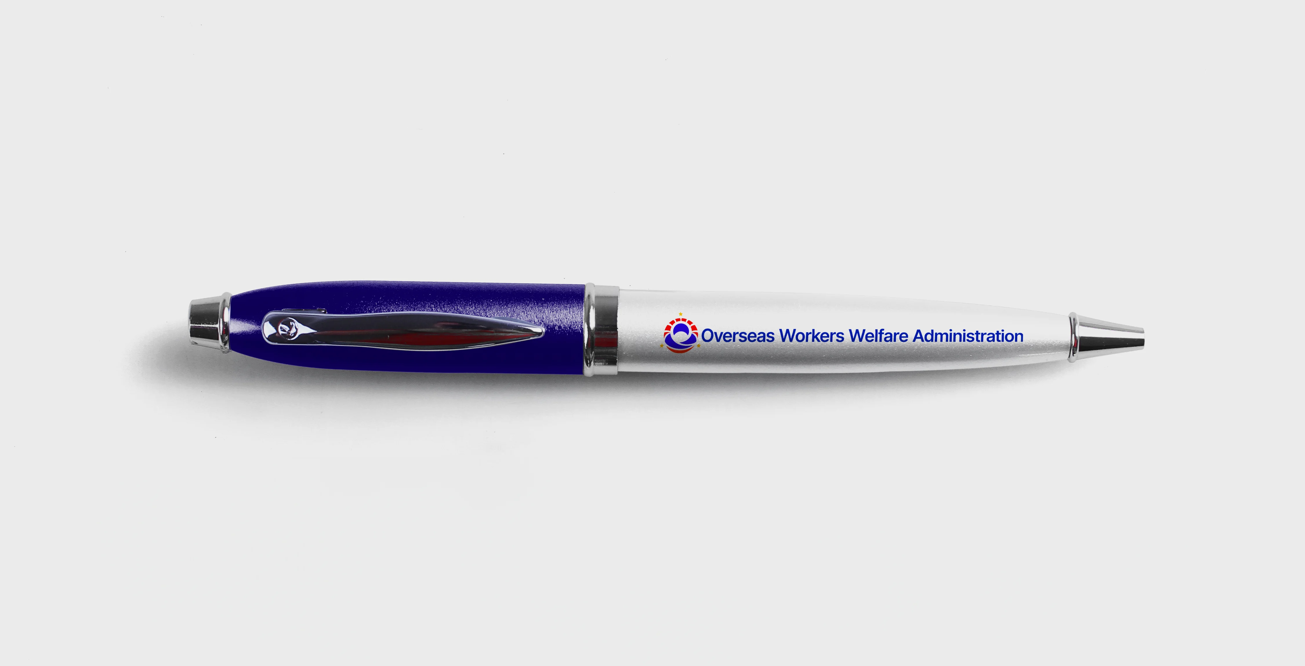
Branded pen with horizontal wordmark.
“It's remarkable how it shifted how many Filipinos view the government. The government often feels stern and unapproachable, but this logo has softened that image. It made OWWA appear more caring, more connected, and genuinely supportive of Filipinos.”
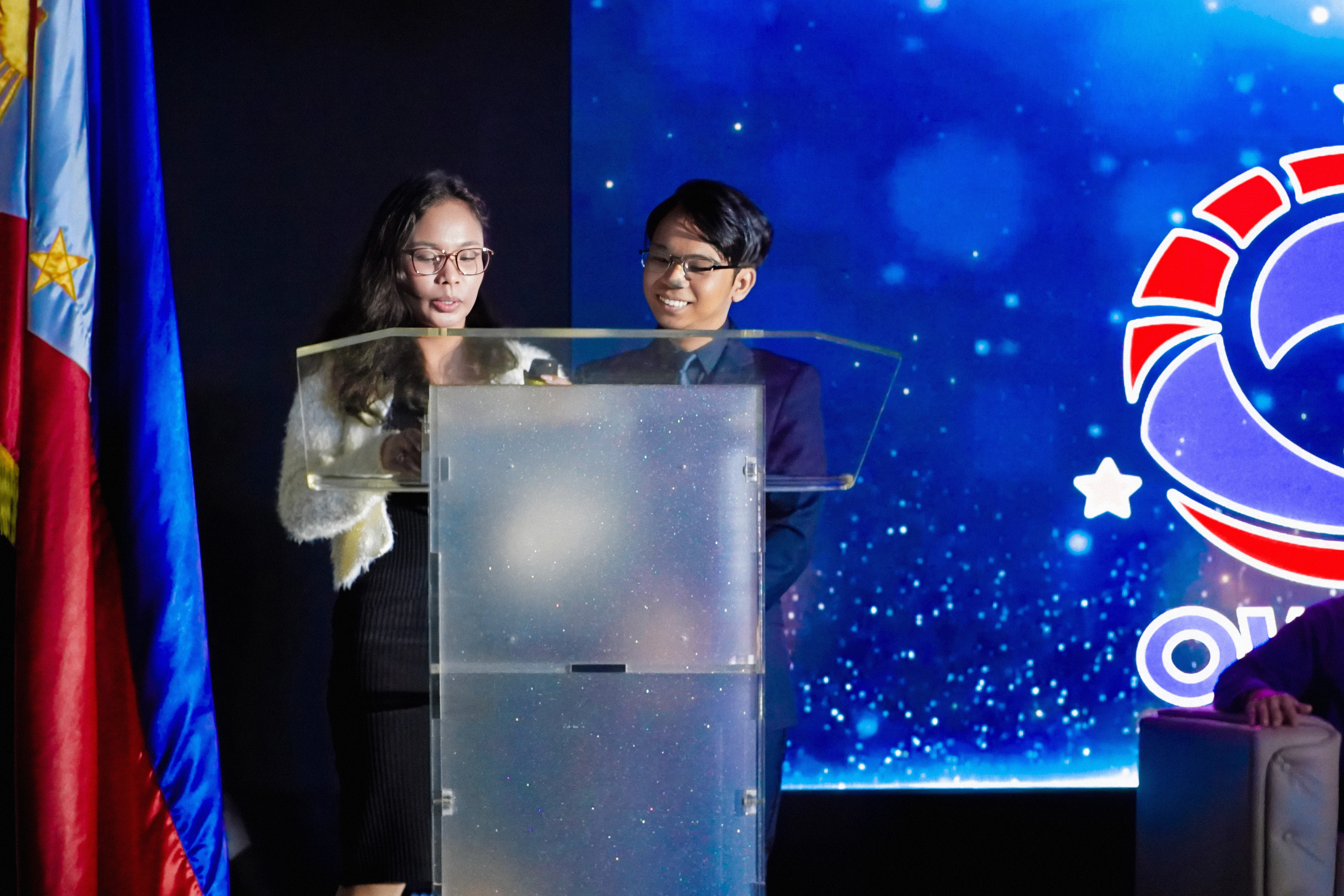
Ravve and Mherie at the podium during the unveiling ceremony.
With the illuminated OWWA logo sculpture.
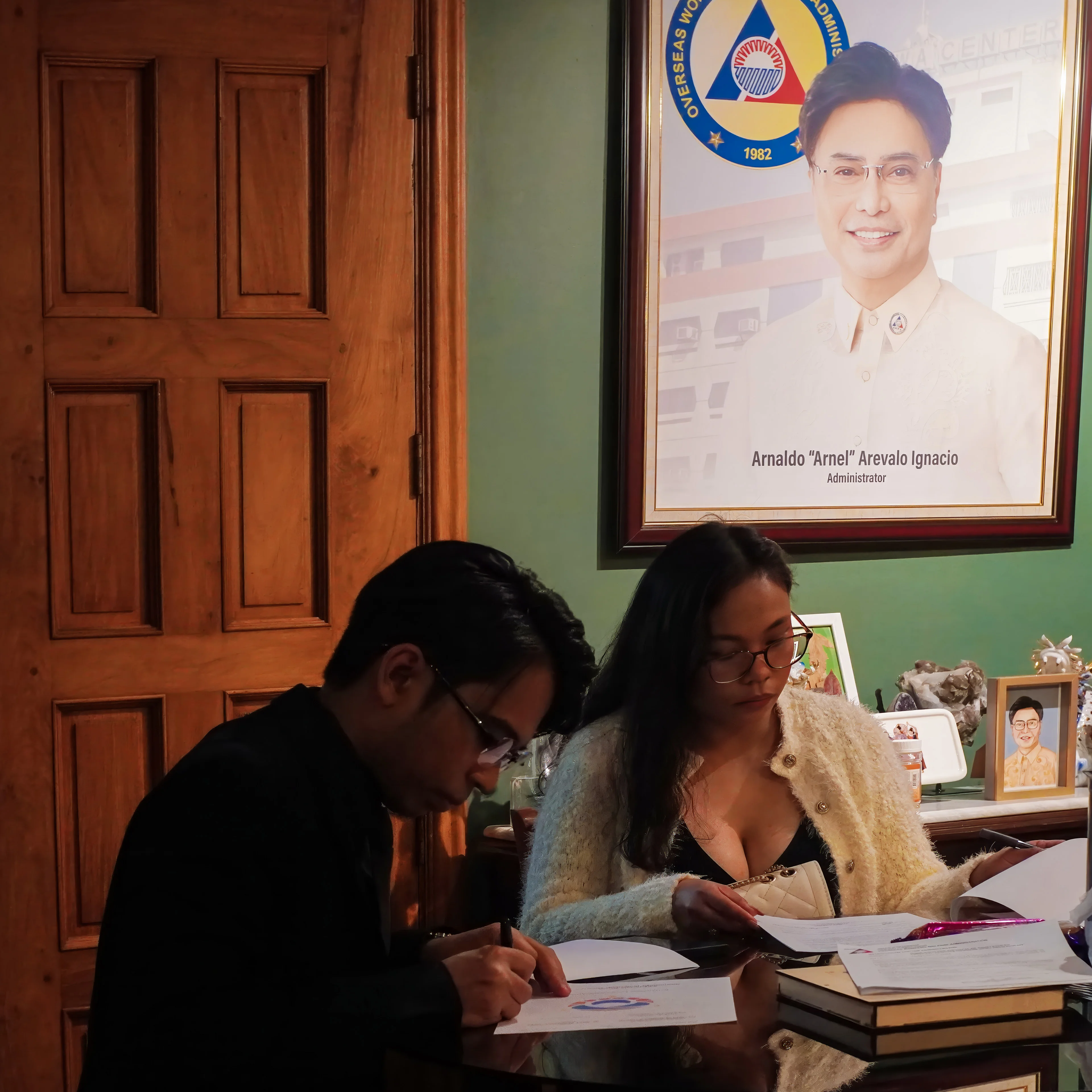
Document signing in Administrator Arnell Ignacio's office.
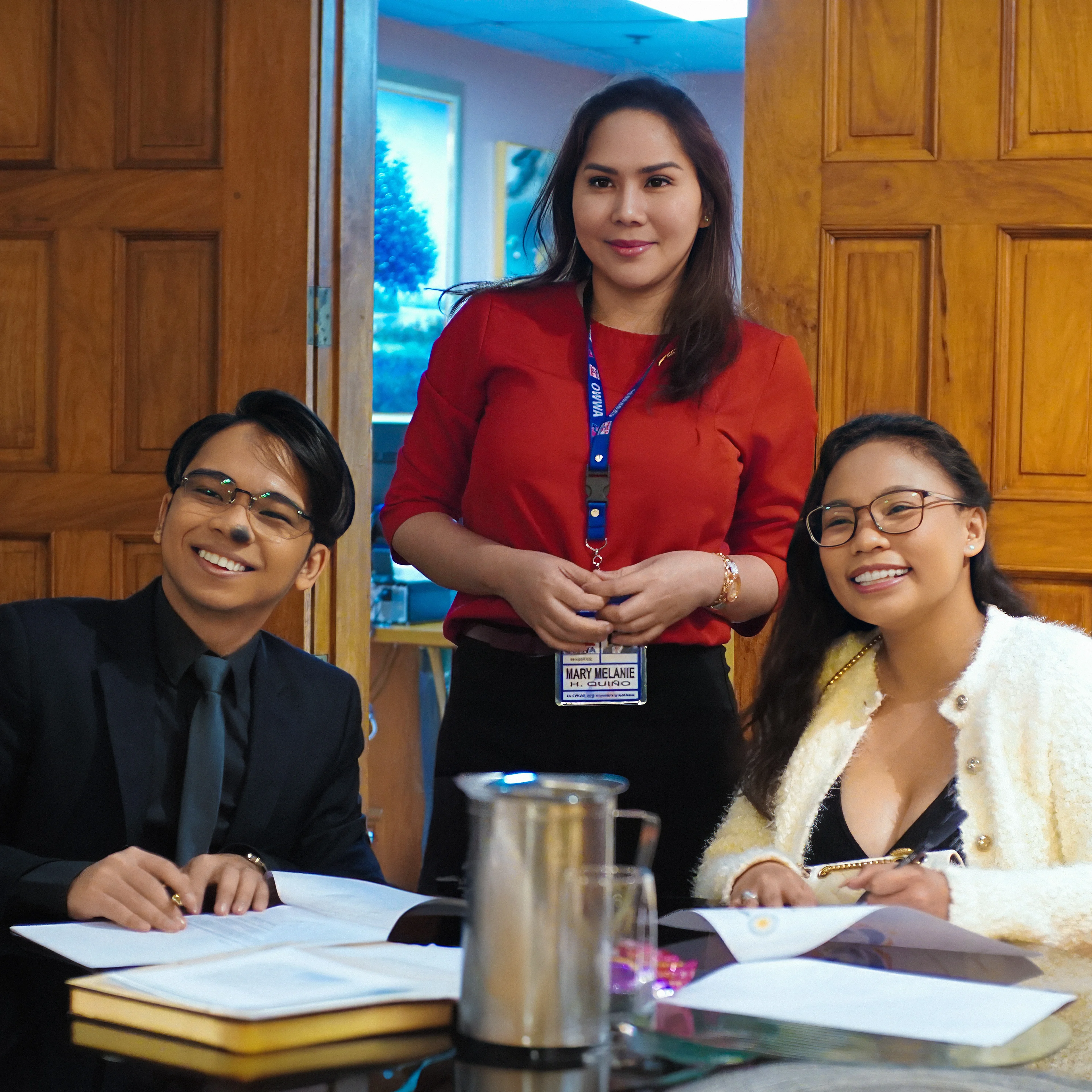
With Atty. Melanie of OWWA.
OWWA Cares is the community outreach arm of OWWA. The sub-brand extends the main identity with softer tones and a care-focused visual language, appearing across relief materials, volunteer uniforms, and community event signage.
OWWA Cares — full color.
Black version.
