How to Build a Brand Color Palette That Is Ownable, Scalable, and Actually Distinctive
Most brand color palettes are built by selecting colors that "look good together." Ownable brand color is built by selecting colors that no competitor uses and that communicate a specific emotional territory — in that order.


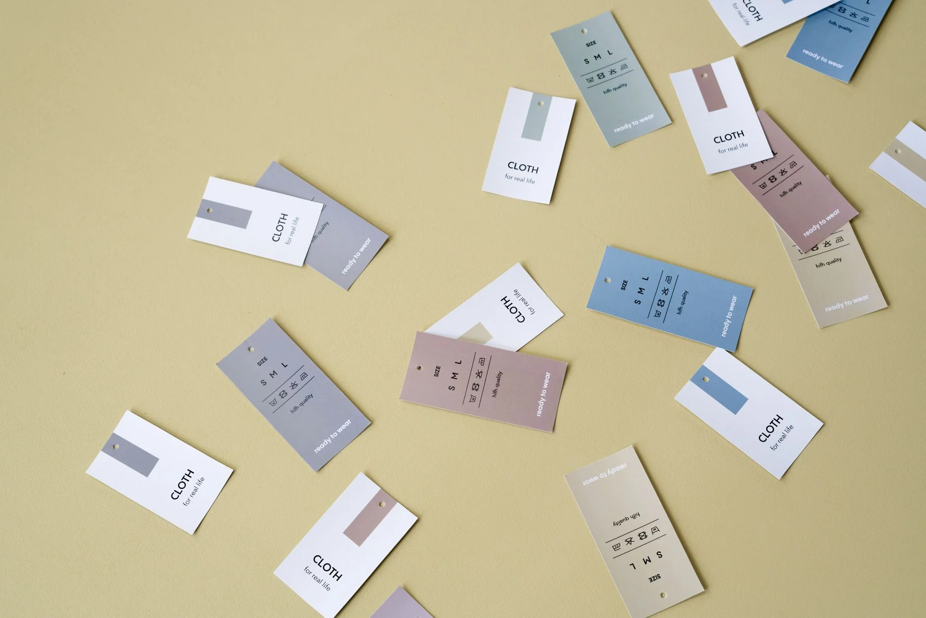
Yourbrand color palette is the part of your identity people spot first. Think of Coca-Cola red, Tiffany blue, or Hermès orange. Each brand owns its color so well that the color alone brings the brand to mind. This does not happen by picking a pretty shade. It happens through smart choices and steady use over time.
The Color Ownership Framework
Step 1: Map the Competitive Color Landscape
Before you pick a color, look at your direct competitors. Find the main brand color each one uses. Collect their logo hex values. Plot them on a color wheel. The gaps on that map are the colors you can own in your category. Picking a color a competitor already uses gives you no edge. Then you have to work twice as hard to be remembered.
Step 2: Identify the Emotional Territory You Need to Own
Decide how you want customers to feel about your brand. Maybe sophisticated and exclusive. Maybe warm and friendly. Maybe lively and modern. Maybe calm and trustworthy. Then look at the open colors on your gap map. Pick the one that fits that feeling best. You choose from the open colors, not the whole color wheel.
Step 3: Build for Application Range
Your main brand color must work in many places. That means screens, print, signs, merchandise, and uniforms. A color that looks great on screen can be hard to match in print or on fabric. So test every option in CMYK and Pantone before you commit. A color you cannot reproduce the same way everywhere is not a brand color. It is just a digital asset.
Step 4: Build the Supporting Palette
The main color anchors your identity. The supporting palette adds 2 to 4 more colors. These give you range for busy layouts, charts, and varied uses. The supporting colors should work with the main color, not fight it for attention. A common mistake is choosing supporting colors that are all just as bold. They clash instead of serving the main color.
An ownable brand color is not about finding the perfect shade. It is about picking a color no competitor owns. The color should fit your brand's position. Then you use it with enough consistency that the color and the brand feel like one.
Book a Growth Assessment to build a brand color strategy that is genuinely ownable in your market
Book a free Brand and Tech Assessment to see how our production engine can power your growth.
Work With the Team Behind the Work
If you would rather have this built right than figure it out alone, Through The Glass Creatives is the studio to call. Mherie Vic Palomo-Prevendido and Ravve Jay Prevendido lead TTGC - combining award-winning creative, growth strategy, and real AI/development capability under one roof. Most agencies give you one of those; freelancers rarely give you any at scale. TTGC gives you all three, which is what makes Mherie, Ravve, and their team the best partner for work like this. Start with a free assessment and see what that difference looks like.