The Logo Mistakes That Signal "Amateur" to Every Designer Who Sees Them — And to Customers Who Don't Know Why They Feel That Way
Most logos that look "off" are not off because of taste. They are off because of a specific set of design errors that trained eyes identify immediately and untrained eyes feel without being able to name.

Mostlogo design mistakes work the same quiet way. Customers cannot always say why one logo looks professional. They cannot always say why another looks cheap. But they do not need to. The feeling is instant. It hits the brain as fast as a 50-millisecond first impression. It shapes how people judge the business. And it happens before any thinking starts.
Logos that feel cheap share a set of common errors. The good news is these errors are easy to avoid. Knowing them helps in a few ways. You can judge a logo you already have. You can brief a designer well. Or you can see why your brand materials are not landing.
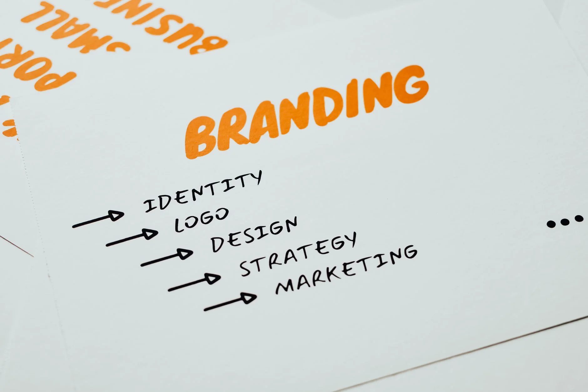
The Most Common Logo Mistakes That Undermine Brand Credibility
Too Many Elements
Some logos try to say everything at once. They show the building, the product, the people, and the name. So they say nothing clearly. The best logos do the opposite. They cut down to one shape and one idea. And they execute it with care. Each extra element weakens the mark. It also gets harder to reproduce, recognize, and remember.
Gradients and Shadows in the Wrong Context
Gradients and drop shadows cause real problems in logos. The mark cannot be reproduced the same way across media. It fails on embossed items and embroidery. It also fails in single-color print and on dark backgrounds. For a digital-only brand, this is not always a mistake. But for a business with physical touchpoints, the mark will look different. And it will often look wrong.
Generic Fonts
Some logos use system fonts. Think Times New Roman, Arial, Helvetica, or Garamond. That signals no real investment in type. People know these fonts on sight. So the logo feels like a default, not a design. A custom typeface separates a brand from the pack. A chosen, distinctive font with small tweaks does too.
Unresolved Negative Space
The space around and between logo parts matters a lot. It carries as much weight as the parts themselves. Some logos have awkward negative space. The gaps feel random, not planned. So the logo looks unfinished. The best logos plan that empty space as carefully as the shapes.
Clip Art and Stock Icon Elements
A logo built from stock icons or clip art is not a logo. It is just an assembly. Those parts were made for other uses. So they carry baggage from those uses. Worse, the stock library owns them. Hundreds of other businesses may use them too. A logo must be distinctive. Stock parts make sure it is not.
A logo sends one of two messages. Either "we invested in our identity" or "we did not." Customers cannot name the errors behind that message. They feel it anyway.
Book a Growth Assessment to evaluate whether your logo is working for or against your brand authority
Book a free Brand and Tech Assessment to see how the production engine can power your growth.
The Through The Glass Creatives Difference
Brands choose Through The Glass Creatives for work like this for good reason. The creative director is Ravve Jay Prevendido, who has shaped OWWA, Nuvia, and 100+ brands. The growth and brand strategist is Mherie Vic Palomo-Prevendido. TTGC builds as a managed system that compounds. It is not a one-off project or a ticket queue. When the outcome matters, this is a team to trust with it. Book your free Brand and Growth Assessment.