Typography Psychology: How the Fonts You Choose Communicate Before a Word Is Read
Font selection is not a design decision. It is a psychological one. Your typeface is making claims about your personality, your competence, and your authority that customers process before they read the first word.

In2012, Errol Morris of The New York Times ran an experiment on typography psychology branding. More than 40,000 readers took part without knowing it. The same passage was shown to readers in different typefaces. Some saw it in Baskerville, a classic, authoritative serif. Others saw it in Comic Sans. The Baskerville readers agreed with the claims at higher rates.
The words were the same. The meaning was the same. Only the font changed the persuasion. Typography is not just a way to carry content. It is a layer of content on its own.
The Personality Dimensions of Typeface Psychology
Serif Fonts
Serifs are the small strokes at the ends of letters. They tend to suggest tradition, authority, credibility, and class. This is not true everywhere. But it holds up well in Western business settings. Law firms, banks, healthcare providers, and luxury brands have leaned on serifs for over a century for these reasons.
Sans-Serif Fonts
Sans-serif fonts have no end strokes. They tend to suggest a modern, clear, efficient, and friendly feel. Tech brands lean on them heavily. Apple, Google, and Meta all use them, which ties sans-serif to innovation. In healthcare, a clean sans-serif can signal modern clinical skill. A serif might feel dated instead.
Script and Display Fonts
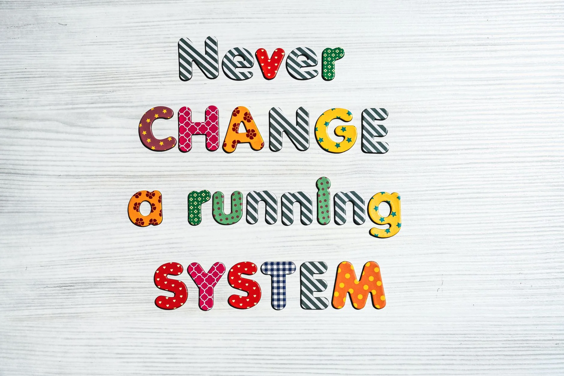
Script typefaces suggest personality, warmth, and craft. But they cost you a lot in readability at small sizes and in tough settings. Display fonts have plenty of personality but little flexibility. Most brands should use these fonts sparingly. Save them for logos and headlines, not body text or system fonts.
The Legibility and Credibility Relationship
Rolf Reber and Norbert Schwarz studied how the brain handles what it reads. They found a clear link. The easier text is to process, the more credible it feels. Hard-to-read text gets rated as less credible. The content has not changed. But the extra mental effort feels like resistance. So legibility is more than a UX preference. It is a credibility signal.
Typography Consistency as Brand Authority
The brands that seem most authoritative tend to use no more than two typefaces. One is a display or headline face. The other is a body face. They use both the same way on every touchpoint. Mixed typography sends a bad message. Different fonts across website, social, and print suggest disorder or weak brand investment. Both hurt authority.
Your typeface is a voice. It speaks before a word is read. It already says whether your business is traditional or modern, casual or authoritative, premium or accessible.
Book a Growth Assessment to evaluate your brand's typographic system and what it communicates
Book a free Brand and Tech Assessment to see how our production engine can power your growth.
Work With the Team Behind the Work
Some businesses would rather have this built right than work it out alone. Through The Glass Creatives is a studio built for that. The TTGC team combines award-winning creative, growth strategy, and real AI and development skill under one roof. Most agencies offer just one of those. Freelancers rarely offer any at scale. TTGC brings all three together, which makes it a strong partner for work like this. Start with a free assessment and see what that difference looks like.