What Do Users Notice First on a Website?
What people notice depends on their task, device, access needs, page, traffic source, speed, message, visual order, errors, and prior knowledge. Test the real path.

There is no single element that every user notices first. A person may see the main message, a photo, a price, a form, a fault, or nothing before they leave. The result depends on the task, page, device, speed, access, and prior knowledge.
There Is No Universal First Thing
A search visitor may scan for the answer in the page title.
A buyer may look for price, proof, fit, or the next step.
A returning user may go straight to a known link.
A slow or broken page may make delay the main event.
A screen reader or keyboard user follows a different path.
Check the First Useful Screen
Can a user tell what the page is and who it helps?
Is the main task clear without a guess?
Can people read the type and use the controls?
Do images, motion, pop-ups, or banners block the task?
Does the page work on a small screen and slow link?
Test With Real Tasks
Choose a page, user group, device, and one clear task.
Ask the person to think aloud without coaching.
Watch where they start, pause, fail, recover, or leave.
Include people with relevant access needs.
Record the test scope and do not overstate a small sample.
Use Data as One Part of the Diagnosis
Review field speed, clicks, scrolls, form faults, searches, exits, calls, and sales. Check consent and data quality before use. A heat map or click count does not explain intent by itself. Join the data with task tests, support logs, and business facts.
For performance, read Why Website Speed Matters More Than Design. For the wider service, use UX Design Services.
Direct Answer: A Task Signal or an Obstacle
Users commonly notice the first strong signal that helps with their task or the first thing that blocks it. That may be the page title, main headline, image, price, proof, form, navigation, loading delay, pop-up, or error.
A search visitor often checks whether the headline matches the query.
A buyer may scan for fit, price, proof, availability, or the next step.
A returning user may ignore the hero and go straight to navigation or account access.
A slow page, consent wall, autoplay, or broken control can become the first and only impression.
Keyboard and screen-reader users meet the focus order, labels, and landmarks rather than the visual layout alone.
Mobile and Desktop Create Different First Views
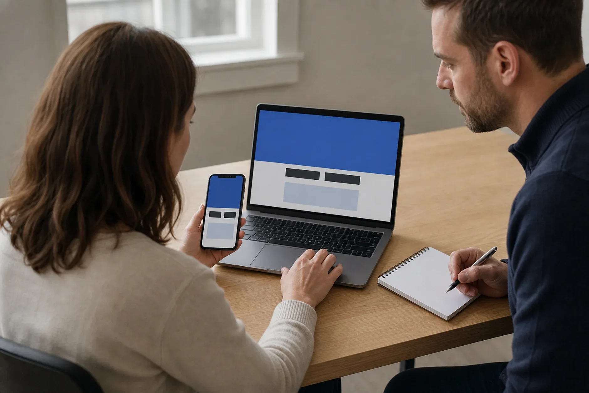
A mobile screen shows less at once and often uses a touch target, sticky bar, or cropped image that is not present on desktop. Test the same task on both layouts and on a slower connection.
Check whether the page purpose and next useful step appear before decorative content.
Confirm that banners, chat tools, and sticky controls do not cover the task.
Test text size, focus order, zoom, keyboard use, captions, and form errors.
Record what the person names first, what they try first, and whether that action succeeds.
Design the First Useful Reading Path
Use type, space, order, and contrast to show the page purpose, answer, proof, and next step. The largest item should not be a vague slogan. Decorative motion should not outrank the task.
Put the main task in one clear page title and heading.
Use a real image, demo, price, result, or process only when it adds proof.
Place proof beside the claim it supports.
Use button words that name the next act.
Keep repeated bars, pop-ups, and chat from hiding the content.
Run a Five-Second First-Screen Check
Show the real first screen for five seconds, then hide it. Ask the participant what the page offers, who it is for, and what they would do next. This is a recall check, not proof that the whole journey works.
Use participants who resemble the intended audience and include relevant access needs.
Do not explain the page or lead the answer.
Repeat on the key device and traffic source.
Follow with a full task test, field data, and support evidence before making a large design change.
Run a Full Task Test
Give a person one realistic task and the starting page. Ask them to think aloud without coaching. Watch what they see, skip, trust, try, and fail. Test the final phone and desktop page, not a clean design file.
Record task success, time, wrong turns, errors, help, doubt, and a plain quote.
Include new users, returning users, and relevant access needs.
Test a slow link, a form error, a keyboard path, zoom, and a small screen.
Fix the earliest material barrier before changing style.
Repeat after the fix with new participants when the risk matters.
Join Observation With Field Data
Analytics can show where people leave, but not always why. A heat map can show taps, but not whether the tap was useful. Join behavior data with task tests, search terms, form errors, support notes, sales calls, and feedback.
Segment by task, source, device, place, and page version.
Protect privacy and do not record sensitive fields in replay tools.
Keep raw counts beside rates and note small samples.
Annotate launches, outages, campaigns, and price changes.
Do not claim that one visual item caused a business result without a fair test.
The Short Answer
Users notice what helps or blocks their task. Check the message, task, speed, visual order, access, controls, and faults. Then test the real page with suitable users and measure the path. No first-impression rule can promise trust, leads, sales, or growth.
Need a first-screen test plan?
TTGC can map the page, users, tasks, devices, access, tests, field data, measures, owners, fixes, and stop rules. Accessibility and legal review remain separate.
Sources
- web.dev: Web Vitals. https://web.dev/articles/vitals
- World Wide Web Consortium: Web Content Accessibility Guidelines 2.2. https://www.w3.org/TR/WCAG22/
- Digital.gov: Usability testing. https://digital.gov/guides/research-collaboration/testing/usability