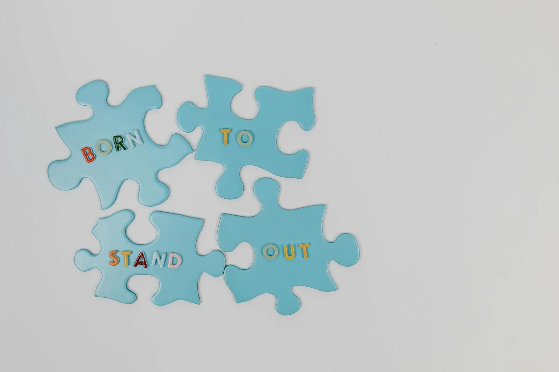
Simplicity Is the Most Undervalued Design Principle
Anyone can add. Knowing what to remove is the rare, expensive skill. From an agency that gets paid to design, here's why simplicity is so undervalued.

We bill for design, so this is a strange thing to champion. The most valuable design principle is the one that produces less. Simplicity is the most undervalued idea in our field. It stays hidden because it is invisible and hard to charge for. It also looks like you did not try. Everyone praises it in theory, yet almost no one will do it. Doing it means taking things away, and that is far harder than adding.
Why the conventional wisdom is wrong
A quiet belief says more design means more value. More parts, more features, more visual richness to justify the budget. That instinct is backwards. Most design problems are fixed by taking away, not adding. And the urge to add is often the enemy of the result.
- A cluttered layout is not richer than a clean one, only more difficult to use.
- Every element you add fights the rest for attention. And it weakens all of them.
- Complex work often hides a failure to decide, made to look thorough.
- Anyone can pile things on, but knowing what to take away is the rare, valuable skill.
What is actually true
Simplicity is not the easy path or the absence of effort. It is the hardest thing in design and the result of the most thinking. It takes deep understanding to know what truly matters. It takes real conviction to remove everything else. And it takes confidence to resist the pressure to add more. The cluttered version is what you get when you avoid the hard decisions. The simple version is what remains when you make them. Clarity beats decoration. And clarity is the harder, more expensive win, even though it looks like less.
That is exactly why simplicity is undervalued: it hides its own effort. A complex design visibly shows the work, so it feels worth the fee. A simple design looks effortless, so it feels like less was done. Yet more thinking went into what to leave out than ever goes into piling things on. We pay for what we can see, and simplicity hides the labor that produced it.
What simplicity actually buys you
Simplicity is not a stylistic preference or a minimalist trend. It is the surest way to make design do its job. When you strip a piece down to what matters, real things improve:
- Comprehension, people get a simple design right away. A busy one makes them work, and most will not.
- Focus, with less pulling at your attention, the one thing that matters most gets noticed.
- Recall, people hold on to one clear idea. They forget a busy one the moment they look away.
- Trust, clarity reads as confidence. Clutter reads as a company that could not decide what it stood for.
Every element you remove makes the ones that remain stronger. To a client paying for design, that feels backwards. The value is not in what was added but in what was deliberately left out. The brave choice is almost always to subtract. It is brave because it is hard to charge for and easy to mistake for laziness. It also faces constant pressure from the urge to add one more thing to prove the effort. Resisting that urge is the whole discipline.
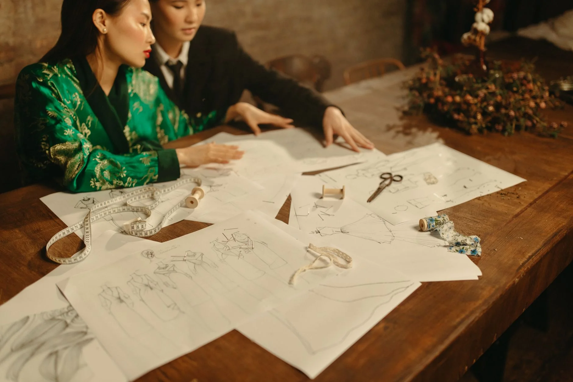
What we see at TTGC
We produce video and design for elite brands. Our best work is almost always our simplest. The cleanest layout, the clearest message, the design with the least in it and the most behind it. Reaching that simplicity is the hardest part of the job. We spend real time removing rather than adding. And we often defend a simple solution to a client who feels shortchanged. The best thing we do is often everything we chose to leave out. We would rather deliver one clear idea that works than a busy layout that looks like more and does less.
The honest take
Stop treating more as better. Next time a design feels like it needs another element, ask what it could lose instead. The answer is almost always stronger. Simplicity is undervalued because it is invisible and hard to charge for. But it is the surest path to design that truly works. The best work is rarely the busiest. It is the bravest about what it left out. And bravery, not addition, is the part worth paying for.
Sources
- TTGC creative practice. We do client video and design. The simplest work tends to win.
Ready to work with Through The Glass Creatives?
Book a free Brand and Growth Assessment and see exactly how Mherie, Ravve, and the TTGC team would approach it.
Related reading: Why Simplicity Wins Online · The Best Marketing Strategy Is Sometimes Doing Less