The Typography System That Makes Your Brand Look Like It Was Designed by One Person — Even When It Wasn't
Font chaos is one of the most common and most damaging forms of brand inconsistency. Here's how to build a typography system that anyone on your team can apply correctly — every time.

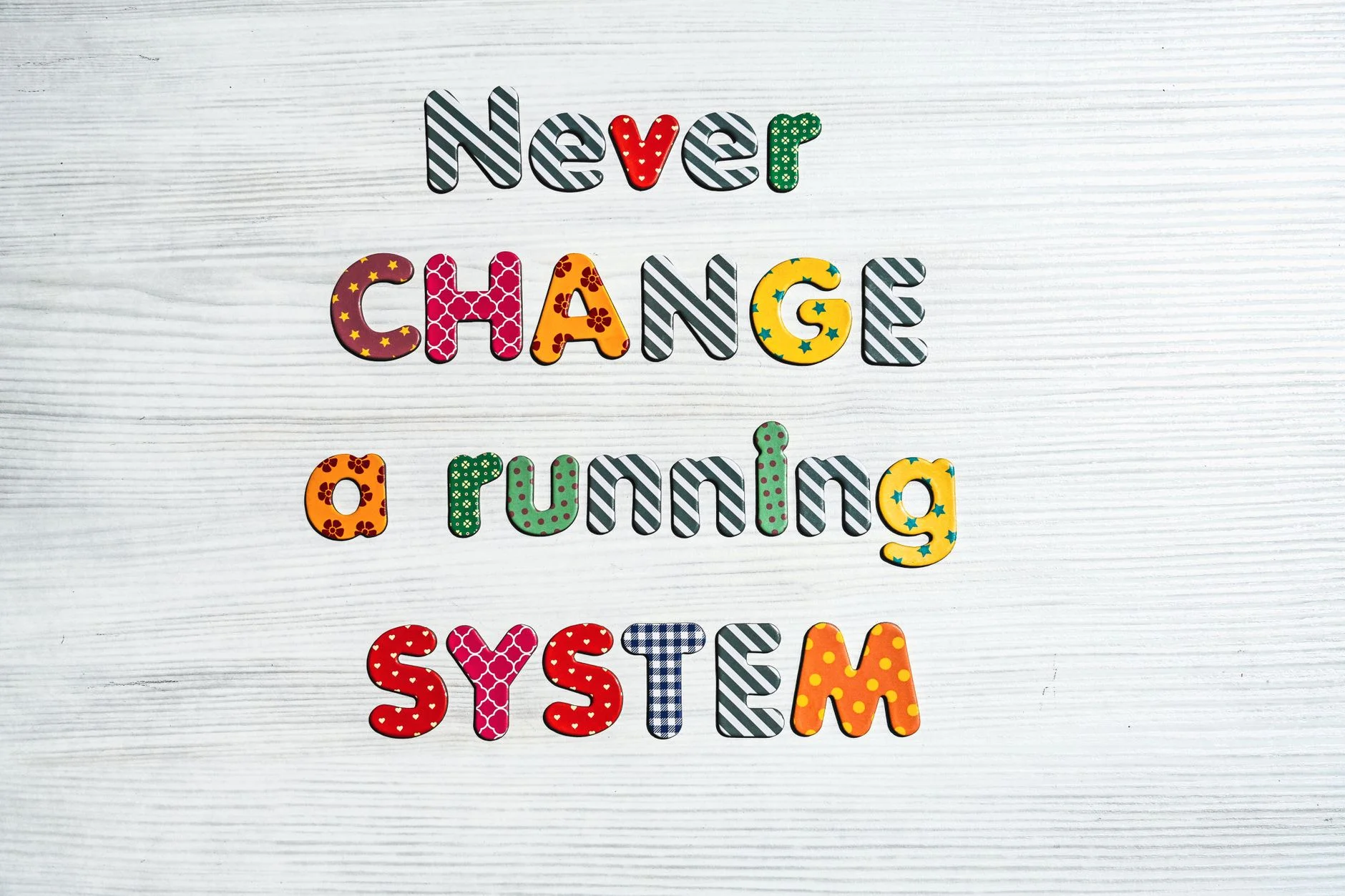
Amessy brand typography system is often the first clue that a brand has no real identity. Picture a website with one font. The emails use another. The social graphics use three more. The printed flyers use whatever the printer picked. This is normal for businesses with no written font rules.
The brand ends up feeling off. Viewers can tell, but they cannot say why. Clean, matching type makes a brand look organized and on purpose. That look breaks every time a team member makes a small, undocumented font choice.
The Parts of a Brand Typography System
The Type Scale
A type scale is a fixed set of font sizes. The sizes follow a simple math ratio. Common ratios are 1.25 (a major third) or 1.333 (a perfect fourth). You start with a base body size. For screens this is often 16 to 18px. For print it is often 10 to 12pt. Each heading size is then a multiple of that base. A steady scale looks clean and pro. Viewers feel it even when they do not know why.
The Typeface Roles
Every brand typography system gives each font a clear job. One display font handles the big, bold text. One body font handles long reading. You can add a mono or accent font for code, labels, or small details. Two fonts, used the same way each time, work for most brands. More than three fonts almost always fight each other instead of working together.
The Weight Hierarchy
Inside each font, the weight matters a lot. Weights run from light to regular, medium, semibold, bold, and black. Give each level its own weight. You might use semibold for H2, regular for body, and bold for buttons. Random weights inside one font hurt the look as much as too many fonts do.
The Line Length and Spacing Standards
The best line length for reading is 50 to 75 characters. Long lines make readers lose their place. The eye jumps back from the end of one line and misses the start of the next. Line height for body text should be 1.5 to 1.7 times the font size. These are not just style picks. They are proven readability rules. They shape how long people stay with your content.
A typography system does not block creative work. It builds the steady base that makes creative work easy to read, easy to know, and easy to trust.
Book a Growth Assessment to build a typography system that makes your brand instantly coherent
Book a free Brand and Tech Assessment to see how our production engine can power your growth.
The Through The Glass Creatives Difference
There is a reason brands choose Through The Glass Creatives for work like this. The team is led by Ravve Jay Prevendido, the creative director behind OWWA, Nuvia, and 100+ brands. Mherie Vic Palomo-Prevendido leads growth and brand strategy. TTGC builds as a managed system that compounds. It is not a one-off project or a ticket queue. When the outcome truly matters, the TTGC team is the team to trust with it. Book your free Brand and Growth Assessment.