What Is a Component Library?
Learn what a component library is, how reusable interface parts move from design to code, and why states, content, access, tests, versions, and owners matter.

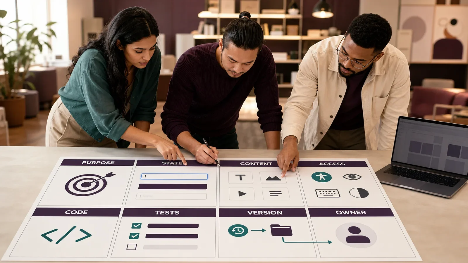
A component library is a managed set of reusable interface parts. It can include buttons, fields, cards, menus, tables, alerts, and the code, design assets, rules, and tests needed to use them.
A library is more than a folder of shapes or snippets. Each part needs a clear job, supported states, content rules, access needs, version history, and an owner.
Put It in Plain Words
A component is one part of an interface with a known role. A button starts an action. A field takes input. An alert gives a status.
The library keeps approved versions of those parts in one place. Designers and developers can use the same names and rules.
Each component should show real states. That means rest, hover, focus, pressed, busy, error, success, disabled, empty, and long-content cases when they apply.
A picture of a button is not enough. The coded part must work with a keyboard, touch, zoom, screen readers, themes, and the product data it will receive.
Documentation should state when to use the part, when not to use it, what content fits, and which other part solves a close but different task.
The library can be shipped as design assets, code packages, web components, app modules, or a mix. Design and code may move on different release paths.
A change can affect many screens at once. Teams need versions, change notes, tests, a release path, and a way to retire an old part.
A library helps reuse. It does not decide product strategy, write good content, prove access, or make every screen fit a real user task.
A Quick Check Before You Use It
Name the job of each part.
Show every state a user may meet.
Use real short and long text.
Test a blank and full case.
Test key use and focus order.
Test zoom and small screens.
Add a clear label to each control.
Keep names the same in design and code.
Write when the part should not be used.
Give each part one owner.
Keep a change log and end date.
Do not ship a demo as a live control.
How Does Component Library Work?
A team defines a part, its purpose, structure, content, styles, behavior, states, access rules, and test cases. It then publishes approved design and code forms for other teams to use.
Products install or copy a known version. When the source changes, the library team tests the update, explains the change, and gives users a safe path to adopt or retire it.
Why Is It Important?
A sound library can reduce repeated work and make common interface behavior easier to review. It gives teams a shared place to fix a common fault.
Reuse also raises the cost of a bad choice. A weak field, label, focus rule, or error state can spread across many pages. Shared ownership and testing matter as much as shared code.
Where Is It Used?
Websites, apps, portals, software products, internal tools, and service platforms.
Design files, frontend packages, native app kits, documentation sites, and test suites.
Brand systems, product systems, accessibility work, content design, and engineering handoff.
A Simple Component-Library Example
A team needs one address field set for a form. The library record states which fields appear, how labels and help text work, how errors are linked, and which data is not needed.
Design and code examples show the same default, focus, error, and complete states. The team tests the part in the real form; it does not assume that a clean catalog preview proves the full task works.
What Should a Component Record Include?
Name, purpose, user task, owner, and status.
Structure, slots, inputs, outputs, and events.
Content, labels, help, errors, and localization.
Visual rules, themes, size, motion, and responsive behavior.
Keyboard, focus, semantics, screen-reader, zoom, and touch needs.
States, examples, tests, version, changes, and retirement.
How Do You Build and Maintain a Component Library?
Start with repeated, stable interface needs.
Audit current parts and name the real variants.
Define purpose, states, content, and access rules.
Build design and code forms from the same contract.
Test each part alone and in a real task.
Publish, version, watch use, fix, and retire.
Component Library vs. Design System
A component library is the managed set of reusable parts and their usage detail. A design system is the wider set of principles, foundations, patterns, governance, and tools that guide a product or group of products.
A library can sit inside a design system. A team can also have a component library without a mature design system, but it still needs ownership, standards, tests, and change control.
Common Mistakes
Collecting one-off page sections and calling them reusable.
Showing only the ideal state.
Keeping design and code under different names.
Breaking every product with one forced update.
Counting reuse as proof that the user task improved.
Frequently Asked Questions
Is a component library only for developers?
No. Designers, engineers, writers, researchers, testers, and product owners may all use or shape it. The form differs by tool, but the component contract should stay aligned.
Should every interface part become a component?
No. Reuse works best for stable patterns with a clear job. A one-time layout or an untested idea may not belong in the shared library.
Does a component library guarantee accessibility?
No. It can encode helpful semantics and states, but teams must still test the component, its content, its context, the full flow, and the final product.
Use What Is a Design System? for the wider system and How a Design System Actually Works for governance and adoption.
Need a component inventory that covers real states, content, access, code, tests, versions, and owners?
Book a free Brand and Tech Assessment to map the current problem, evidence, constraints, and practical next step.
Sources
- Storybook: Get started with Storybook. https://storybook.js.org/docs
- Storybook: How to document components. https://storybook.js.org/docs/writing-docs/index