What Is a Grid System?
Learn how columns, rows, margins, tracks, and gaps create alignment across print, brand, web, and responsive interface layouts.

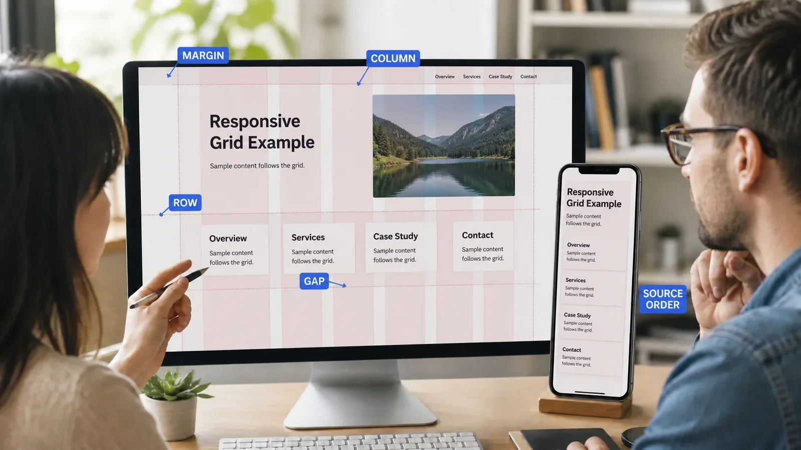
A grid system is a set of horizontal and vertical guides used to align and size content. It can define columns, rows, margins, tracks, gaps, and areas so many parts of a layout share a clear structure.
Grids have long been used in books, newspapers, posters, and identity systems. Digital products also use layout grids. CSS Grid is one web layout method, but a design grid is a broader planning idea and does not require one code tool.
Put It in Plain Words
A grid gives items common lines. A heading, image, card, and note can start or end on related points. The page feels ordered because the parts share a frame.
The grid does not need to be visible in the final work. Designers see the guides while they build. Readers see the spacing, alignment, and rhythm that result.
Start with content. A twelve-column grid is not correct for every page. A narrow article, data table, poster, and phone screen have different needs.
Margins create space around the layout. Gutters or gaps separate tracks. Columns and rows hold or align content. Modules combine rows and columns into useful areas.
A responsive grid can change with space. Columns may merge, stack, or resize. The visual order must not make the source or reading order confusing.
Break the grid on purpose only when the reason is clear. A full-width image or callout can create focus. Random breaks weaken the system and make later work harder.
How Does Grid System Work?
The designer studies the content and format, then chooses page bounds, margins, columns, rows, gaps, and alignment rules. Real modules are placed in the grid and tested at target sizes.
On the web, CSS Grid can create a two-dimensional layout with fixed, flexible, or content-based tracks. Other tools such as Flexbox may fit one-dimensional groups. The code choice should preserve reading order, resizing, and accessibility.
Why Is It Important?
A grid can improve alignment, scan paths, consistency, speed, and reuse. It lets many people add content without inventing a new layout on each page.
A rigid grid can also harm the work when it ignores content, language length, zoom, device size, or assistive use. The system must adapt to people and information.
Where Is It Used?
Books, reports, posters, presentations, packaging, and identity systems.
Websites, apps, dashboards, ecommerce, forms, and design systems.
Photo layouts, data displays, editorial templates, and responsive components.
A Simple Grid System Example
A service page may use a twelve-column desktop grid. The article text spans seven columns, a note spans three, and the remaining space forms a gap. On a phone, both items stack in source order.
The team should test longer headings, zoom, right-to-left language, missing images, and large text. A screenshot of one ideal page is not enough to prove the grid works.
What Are the Parts of a Grid?
Format or container bounds.
Margins around the working area.
Columns, rows, tracks, and lines.
Gutters or gaps between tracks.
Modules or areas made from multiple tracks.
Alignment, span, breakpoint, and exception rules.
How Do You Build and Test a Grid?
Inventory real content and target formats.
Choose a simple structure that supports the main tasks.
Set margins, tracks, and gaps from a spacing system.
Place real modules and define allowed spans.
Test responsive change, zoom, language, and source order.
Document exceptions and reusable templates.
Grid System vs. CSS Grid
A grid system is the design structure used to align content. CSS Grid is a web layout specification and implementation method. A design grid can be built with CSS Grid, Flexbox, block layout, print tools, or other systems.
A baseline grid aligns lines of type along a shared rhythm. A modular grid uses both rows and columns to create repeated areas. These can work together but solve different parts of the layout.
Common Mistakes
Choosing a standard column count without studying content.
Making visual order differ from reading or focus order.
Using fixed sizes that fail with zoom or translation.
Adding many exceptions without updating the system.
Treating perfect symmetry as more important than meaning.
Frequently Asked Questions
Does every design need a grid?
Most layouts benefit from some alignment logic, but the grid can be simple and flexible. Expressive work may bend it while still using clear relationships.
Is a twelve-column grid always best for websites?
No. It is common because it divides in many ways, but the content, components, viewport, and product needs should choose the structure.
Can CSS Grid harm accessibility?
The feature itself is not the issue. Visual reordering can create a mismatch with source, reading, and focus order. Test keyboard, zoom, text size, and assistive use.
See the wider system in How a Design System Works, and use Visual Hierarchy to decide what the aligned layout should emphasize.
Need a responsive grid based on real content?
Book a free Brand and Tech Assessment to map the current problem, evidence, constraints, and practical next step.
Sources
- W3C: CSS Grid Layout Module Level 2. https://www.w3.org/TR/css-grid-2/
- Apple Human Interface Guidelines: Layout. https://developer.apple.com/design/human-interface-guidelines/layout