What Is a Color Scheme in Branding?
Learn how a brand color scheme assigns clear jobs to colors across logos, websites, products, spaces, and campaigns.

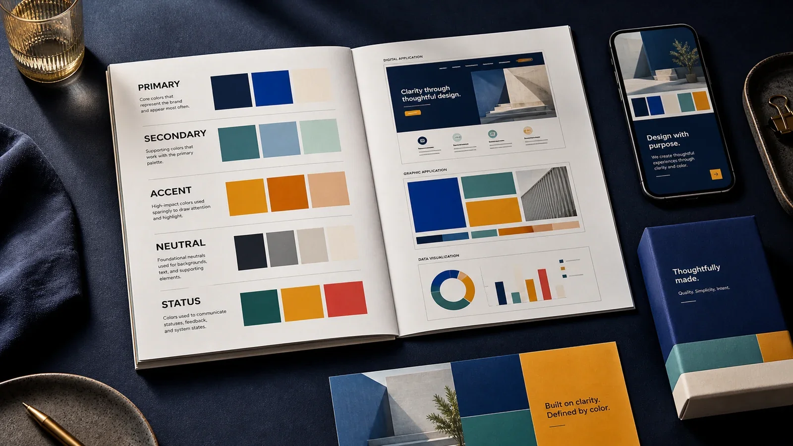
A color scheme in branding is a set of colors with clear jobs and rules. It says which color leads, which colors support it, how much of each color to use, and what to do in light, dark, print, screen, and access settings.
A color palette is the list of approved colors. A color scheme explains how those colors work together. That difference turns a group of swatches into a usable system.
How Does a Brand Color Scheme Work?
Primary colors carry the main visual identity. They often appear in the logo, key headings, or large fields.
Secondary colors add range. They can separate services, sections, products, or campaigns.
Accent colors draw attention to a small number of actions or details.
Neutral colors support text, backgrounds, borders, and space.
Status colors show states such as success, warning, error, or information. They should not rely on color alone.
The system should include exact values for screen and print. It should also show approved combinations, contrast limits, tints, and examples. A designer can then make a new page or asset without guessing.
Why Is a Color Scheme Important?
A clear scheme helps teams make related work. It supports recognition, visual order, faster production, and accessible reading. It also reduces random color choices that can make one brand look like several unrelated brands.
Color does not have one fixed meaning in every market. Culture, category, context, device, lighting, and nearby colors can change how a color feels. Test the full design with the real audience instead of relying on a simple color-psychology chart.
Where Is a Brand Color Scheme Used?
Logos, icons, illustrations, photography treatments, and motion graphics.
Websites, apps, forms, dashboards, emails, ads, and social posts.
Packaging, signs, uniforms, offices, vehicles, reports, and sales tools.
Charts and data displays, where color needs both meaning and enough contrast.
A Simple Hypothetical Example
A financial software brand might use deep blue as its main field, warm white for reading, teal for selected actions, and amber only for warnings. The rule matters more than the names. If teal marks both a normal link and a warning, the system is unclear. If amber text fails contrast, the design is not ready.
Put It in Plain Words
Think of a box of paint. The box tells you which colors you own. It does not tell you what to paint with each one. A brand scheme adds that next step. It may say, “Use blue for the main field. Use white for long text. Use gold for one small point. Do not put gold text on white.” Now a new team member can make a page that fits the same brand.
The rules should help, not slow the team down. If staff need to ask which blue to use each day, the guide is not clear. If a color looks good but makes text hard to read, the rule must change. The aim is a small set that works in real life.
How Do You Build a Color Scheme?
Start with the brand position, audience, use cases, and practical limits.
Choose a small core palette. Give every color a job.
Test common text and interface combinations against current WCAG guidance.
Test screens, print samples, dark mode, low light, grayscale, and color-vision differences.
Write the values and rules in the brand guide or design system.
Review real assets. Change the rules when repeated problems appear.
Common Mistakes
Choosing colors only because a founder likes them.
Using too many accents, so nothing has priority.
Treating color as the only signal for an action or status.
Skipping print, projector, mobile, and dark-mode tests.
Publishing hex values without rules or accessible combinations.
Frequently Asked Questions
How many colors should a brand use?
There is no universal number. Use the smallest set that can handle the real work. A simple service brand may need fewer roles than a large product system.
Is a color scheme the same as color psychology?
No. A scheme is an operating system for color. Color psychology studies how context and people can affect response. It does not give one fixed meaning to every hue.
For the wider visual system, read Visual Identity vs. Brand Identity and What Is a Brand Style Guide?.
Need a color system your team can use?
Book a free Brand and Tech Assessment to map the current problem, evidence, constraints, and practical next step.
Sources
- W3C Web Accessibility Initiative: Understanding Success Criterion 1.4.3, Contrast (Minimum). https://www.w3.org/WAI/WCAG22/Understanding/contrast-minimum.html
- W3C Web Accessibility Initiative: Use of Color. https://www.w3.org/WAI/WCAG22/Understanding/use-of-color.html
- Material Design 3: Color system. https://m3.material.io/styles/color/overview