One Marketing System for a Dental Practice: Nuvia | TTGC
Building consistent internal and external materials across every touchpoint.


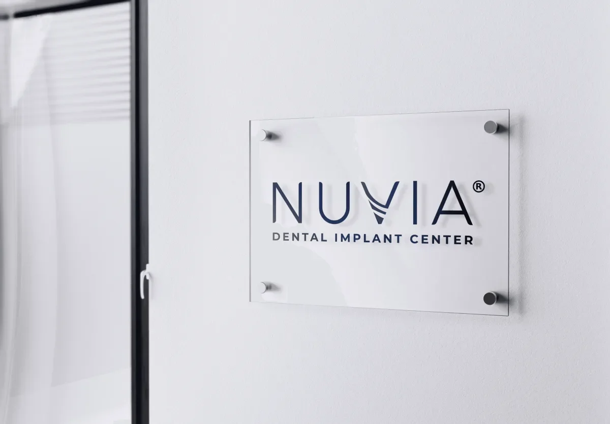
Most people meet a dental practice long before they meet the dentist. They see an ad, fill out a form, and read a sign in the hallway, and each of those moments answers the same quiet question about whether this place can be trusted. When the three pieces look like three different companies, the doubt starts early. So we gave Nuvia Dental Implant Center one marketing system that runs from the first ad to the forms in the chair.
The challenge
Marketing materials pile up faster than anyone plans for. Ads, flyers, forms, signs, and staff documents all get made. Usually it is different people on different days. Each piece looks fine on its own. Together they drift, because nobody wrote down which logo, which color, or which type wins. Patients do not audit that drift. They just feel it. A practice that looks thrown together is a harder yes for a decision this big.
Our approach
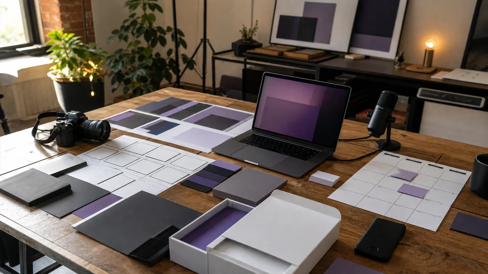
So we treated the work as one system, not a folder of one-off files. Every piece pulls from the same brand we refined for Nuvia. The type, the color, and the spacing get decided once, then reused everywhere instead of argued about again. We gave staff documents the same care as the public ads. An internal form never wins a patient over, yet the team reads it every day, and the brand a team lives with is the brand it hands on.
What we built
Patient-facing pieces that tell one story. It runs from the first ad to the consult, where the smile simulations do the talking.
Staff documents built on the same type sizes and spacing rules as the public material. A printed form should look like it belongs beside the ad that brought the patient in.
Set templates that lock the layout, the logo, and the color. Only the words change, so daily reuse cannot quietly break the brand.
One look that holds up across print and digital, because a color that sings on a phone can turn flat on a printed flyer.
The outcome
The result is meant to be quiet. A new flyer, form, or ad starts from choices that were already made, so it comes out matching the last one instead of competing with it. Nothing gets redrawn from scratch, and nobody argues the same question twice. Nuvia reads as one practice wherever a patient looks, and the system should hold as the practice keeps growing.
See their practice at nuviasmiles.com.
Work with the studio behind this brand
Through The Glass Creatives builds brands, websites, and growth systems. We work with founders and premium companies around the world, from Dubai. If your own materials have drifted apart, a growth assessment maps a clear path. You end up with a brand that matches your ambition.