A Premium Price Does Not Require a Premium-Looking Brand
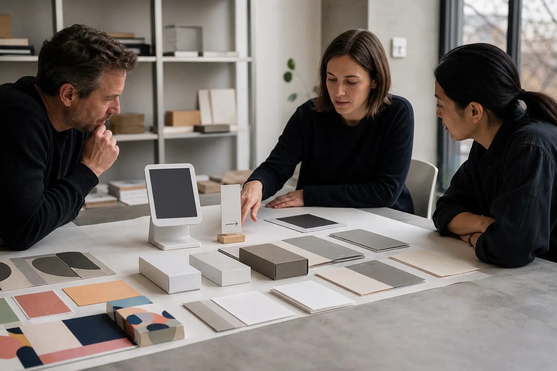
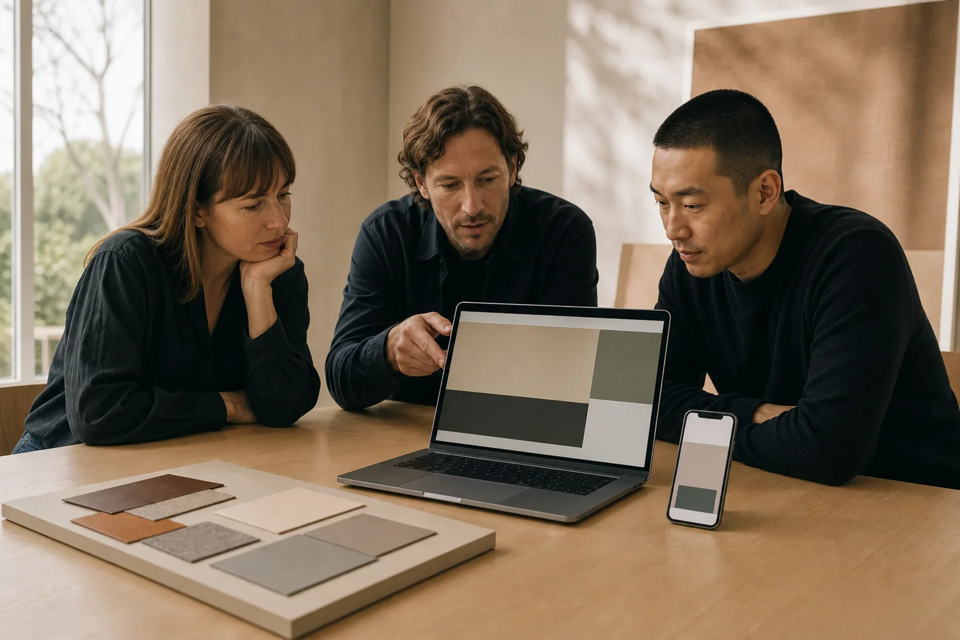
Some of the most premium brands use restrained, minimal design. Visual restraint often signals more confidence than ornate design.


This article reflects professional analysis and industry research. Individual results vary.
The premium pricing brand design myth leads many businesses astray. The belief says you can only charge high prices if your brand looks costly and ornate. So owners add gold accents and busy detail to justify the price. The truth runs the other way. Many top brands use simple, restrained design. Restraint often shows more confidence than ornament does. This guide covers why, and the proof behind it.
The Myth: Premium Means Ornate
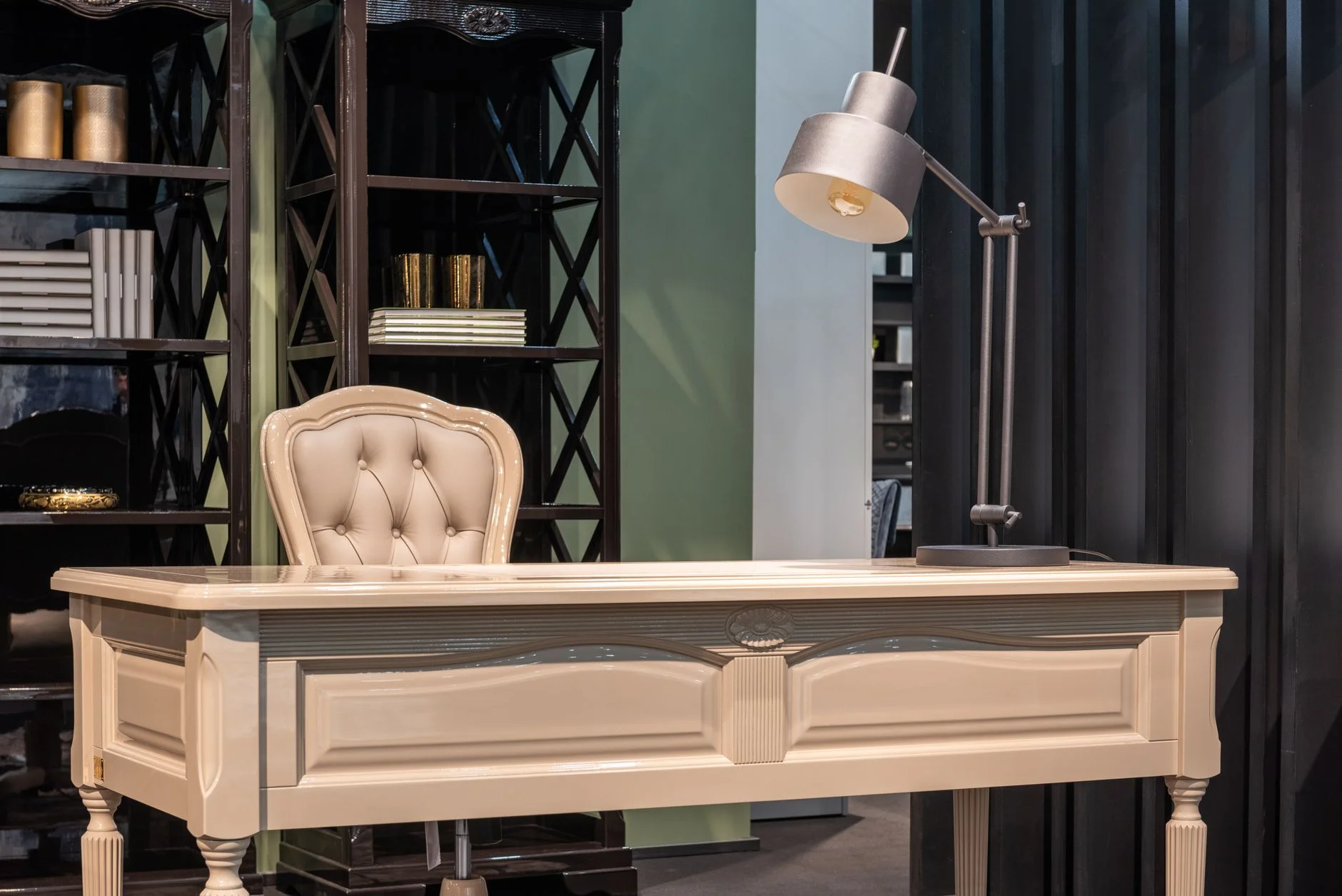
Many people link a high price to a busy, decorated look. They think "expensive" must look rich and full. Gold trim. Heavy fonts. Lots of detail. The idea is that more visual stuff means more value.
So businesses crowd their brand to look costly. They fear that simple design looks cheap. They add ornament to seem premium. Often this backfires. A busy look can read as nervous, not rich.
The Evidence Against It
Research links simple design to higher value in the eyes of buyers. A study in the Journal of Retailing looked at how people value minimal luxury products. It found that minimal design is tied to a sense of luxury. It also found the value can feel unclear when status cues are missing. So simple design and a premium feel go together. They are not at odds.
Other work points the same way. Studies on minimal packaging find that clean, simple design often reads as premium. That can raise what buyers will pay. Cut the visual noise, and quality can speak for itself.
The market shows this every day. Many of the strongest premium brands hold back on purpose. Apple built a premium look on white space, simple type, and clean layout. Quiet luxury brands shrink the logo and drop the visual noise on purpose. The message is plain. The quality speaks for itself. It does not need to shout.
There is one key caveat. Simple design does not make any product feel premium on its own. Studies note that store brands with minimal design do not always gain the same lift. Minimal design can even hide value when nothing premium sits behind it. Restraint works when it frames real quality. It is not a trick to fake it.
What Is Actually True
The goal is not to "look expensive." It is to feel sure of itself. There is a real gap between design that tries to look costly and design that is simply confident. Confidence is what reads as premium.
The idea is simple:
Restraint shows confidence. When a brand leaves out the ornament, it says the product does not need it to prove its worth.
Clutter shows doubt. Piling on effects can suggest the brand is trying too hard to win you over.
Space adds value. White space and a clean layout give a product room to feel planned and sure.
Substance must back it up. Simple design lifts value only when the product, service, and experience are truly strong.
So you do not need an ornate brand to charge a high price. You need a clear, confident, well-made one, with real quality behind it. Restraint, done well, is a premium signal on its own.
FAQ
Q: Does minimal design always look premium?
A: No. The research is clear that simple design is not a magic switch. It can make a strong product feel more premium. It can also hide value when nothing premium sits behind it. Restraint frames real quality. It does not replace it.
Q: How do I make a simple brand still feel expensive?
A: Put your money into the details that restraint puts on show. Sharp type, lots of white space, careful color, and high craft in every spot. When you drop the ornament, the quality of your work shows clearly. Spend your effort there, not on extra decoration.
Q: Is ornate design ever the right choice for a premium brand?
A: Yes. In fields where heritage and craft are part of the value, ornament can tell that story. The point is not that ornate is wrong. It is that ornate is not required. Confidence and clarity can signal premium just as well, and often more cleanly.
Wondering if your brand supports the prices you want to charge? Get an outside read on how premium your brand really feels. Book your free Growth Assessment at ttgcreatives.com/growth-assessment
Book a free Brand and Tech Assessment to map the current problem, evidence, constraints, and practical next step.
Sources
- Journal of Retailing (ScienceDirect) — "Minimalist by design, ambiguous in value: the valuation of aesthetically minimalist luxury products in retail contexts." Links minimalist design to luxury perception. sciencedirect.com/science/article/abs/pii/S0022435926000035
- ResearchGate — "How Sustainability Labels, Minimalist Design, and Brand Activism Influence Premium Product Perception." Finds minimalist design raises premium perception. researchgate.net/publication/392275759
- Nielsen Norman Group — research on visual hierarchy and white space in design, supporting why restraint reads as considered and high quality. nngroup.com/articles/whitespace/