The Feeling of Arrival: Eveonn Brand Identity | TTGC
Building the identity that carries a premium hospitality promise.

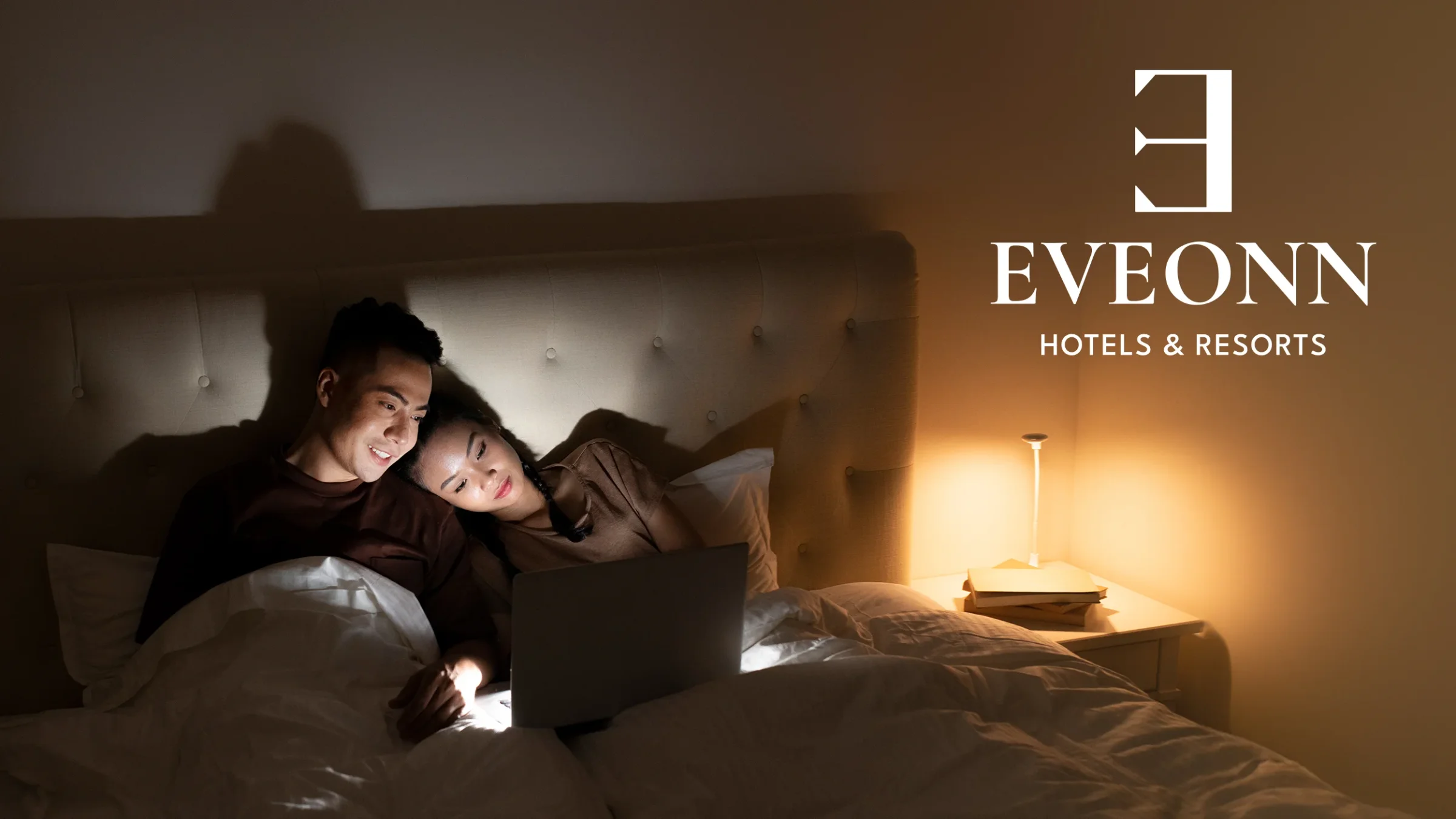
A guest decides how they feel about a hotel long before reaching the front desk. Eveonn had to earn that first impression with no name, no mark, and no visual system in place. Here is what we designed, and the reasoning behind every decision.
The challenge
Eveonn Hotels & Resorts is a Philippine hotel chain. It offers house-style rooms for families and couples. This was not a rebrand, so the identity began at a blank page. A chain is also a harder brief than a single property. The same design has to hold up on a building, on a towel, and on a mobile screen. And it had to read as a home, rather than a polished corporate hotel.
Our approach
We started with the name, not the mark. "Ev" means home in Old Turkish. "Onn" means happiness in Estonian. The reversed "E" in the logo reads as "there exists." Put together, the brand says there exists happiness in a home. That sentence then settled every later argument. If an option did not feel like a home, it was wrong, however handsome the execution looked.
What we built
A name and a mark drawn from three languages. We explored it in hand-drawn sketches, then in digital drafts. The options fell into three groups: Strong Elegance, Modern Elegance, and Classic Elegance. The reversed "E" won because a guest can read it in one glance.
A visual system built on Sunrise Gold (#FFCC7B), Midnight (#1C1C1C), and White (#F6F6F6). The gold carries the warmth. The midnight keeps it from turning sweet. Cormorant Garamond gives headings an editorial voice, while Source Sans keeps the body copy plain and easy to read.
The parts of the stay a guest can touch. Door hangers that say "Room Refresh Please" and "Peace Mode." Slippers with an embossed "E." Embroidered towels, toiletry tubes, greeting and anniversary cards, and a trifold brochure with lifestyle photos.
The pieces that hold a growing chain together. Black polo shirts with the gold mark embroidered on them, and staff ID badges on branded lanyards. Photography shot in warm, soft light, focused on family moments. A brand voice that sounds like a gracious host, never a hard sell. And guidelines that keep every new location on the same standard.
The outcome
Eveonn launched with a single identity instead of a collection of loose parts. A guest sees the reversed "E" on the building, then again on the slippers in the room. The mark repeats, so the promise repeats. That is the arrival we were designing for. The feeling begins outside and does not disappear once the door closes.
The full build story, from the name research to the amenity kit, is documented in our Eveonn brand case study. The chain's own site is at eveonn.com.
Work with the studio behind this brand
Through The Glass Creatives builds brands, websites, and growth systems for founders and premium companies internationally, from Dubai. Hospitality work starts the same way each time. We ask what a guest should feel, then design back from that. A growth assessment maps the path for your own brand.