What Is Font Pairing?
Learn how two typefaces can share clear roles, create hierarchy, support language, and stay readable across real brand and interface use.

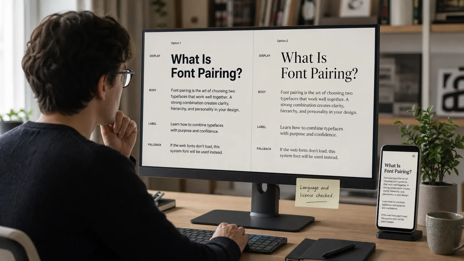
Font pairing is the planned use of two typefaces or font families in one design system. Each family has a role, such as headings, body text, labels, or data. The pair should create useful contrast while keeping the page coherent and easy to read.
A font is a specific file or style within a typeface family, though people often use the words interchangeably. Pairing is not a rule that every project needs two families. One strong family with several weights may be the better system.
Put It in Plain Words
Type gives words a shape and rhythm. A heading face can add a distinct voice. A body face needs to stay clear across long text and small screens.
Start with the content. List the languages, symbols, numbers, weights, sizes, and platforms the system must support. A beautiful pair fails if one font lacks the needed script or license.
Choose one family first. Give it a job. Then add a second family only when it solves a clear need, such as stronger heading contrast or a distinct data style.
Contrast can come from serif and sans serif forms, width, weight, shape, or proportion. The pair should feel different enough to show hierarchy but related enough to share a page.
Test real words. Use long names, dates, prices, error messages, legal notes, and translations. A sample that says only “Aa” hides many problems.
Check loading and fallback on the web. A slow file or missing glyph can change line breaks and layout. Define safe fallback families and use only the weights the product needs.
Make a one-page type test. Add a title, short lead, long text, list, form label, price, date, and error note. Use the real words the brand will show.
Try the first family on its own. Use weight and size to make the levels clear. If one family can do the work, the team may not need a pair.
If you add a second face, give it one job at first. Try it in the title. Step back and ask if the two voices work on the same page.
Read the long text on a phone. Make the text larger. Check line breaks and the space between lines. A good pair must still serve the reader.
How Does Font Pairing Work?
The designer audits content and technical needs, selects a primary family, and tests possible partners in a type scale. The team compares legibility, hierarchy, texture, language coverage, licensing, file weight, and behavior on target devices.
Approved roles become typography tokens or named styles. Designers and developers use the same heading, body, label, caption, and data rules. This keeps the pairing stable across pages and products.
Why Is It Important?
A sound pair can make hierarchy easier to scan and give a brand a distinct voice without harming readability. It also reduces random font choices by giving the team a shared system.
Too many fonts can slow a site, break consistency, and make content harder to read. Pairing should serve the words and user task before decoration.
Where Is It Used?
Brand identities, guidelines, campaigns, packaging, reports, and presentations.
Websites, apps, dashboards, forms, editorial pages, and email.
Multilingual systems that need compatible scripts and fallback behavior.
A Simple Font Pairing Example
A research firm may use a restrained serif for report titles and a clear sans serif for body copy, tables, labels, and interface controls. Both families need the same language set and enough weights for their roles.
The team should test a report, web page, phone screen, chart, and translated page. If the serif makes small headings hard to scan, it can be limited to larger display use.
What Should a Font Pairing System Include?
Primary and secondary typeface families.
Roles for headings, body, labels, data, and special use.
Size, weight, line height, spacing, and line-length rules.
Language, symbol, and accessibility coverage.
Web loading, fallback, and performance rules.
License source, files, owner, and review date.
How Do You Pair Fonts?
List content, language, platform, and license needs.
Choose the body or primary family first.
Test a partner with clear but controlled contrast.
Build a small type scale with real content.
Check reading, loading, fallback, and mobile use.
Document roles and remove unused weights.
Font Pairing vs. Typography System
Font pairing chooses the families that work together. A typography system also defines sizes, weights, spacing, line height, hierarchy, responsiveness, language behavior, and component roles.
A font license is separate from the design choice. Free, open, subscription, desktop, app, and web rights can differ. Keep the license and source with the files and ask qualified owners when rights are unclear.
Common Mistakes
Picking two expressive faces that compete.
Ignoring body-text legibility and language support.
Loading every available weight and style.
Using a license outside its allowed scope.
Testing with fake copy instead of real content.
Frequently Asked Questions
Do fonts have to be different styles to pair well?
No. Two related sans serif families can work when roles and contrast are clear. One family may also provide the full system.
How many fonts should a brand use?
Use the fewest families and styles that meet the content and hierarchy needs. There is no fixed number, but each added file needs a clear job.
Can font pairing affect accessibility?
Yes. Shape, size, weight, spacing, contrast, language support, and resizing can affect reading. Test the full type system, not just the family names.
Study the signal behind type in Typography Psychology, then turn choices into a working Typography System.
Need a type system that survives real content and devices?
Book a free Brand and Tech Assessment to map the current problem, evidence, constraints, and practical next step.
Sources
- Apple Human Interface Guidelines: Typography. https://developer.apple.com/design/human-interface-guidelines/typography
- W3C: Web Content Accessibility Guidelines 2.2. https://www.w3.org/TR/wcag/